


The world is getting hyped up about bond yields lately with bonds of all stripes declining, as if we are in the midst of a debt Armageddon (we are and have been in the midst of a decades-long and still intact 'debt for growth' Ponzi operation). Here is some perspective...
Daily 10 year Treasury Note...

Here's the weekly with a trend line and a lateral support cluster...

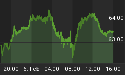
Euro Bund daily...

Euro Bund weekly with trend line and lateral support...

Here is the daily chart status of 30 year (long-term) T bond yields, which of course go inverse to bond prices...

And here is the ratio of junk bonds (HYG) to long-term Treasury bonds (TLT). Looking mighty similar, eh? Is bond risk on or off? Is equity risk on or off? Junk rising vs. T bonds usually indicates the former in each case.

Finally, 'the Continuum' ©, our long-standing arbiter chart of the current system, remains intact. Indeed, considering the bond yield hype in play already, I have significant doubts that the Continuum is even going to make another hit of the 100 month EMA (red dotted line) any time soon.

The chart above has served as the backbone to the current system of debt for growth and it is nowhere near breaking. We have fully expected an 'inflation bounce' and associated bond revulsion (yields rising in tandem). But the Continuum is intact and so is the system.
Filter hype, now as much as ever. There is growing talk out there about 'the end of the 35 year bond bubble'. When the dotted line breaks, the system will have done something it has not done in the post-Volcker era. Until that happens, keep b/s detectors at the ready.
Subscribe to NFTRH Premium for your 25-35 page weekly report, interim updates (including Key ETF charts) and NFTRH+ chart and trade ideas or the free eLetter for an introduction to our work. Or simply keep up to date with plenty of public content at NFTRH.com and Biiwii.com. Also, you can follow @BiiwiiNFTRH.


