


Weekly Trader Alert #82
12/11/2006 9:19:13 AM
Overview
Last week's market focus was clearly that the contractions being seen in the manufacturing and housing sectors threatened the soft landing scenario. This week, we saw a rise in the ISM Service Index, countering last week's fall in the ISM manufacturing index. Of course, the problem with the service sector continuing to grow and manufacturing beginning to contract is that the service jobs, in general, do not pay as much as the manufacturing jobs.
The Fed may like this, as this will cause wage growth to appear to be dropping, thereby slowing inflationary trends. However, this will cause many consumers, those who work in manufacturing or housing, to slow down their spending habits. It is a delicate balance to find a soft landing.
The week's economic news showed the ISM services index reported unexpected strength, reporting 58.9 versus and expected 55.5. Additionally, a revision to the Q3 productivity numbers revised unit labor costs down to 2.3%, significantly lower than the 3.8% originally reported and the 3.2% expected.
The European Central Bank (ECB) raised rates a quarter on one percent to 3.5%. ECB President Trichet stated that it would be "wrong" to assume that the ECB would again raise rates in February.
Finally, the jobs numbers came out on Friday, which allowed the markets to lift again on Friday. Non farm payrolls increased by 132,000 in November, which is better than 100K that economists were expecting. Unemployment rose to 4.5% from 4.4% as expected. Most importantly, hourly earnings rose 0.2% versus the expected 0.3% rise, dropping the annual rate to 4.1%. The Michigan consumer sentiment number dropped to 90.2 from 92.1, but this hasn't been an historic market mover.
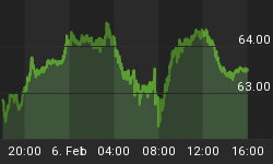
Oil and natural gas closed down from a week ago, with oil at a closing price ($62.03), this represents a drop of $1.40.. Natural gas fell nearly one dollar to close at $7.56.
Overall, we see oil trading in a range of $61 to $64, natural gas declining heavily from last week, and the services portion of the economy expanding. Employment appears to be expanding supporting the soft landing scenario. The market will be carefully watching the Fed policy statement to be released next Tuesday. If the Fed expresses greater concern about inflation, that would roil the markets. With contractions in the manufacturing and housing sectors, it favors the Fed not raising rates in the near future and perhaps beginning to reduce them in the Spring.
To understand more about our view on the markets, we will have to look at the charts.
Market Climate
The market continues to rise, but trades in split fashion with the tech heavy NASDAQ continuing to show signs of weakness, while the Big Board stocks continue to perform strongly.
A chart of the composite of over 8,000 stocks traded on the U.S. Stock markets continues to be included.
The U.S. stock market composite chart:

Price has been testing the upper Bollinger Band, with the 20-day moving average rising. Price is caught between these two boundaries, while price trend has been accelerating to the upside, with support trend lines getting steeper. Volume fell off, late in the week for the composite, when price also fell a bit.
Overall, we are going to have to wait to see how trading develops, as other indicators are inconclusive. Once again, until you get a break downward, the bullish case is still intact for the US Composite.
To understand more about what is happening and to determine whether we may be at a market top, we have created a special essay titled, "The Anatomy of a Top." We are going to insert it here, so this section will become unusually long, however, we feel it is worthwhile, as it will provide you with an historical perspective on the NASDAQ-100 and the S&P-500.
The Anatomy of a Top
Last week we explored the value of reviewing Advancers and Decliners on the exchanges to get an idea of the breadth of a market move. This week, we will examine how top's may form. In particular, we are going to look at tops (and bottoms) for two of the market indexes to see what we look for in a market top.
We are going to look back at some important inflection points for the NASDAQ-100 and the S&P-500 in recent times. The charts will show us correlations between candlestick patterns and indicators at market tops and bottoms. In particular, calling a top is really about building a case why the market will exhaust itself, which generally depends on extremes being reached, a definitive candlestick pattern, or both.
We will first look at the weekly charts, comparing the candlestick patterns, the Fractal (Choppiness) Indicator, the Stochastic, and whether the ETF is showing Accumulation or Distribution.
Let's take a look at the weekly chart of the QQQQs (NASDAQ:QQQQ):

In the chart above, we see that there are major candlestick patterns that show tops and bottoms, such as D and F. We also see periods where the Fractal Indicator shows trending action is underway, such as the blue shaded area, and the area after F, as well as the yellow shaded area under G.
A shows a Harami pattern indicating a possible bottom, which is confirmed the next week. The stochastic confirms the move and accumulation begins.
B shows a Harami pattern indicating a possible top with the small candle being a shooting star with a very long overshadow This is confirmed the following week. Stochastic reverses lower, and Distribution begins.
C shows a shooting star with a long overshadow. The Fractal indicator is at a level indicating the uptrend is exhausted. The stochastic reverses lower and accumulation stops.
Blue shaded area shows a bottom before it that was indicated by price and a reversal of the stochastic and the beginning of accumulation. The reason the area is shaded, however, is because the Choppiness Indicator (Fractal) shows a trend is getting started.
D shows an evening star, which is a major reversal signal. The Fractal indicator shows the uptrend is exhausted, and the stochastic reverses lower. Accumulation moves lower for one week, but it then moves sideways for months before committing to a downtrend.
E is a yellow shaded area that indicates the Fractal (Choppiness) Indicator is confused but saying that a strong trend is in process of getting started. It takes a few weeks to develop but when it does it turns into a sharp downtrend. (This is where the money is to be made!) You will note that an unsuccessful retest of the top at D is attempted during this time.
F shows a Morning Star, which is a major candlestick reversal pattern. Note the choppiness indicator has reached the point of exhaustion and turned higher. Also not the reversal in the stochastic and the low level of distribution turning into accumulation.
G indicates strong trending action (look at the Choppiness Indicator moving from the 60 to the 40 level). In addition, this had been preceded and continued with a rising stochastic and persistent accumulation.
H shows a possible top pattern that we will explore in detail.
A possible top in the QQQQs starts with the pseudo-evening star pattern (circled). It isn't a true evening star pattern, as the middle candle isn't a shooting star, but rather a short overlapping candle. Let's look at the other indicators.
- The Choppiness indicator bottomed corresponding to the market top. This indicates the strong uptrend is over, and we have entered a weakening trend state. Note that significant moves can occur during these times, as well. In fact, counter trend moves often occur when the choppiness indicator is moving back up to the 60 level readying to start another trending move.
- The stochastic has reversed. The problem with this (as we shall see when we examine the weekly SPYders chart) is that the stochastic can fibrillate at an extreme level, essentially moving sideways for months.
- Distribution started a significant reversal but has stopped as of the last week, and slight accumulation started again.
Do we have enough to indicate a top is in? Before we answer that, let's take a look at the weekly chart for the SPYders.
Weekly chart for the S&P-500 ETF(AMEX:SPY):

In the chart above, we see that reversals occurred in contact with the Bollinger Bands most of the time, such as at A,B,D,E, G, and H. We also see periods where the Fractal Indicator shows trending action is underway, such as the blue shaded area, and the area after F, as well as the yellow shaded area under G.
A shows a Harami pattern (note this is the same time as the Harami pattern for the QQQQs) that has the reversal outside of the Bollinger Band. The Stochastic reverses upward, and Distribution changes to Accumulation. The Choppiness indicator is in no mans land.
B shows a bearish engulfing with a move away from the upper Bollinger Band (not in itself conclusive). The stochastic reverses and accumulation gives way to distribution. The choppiness indicator moves to a low level and reverses higher indicating a likely exhaustion of the previous trend.
C represents a local bottom and a local top which is essential a retest of the inconclusive top put in at B. The choppiness indicator used this time to climb back up to 60 so that it was ready to commit to a downward move to indicate the start of a new trend. Note that accumulation and distribution essentially moves sideways while the Stochastic crosses twice from the upper middle of its range to the top boundary indicating likely reversals before reversing to a downward move.
The move from C to D is sharply downward and correlated with a like move in the stochastic and with distribution as well as the choppiness indicator signaling a strong trending move.
D shows a classic morning star, which is a major reversal signal. The Fractal indicator is still showing a trend, so it is a bit confusing. However, the stochastic reverses from a low level and accumulation begins. An uptrend is underway and turns out to be strong as it is part of the strong trending move indicated by the Fractal indicator. This is a case where the Fractal indicator continued to show a strengthening trend, even though the trend actually reversed!
E is a Harami at the upper Bollinger Band. A Harami indicates a trend is stopping, which may, or may not, indicate a reversal. In this case, there is only a minor move downward in an essentially sideways moving stochastic and accumulation and distribution are neutral. The choppiness indicator continues to move to the point of exhaustion, so is of little use during this reversal. It is, however, useful, when it become exhausted, indicating a new phase.
F shows a clear evening star pattern that occurred when price was not reaching up to the Bollinger Band. The stochastic continued to meander sideways and the choppiness indicator moving back up to begin a new trend. There is a netural read on accumulation/distribution. The evening star indicates a reversal that really is only a pause in the action for a month. This period corresponds to a sell-off in the QQQQs during the same period, that is reversed into an uptrend after a month.
G saw a large red candle engulf the small previous white candle at the upper Bollinger Band, a clear reversal signal. This was followed with the stochastic breaking down out of its multi-month sideways movement to begin a downward phase. Distribution began and the short trade was quite profitable.
H shows a Harami pattern reversing from the lower Bollinger Band. It was confirmed the next week and the latest uptrend got under way. The stochastic moved up with this move and accumulation began. The stochastic began to move sideways at a high level so has become useless as an indicator until it break down from its sideways trading pattern. Accumulation has been relatively steady, and hasn't broken this for months. The choppiness indicator is at a point where the strongest trending move is over, but it hasn't relinquished the low level it is at. A strong move back up for the choppiness indicator would indicate a readying for another trending move, but this will likely take weeks, if not longer.
Examining the current candlestick pattern for the SPYders, there is nothing to indicate a top has yet been reached. The stochastic continues to move sideways and accumulation continues. We would be hesitant to short the SPYders until we have to opposite set of conditions, i.e. a major topping pattern appears, the Stochastics move lower, distribution begins, and optimally, we have the choppiness indicator begin moving down from a level of 60 or higher.
The QQQQs, on the other hand, look weaker with their pseudo evening star from a point below the Bollinger Band. With the stochastic starting a downward move from a high level, it is possible a larger move gets underway, but we will need more convincing before aggressively entering a short trade here. We would turn to the daily chart for more information.
Now let's move on with our regular weekly analysis.
Note: The coming week is options expiration week, which often mutes volatility.
A look at the chart for the Dow Industrials is represented by the Diamonds ETF (Amex:DIA).

Abbreviations and color key appears below:
Note the following order is Red, Yellow, Green, just like a stop light, so it might be a helpful mnemonic:
Thick Red line represents the 200-day simple Moving Average, (200DMA)
The yellow line represents the 50-day simple Moving Average, (50DMA)
The green line represents the 20-day simple Moving Average, (20DMA)
The light blue line represents the 3-day Moving Average, moved forward three days in time, (3x3MA)
The thick blue line indicates the exponential 13-day Moving Average (13DMA)
Bollinger Bands are abbreviated as BB. There is an upper and a lower Bollinger Band that varies in distance from a central moving average (shown as light red/pink) based on the volatility of stock price movements.
RSI stands for Relative Strength Index. It is an oscillator, which can be used to determine how overbought or oversold a stock may be.
The DIAmonds have been limited for the last three weeks by resistance at the $123.50 range. The uptrend line that has support the bullish move for five months is now within days of intersecting the horizontal resistance line. Something has to give. In our opinion, the most likely scenario, given the sharp reversal at the stochastic at a high level, is for downside action to develop. Given that price would then be forced to break the uptrend line, all the traders that have been impatiently waiting for a pull back, may finally get their wish.
Thursday's move was clearly a failed test of resistance, while Friday's candlestick pattern, although an upward move, actually represents continuation to the downside. The bounce on Friday was off the 20-day moving average, so a downward move below Friday's open would break that support, and would likely result in a test toward $121, which is where the lower Bollinger Band is currently residing.
The S&P 500 ETF, known as the Spyders (AMEX:SPY) is shown in the chart below:

The SPYders actually broke to new six-year highs last week, breaking through resistance and look the strongest of all the major indexes. With that said, the stochastic just rolled over so if a downward move develops, things could get interesting very quickly. Support exists at former resistance (black horizontal lines) levels, which saw a fair amount of trading action last week. The 20-day moving average lies not far below, as does the lower Bollinger Band and the uptrend line.
We would be careful about shorting the SPYders until a sign of a top is put in. Friday's candlestick pattern does indicate continuation to the downside, but the five month old uptrend hasn't yet been broken.
This week's NASDAQ 100 ETF (QQQQ) Chart is below:

The QQQQs continue to be the weakest of the major indexes, leading the market lower. The stochastic indicates the downtrend is still intact, while the candlestick pattern also indicates a continuation of the downward move.
The original uptrend line has been broken, while the revised one indicates the bulls have been barely able to keep the uptrend alive. The QQQQs look vulnerable to a pull back here. When a move gets started (up or down), it appears to be readying for a strong trending move (choppiness indicator), so things could get interesting really quickly.
Fundamental Trends
It's all about Steel and Oil. Oil industries are in fifth, sixth, and seventh place. In addition, Fertilizers continue to be leaders as well as the recently elevated Internet Network Industry. With the two steel industries occupying the number one and number two spots, it is clear that investors are favoring continued demand for steel and steel alloys.
The only retailer remaining in the top screen is the department store industry. There seems to be less of a bet on the consumer, here, which is actually somewhat typical of the year end, with investors and traders, buying the rumor and selling the news of the end of year retail sales pop.
We believe we have missed our entry to oil stocks in this go around, and will have to be patient.
The Industry leaders (ranked 1st-5th out of 190) are:

Control Instruments are again in the laggards, but this has been the case for much of the last year. Transportation services are somewhat unexpected, given the rise in other Transportation industries. The others are repeats from last week. It is important to note that the mortgage services are under pressure in that losses are significantly greater than expected at sub prime lenders. Lending standards have become lax and this is coming back to bite the industry now as homeowners can't make their payments.
The Industry laggards (ranked 186th-190th out of 190) are:

Trade Recommendations
We will delay making a recommendation for another day, as we want to see if the markets will enter a short term correction before making a new recommendation.
We continue to monitor CNE for a possible trade entry.
Current Portfolio
FDG continues to strengthen significantly and has broken above resistance, even as the market has been showing signs of a reversal downward. We believe that it should improve further from here.
Generally, our model uses set stop prices to control risk. Index ETFs, including DIA, SPY, QQQQ, and IWM are managed somewhat differently, in that trades will be reversed to time the market, as opposed to using a set stop limit.
Unlike the majority of position trades in the fundamental trader, our ETF trades may see us exit positions prior to specific profit goals being achieved, as we are more concerned with positioning for the correct direction of the market more than with achieving a specific profit level. The reason for this is the profits come over time with a fair number of exchanges for long and short trades.
* Initial stop prices are set to cause us to exit our positions if they close below these levels. You will note they are generally kept pretty tightly the opposite side of the trades we initiate. Historic volatility would imply that intraday price action may trade outside of these values, so that condition is insufficient to cause an exit from an existing position. On significant movement beyond our stop prices, we may issue an intraday message to exit the position or to maintain the position. You may chose to implement an absolute stop below these suggested stop values, but that stop should be wide enough to take care of the daily volatility for the stock in question. You can examine the candlesticks for an idea of intraday price fluctuations.
Entry prices are adjusted to account for dividends paid. The stock price was adjusted by your broker, to reflect the dividend taken out. The non-adjusted entry price reflects the actual entry price, without the adjustment for dividend values.
LVPB Concept: The concept is a Light Volume Pull Back, where a stock's price will pull back to a support level on light volume. Obviously, heavy selling is a sign of weakness, and we would not want to buy on a heavy volume pullback. However, we will occasionally place stocks on the LVPB (Light Volume Pullback List) to indicate a "re-entry" buying opportunity, when we have already entered a position. This should be used to add to existing positions, or to enter a position if you missed the initial entry.
LVPB Portfolio Stocks:
Conclusions
Once again we find ourselves waiting to see whether the markets will commit themselves to a reversal or a continuation. We expect that the market may want to commit to a new move, but may wait until the Fed releases its statement on Tuesday in the coming week.
For those of you who have enjoyed your subscriptions to the Fundamental Trader and who would like to get additional savings off the price of your subscription, you may consider an annual subscription to the service. You can save nearly 20% off of the monthly rate by selecting the annual subscription price. Just click on the link below:
http://www.stockbarometer.com/pagesMFT/learnmore.aspx
Regards and Good Trading,


