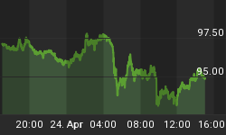
While the deflation/inflation debate rages on, the jump in US government bond yield (and stronger commodities and weaker US dollar) seems to indicate that deflationary pressures are moderating.
The chart of the US 10-year Treasury Note yield shows a clear uptrend since the end of last year, with the yield also now trading above both the 50- and 200-day moving averages.

Source: StockCharts.com
The graph below shows the relatively flat yield curve (red line) immediately prior to the first rate cut in September 2007. As indicated by the black line, the yield curve has steepened dramatically since as monetary policy kept shorter maturities at low levels while longer maturities have been in a rising trend.

Source: StockCharts.com
A steeper yield curve typically heralds better tidings for economic growth, although concerns about massive issuance also come into play. The graph below shows the close relationship between the US GDP-weighted Purchasing Managers Index (PMI) and the US 10-year Treasury Note yield.

Source: Plexus Asset Management (based on data from I-Net Bridge)
This raises the question as to what the impact of the yield curve typically is on the stock market. The blue line in the chart below shows the US 10-year Treasury Note yield relative to the US 2-year Treasury Note yield. A rising blue line indicates a steepening yield curve, whereas a downward trend shows the opposite. A comparison with the S&P 500 Index highlights a broadly inverse relationship, i.e. stocks fall when the yield curve steepens and rise when the curve flattens.

Source: StockCharts.com
A key observation, however, is that the stock market usually bottoms prior to a peak in the yield curve, i.e. as confidence regarding an economic recovery gains ground and earnings prospects improve.
Importantly, the steepening of the yield curve comprises two phases: firstly, when both short- and long-term rates fall but short rates fall more than long rates as a result of poor economic conditions and, secondly, when long rates start discounting better economic prospects but short rates are still kept at low levels. The subsequent decline in the yield curve is when both short and long rates increase, but short rates rise faster than long rates. Share prices typically rise during the second phase of the steepening of the yield curve and the ensuing decline.
The above analysis is merely one cog of the wheel, but seems to support the argument that US stocks are in all likelihood in a broad bottoming-out phase. As said before, investors will now focus on the second-quarter earnings reports as a test of whether stock prices bear resemblance to fundamental reality. In the meantime, a cautious approach is warranted but that should not preclude one from finding stocks that look cheap.
Did you enjoy this post? If so, click here to subscribe to updates to Investment Postcards from Cape Town by e-mail.


