


Investors would be forgiven if, following the financial panic of 2008, they felt frozen and missed a lot of the recovery year that followed. But a strong recovery following a financial panic is not particularly unusual. When the monetary authorities go into panic mode, pump billions of dollars into the financial system and drop interest rates to virtually zero, it should come as no surprise that a stock market recovery follows.
The recovery has been impressive. The most senior of indices, the Dow Jones Industrials (DJI), gained 18.8 per cent on the year and is up an impressive 59.3 per cent from the lows of March 2009. What takes a lot longer is to regain the previous highs.
The table below outlines the past century's financial panics and the performance from the low of the financial panic to the market's next major peak. A summary of how long it took to break even follows the table.
| Date | DJIA | Date | DJIA | % Change | Days | Date | DJIA | % Change | Days |
| 6/17/01 | 57.33 | 11/9/03 | 30.88 | 46.1% | 875 | 1/19/06 | 75.45 | 144.3% | 802 |
| 1/19/06 | 75.45 | 11/15/07 | 38.83 | 48.5% | 665 | 11/19/09 | 73.64 | 89.6% | 735 |
| 11/3/19 | 119.62 | 8/24/21 | 63.90 | 46.6% | 660 | 9/3/29 | 381.17 | 496.5% | 2932 |
| 9/3/29 | 381.17 | 11/13/29 | 198.69 | 47.9% | 71 | 4/17/30 | 294.07 | 48% | 155 |
| 4/17/30 | 294.07 | 7/8/32 | 41.22 | 86% | 813 | 3/10/37 | 194.4 | 371.6% | 1706 |
| 3/10/37 | 194.4 | 3/31/38 | 98.85 | 49.1% | 386 | 11/12/38 | 158.41 | 60.1% | 226 |
| 1/11/73 | 1051.7 | 12/6/74 | 577.6 | 45.1% | 694 | 9/21/76 | 1014.79 | 75.7% | 655 |
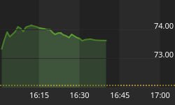
| 10/9/07 | 14,164.53 | 3/9/09 | 6440.08 | 54.5% | 517 | 12/29/09 * | 10,605.65 * | 64.7% * | 295 * |
* To date
-
Financial panic of 1901-03: the assassination of President McKinley as well as a severe drought that caused food shortages resulted in a severe recession at the start of the new century. The recovery was robust and the highs of 1901 were surpassed by December 1905, a period of only two years from the low.
-
Financial panic of 1907: this was known as the "Poor Man's Panic". A banking crisis caused by new financial instruments (sound familiar?), Roosevelt's antitrust drive and then a credit crunch drove this market down. Following the crash the market had numerous bull and bear markets over the years but it was not until 1916 that the highs of 1906 were surpassed.
-
Financial panic of 1919-21: the end of the post-war boom, the Spanish flu crisis, and a bursting of the tech bubble of the time (cars, although during the "Roaring Twenties" automobiles boomed) caused a recession that lasted over two years. It was not until September 1927 that the highs of 1919 were taken out.
-
Great Depression 1929-32: this was a two-stage affair with the initial stock market crash of 1929 bottoming in November 1932. What followed was a feeble recovery into April 1930 before the big decline got underway. It was not until November 1954 that the highs of 1929 were finally surpassed; a period of 25 years.
-
Financial panic of 1937: a subset of the Great Depression crash. Financial scandals and the threat of war sparked a panic. The highs of 1937 were not surpassed until December 1945 as the market roiled through the war years. There were a number of ups and downs; the largest drop for the markets during this time came with the entrance of the US into WW2 in December 1941. The market went into another panic, losing 40.4 per cent into 1942.
-
Financial panic of 1974: this came at the height of the Watergate scandal and the end of the war in Vietnam. As well the Arab oil embargo quadrupled oil prices tipping the economy into a recession. The highs of January 1973 were not seen again until November 1982, a period of almost 10 years. There were a number of attempts to take out those highs in 1976, 1978 and 1981.
-
Financial panic of 2008: apart from the crash of 1929, where it took 29 years to regain previous highs, and the short period at the turn of the last century where the highs were recovered in two years, the range has been 6-10 years before recovering the previous high. This suggests that following a financial panic there is some probability that it could take anywhere from 2013 to 2017 before the highs of 2007 are seen again.
Note: The stock market crash of 1987 and the tech bubble crash of 2000-02 are not included. The former was a decline of 36.1 per cent and the latter saw a decline for the DJI of 37.8 per cent. The cut off point to be included in the above summaries was a loss of 45 per cent or more for the DJI. The 2000-02 collapse of the NASDAQ of 78 per cent was, however, comparable to the 89 per cent crash of the DJI from 1929 to 1932.
The financial panic of 2008 was the second worst on record, surpassed only by the Great Depression. In the past ten years the Dow Jones Industrials has lost 9.3 per cent. Only the 1930s, with a loss of 39.6 per cent, was worse. The NASDAQ lost 44.4 per cent over the past decade comparable with the loss for the DJI during the 1930s.
In looking back at the Dow Jones Industrials of 10 years ago, not only has the index's market cap fallen, but a number of corporations that were a part of the Index on December 31, 1999 are no longer there. Amongst those removed are General Motors, Allied Signal, Citigroup, International Paper and Eastman Kodak. The longest serving component of the DJI is General Electric, present since July 1907.
While the DJI fell over the past decade, not all stocks lost, nor did all sectors. The leading sectors over the past ten years were mining, gold and energy. Given that in all probability a new long term cycle got underway for commodities as they bottomed between 1998 and 2002, this up cycle should continue for many years to come. But as was seen in 2008, corrections can be vicious. The table below summarizes the performance of some of the key sectors over the past decade.
| Market Component | December 31, 1999 | December 31, 2009 | % Change |
| Major Indices | |||
| Dow Jones Industrials | 11,497.12 | 10,428.05 | -9.3% |
| S&P 500 | 1,469.25 | 1115.10 | -24.1% |
| NASDAQ | 4,069.31 | 2,269.15 | -44.24% |
| Dow Jones Transportations | 2,977.20 | 4,099.63 | 37.70% |
| S&P TSX Composite | 8,413.75 | 11,746.11 | 39.61% |
| Gold Bugs (HUI) | 74.03 | 429.91 | 480.72% |
| AMEX Oil & Gas (XOI) | 503.00 | 1,068.20 | 112.37% |
| Some TSX Sub Indices | |||
| Energy | 74.43 | 297.38 | 299.54% |
| Financials | 84.32 | 176.09 | 108.84% |
| Gold | 120.68 | 333.99 | 176.76% |
| Industrials | 266.01 | 96.64 | -63.67% |
| Metals & Mining | 110.34 | 1,004.94 | 810.77% |
| Information Technology | 64.15 | 29.32 | -54.29% |
| Commodities | |||
| Gold | $289.60 | $1,095.20 | 278.18% |
| Silver | $5.41 | $16.82 | 210.91% |
| Oil | $25.60 | $79.36 | 210.00% |
| Gas | $2.33 | $5.57 | 139.06% |
| CRB Index | 205.14 | 484.42 | 136.14% |
| Currencies | |||
| US Dollar Index | 101.42 | 78.22 | -22.88% |
| Canadian $ | 69.36 | 95.62 | 37.86% |
| Euro | 103.90 | 143.30 | 37.92% |
| Bonds & Money Market | |||
| 10 year US Notes | 6.45% | 3.85% | -40.31% |
| 10 Year Cdn Bonds | 6.18% | 4.09% | -33.82% |
| Fed Rate | 5.30% | 0.12% | -97.74% |
| Bank of Canada Rate | 5.00% | 0.25% | -95.00% |
| Market Component | December 31, 1999 | December 31, 2009 | % Change |
| Economic & Monetary (billions of dollars) | |||
| US CPI * | 174.1 | 216.33 | 24.26% |
| US GDP * | $9,353.50 | $14,266.30 | 52.52% |
| US M2 * | $4,662.00 | $8,384.80 | 79.85% |
| US Debt Outstanding * | $17,291.60 | $34,551.90 | 99.82% |
| US Federal Govt. Debt * | $3,681.00 | $7,566.50 | 105.56% |
| Cdn GDP * | $661.30 | $1,319.10 | 99.47% |
| Cdn M3 * | $589.30 | $962.10 | 63.26% |
| Case Shiller National Home Price Index ** | 98.29 | 137.19 | 39.5% |
** To third quarter 2009 only. The Case Schiller National Index peaked at 189.93 in the
2nd quarter 2006. Prices are currently back where they were in the 3rd quarter 2003
Source: Standard & Poor's www.standardandpoors.com.
Bonds also did well over the past decade as interest rates fell. But bonds are coming under some pressure as an economic recovery gets underway. And with governments not only in North America but around the world on a deficit binge, bonds should continue to come under pressure this year and interest rates particularly long rates will slowly be forced up. This should occur even as the monetary authorities maintain a low interest rate policy. The result will be a widening yield curve as long rates rise and the monetary authorities keep short-term rates low.
As we go into 2010, gold, metals & mining and energy should continue to perform well and return above-average gains.
One of the reasons gold and commodities should continue to do well is the declining US$. Since the Federal Reserve System was created in 1913 the US$ has lost 92 per cent of its purchase value. The decline of the US$'s purchasing power has accelerated from the time President Richard Nixon took the world off the gold standard in August 1971. Recall that at the time gold was convertible into US$ at a fixed price of $35 an ounce. With the closing of the gold window (in effect a default by the USA) the world embarked on another experiment in fiat currencies. History is replete with failures of fiat currencies; probably the most famous collapse was in Germany in 1919-23, where the Mark fell from 12 to the US$ to 4.2 million to the US$. More recently Zimbabwe saw its currency collapse as monetary inflation reached an incredible 231 million per cent a year.
The US$ has fallen roughly 35 per cent since 1970 and almost 53 per cent from the peak in 1985. The period 1980-85 saw US dollar strength. The weak US$ in the 1970s coincided with gold's accent to $850 in 1980. When the US$ began a period of strength following the long decline of the 1970s, gold followed by falling sharply. Naturally the US$ overshot on the upside and the US at the time was quite concerned about the strong dollar and its negative impact on exports. This led to the Plaza Accord to intervene in foreign exchange markets to get the US$ down and (primarily) the Japanese yen up.
Gold, after bottoming in 1985, embarked on a period of varying strength over the next several years as the US$ weakened. But once again in 1994, during a period of US$ weakness and concern over the potential for a financial crisis and international currency crisis, it was agreed to strengthen the US$ and weaken the yen, this time to help the ailing Japanese economy. The result was gold eventually falling to $250. Since 2001 the US$, burdened by growing deficits, huge trade deficits and then an economic crisis, has once again seen its currency weaken. Gold once again began to rise and since all commodities are priced in US$, metals, energy and others also began a period of strengthening prices that continues today.
The chart below shows the US Dollar Index from 1970.

Our second chart below shows the relationship between gold and the US$ since 1970. Recall that in 1970 the global currencies were fixed to the US$, trading within narrow bands. Gold was fixed at $35/oz and the US$ was convertible into gold. Finally our third chart below shows the long term decline of US$ purchasing power.

Value of US$1 over time priced in 1776 dollars

Source: http://www.measuringworth.com/ppowerus/
Despite a decade of rising gold prices, less gold is produced today than in 2000. In 2000 roughly 2,600 tonnes of gold was produced vs. roughly 2,400 tonnes in 2008 (last good figures available). Demand figures shows that about 3,800 tonnes of gold was consumed in 2008, leaving a 1,400 tonne shortfall. Figures to the 3rd quarter 2009 shows mine production of 1,886 tonnes and demand of 2,569 tonnes for a shortfall of 683 tonnes (Source: World Gold Council). The differential is made up from gold scrap and official sector sales. Over the past number of years official sector sales have been declining putting more pressure on gold scrap to make up the difference. The first 3 quarters of 2009 show a net disinvestment for central banks sales suggesting that central banks are now net buyers of gold. This makes sense given the announcements seen in 2009 of India, China, Russia and others making net purchases of gold to add to their reserves.
The chart below shows this shortfall.

Gold like all commodities is cyclical in nature. According to analyst Ray Merriman www.mmacycles.com since becoming free trading in 1971 gold has exhibited a long term cycle of roughly 8.5 years (with a range of +/- 17 months). The chart below shows this long term cycle. If the long term cycle is correct gold made its most recent 8.5 year cycle at the height of the financial panic of 2008. The cycle was a short one coming in at 7.5 years. Since then the market has broken out to new highs potentially confirming this long term cycle low. Based on the massive head and shoulders pattern that formed between March 2008 and September 2009 gold projects up to a minimum US$1,300-$1,400/ounce.

Charts created using Omega TradeStation 2000i. Chart data supplied by Dial Data
One main reason for the financial collapse of 2008 was debt, sparked by the defaults in the sub-prime mortgage market. History shows that as debt builds up it eventually creates financial instability and there is a debt collapse. All depressions are a result of debt contraction and collapse. The chart on "The Decade Performance" (page 3), showed that US debt doubled from 1999. Household debt rose even faster, going up 113 per cent, primarily through mortgages that jumped 133 per cent. However, in the past year household debt actually contracted by about 1.8 per cent. Household debt peaked in the second quarter of 2008.
This contraction of US household debt is bad news for the US economy and even the world economy, as the US was the world's largest consumer of imported goods. Despite this there are indications that households did not want to miss the recent holiday season and debt levels rose. This was true in both Canada and the USA.
It may, however, be a short-term phenomenon. There were four million fewer automobiles on the road in the US in 2009 than in 2008. These numbers bode poorly for the car companies but then in the US there were more cars than there were licensed drivers. It may be that these figures are merely going to come more in line with other countries. In Canada the ratio is roughly 75 cars for every 100 licensed drivers. With the decline in the US this would help explain at least partially why consumer debt declined about four per cent in the past year.
The potential economic fallout from a contraction of debt is uncertain. Couple debt contraction with official unemployment of 10 per cent and the Bureau of Labour Statistics B6 unemployment at over 17 per cent and any consumer led recovery appears tenuous at best or potentially still born. The US consumer who generally accounts for up to 75 per cent of GDP will not be able to consume to the level the US is accustomed to, nor to the level required in order to create the GDP growth that the market may be looking for. Many of the temporary programmes put in place to deal with the financial collapse of 2008 are coming to an end in 2010 so a further reckoning may be down the road. Unless these programmes are renewed, at the expense of the issuance of even more debt, the current recovery could run into problems later this year.
But while household debt may be contracting the US government is ramping up its debt. With expected $1.5-$2 trillion deficits in the past year, plus huge further deficits ahead, this is only adding to the US debt outstanding. The budget deficit to GDP ratio has shot up to 11.9 per cent and total government debt (public debt and government account debt) to GDP ratio is approaching 90 per cent.
The only good news for the US is that these numbers are not the worst, with Britain having a budget balance to GDP ratio of 14.5 per cent and Japan having a debt/GDP ratio approaching 225 per cent. But the US numbers are somewhat deceiving as they do not include unfunded liabilities: Social Security, prescription drug plans and Medicare are estimated to be anywhere from $60 to $100 trillion. There are also uncalculated costs for the new health care plan, although much of it will be shouldered by the consumer, with the insurance companies the direct beneficiaries.
If the US debt is a debt reckoning waiting, the situation is similar in Japan and Europe. The Japanese situation may be even more critical. Japan may be the first to hit the wall. With its monstrous debt/GDP ratio, the wall may be the market is no longer willing to lend at the abnormally low rates prevalent in Japan (ten-year government bonds are 1.3 per cent). As well the credit agencies have not only Japan on the radar screen for a potential debt downgrade but also Great Britain and the USA. While a debt downgrade is not likely the fact that it is being discussed should be cause for concern.
If Japan hits the debt wall then a run on the yen could occur. This could in turn trigger the "beggar-thy-neighbour" policies that often occur when a key currency is suddenly devalued and everyone leaps to push their currency lower so as not to lose competitive advantage. China has been doing its best to inject trillions of dollars into its economy to offset the impact of the global recession. While China has demonstrated some sharp growth numbers, much of it is illusory as its export sector has actually contracted.
Many are pointing to a nascent economic recovery as the route out of the still large debt mess. But the economic recovery is tepid at best and its permanence is not assured. As noted, China is struggling with its export-led recovery and Europe has numerous problems including a still very shaky banking sector where the ravages of the 2008 financial panic have still not been exorcised. In the US the housing recovery is especially feeble, and without the participation of the debt-laden consumer any economic recovery could be short-lived. Whether another financial crisis erupts in 2010 is difficult to say at the moment. In the US a large amount of sub-prime mortgages come due this year and over 10 million households have negative equity in their homes.
The chart below of the Case Shiller National Index shows how housing prices have acted over the past 100 years. The index is set at 100 in 1890. The peak was seen in 2006. The run-up from 2000 was historically unprecedented. Two other run-ups in the 1970's and 1980's saw the index return to its previous levels. By this measurement the index has further to decline despite some recent improvement seen in 2009.

If there is any encouragement it is the recent numbers showing falling employment claims and some small signs that lending is once again getting underway. But many of the financial institutions, still wary after the financial collapse of 2008, are reluctant to lend or lend only on far more stringent terms.
The geo-political situation is also very shaky. While the US has increased the number of troops in Afghanistan, the real problem is not there but in Pakistan. The wars have consumed the US military. The cost has been horrendous with conservative figures estimated at $715 billion for Iraq and about $250 billion (and rising) for Afghanistan. Afghanistan is an insurgency of classic guerrilla warfare. The Taliban don't have to win the war; they just have to last longer than the US and NATO is willing to stay. But the real problem is in Pakistan and they could be near the breaking point in 2010. (Stratfor Global Intelligence - Annual Forecast 2010 - www.stratfor.com).
The Middle East remains a flashpoint, particularly Iran. The Israelis want to halt Iran's nuclear activities either through crippling sanctions or military action. Sanctions are impossible without the co-operation of the Russians and the Chinese. The former have little interest because of their own strategic interests in the region, and the latter is dependent on Iran's oil.
A military strike against Iran is also very risky because Israel doesn't have the military range and the US is reluctant to get involved in still another war. Israel would need US assistance with the military aspects of any strike. Any outbreak of war in the region would involve the Straits of Hormuz, through which two-thirds of the world's oil passes. Oil prices that are already rising would undoubtedly soar and there would go any hopes of an economic recovery.
Therefore the Americans are trying to avoid any outbreak of war but the Israelis are pressing and the Russians are manipulating the situation in order to keep the Americans off balance in the region. The wild card in all of this is the direction of the protests in Iran and whether a more serious civil war breaks out. Still the Iranian situation is probably the world's number one potential place for a war to break out and while nothing has happened up until now, this may be a crisis that comes to a head in 2010. (Stratfor Global Intelligence - Annual Forecast 2010).
The cycles are not favourable in 2010. While our economies will probably not fall into a 1930s Great Depression, chart-wise the stock market of the past decade has generally followed the cycle of the 1930s. Of course this is not in absolute terms but more generally in direction and timing. The two charts below show both the 1929-39 and the 1999-2009 Dow Jones Industrials. Some of the comparisons are compelling.
DJI 1929-1939 | DJI 1999-2009 |
| Top Sep 3, 1929 | Top Jan 14, 2000 |
| 89% collapse to bottom Jul 8, 1932 | 37.8% collapse to Oct 9, 2002. The NASDAQ lost 78% which was more comparable to the DJI collapse of 1929-1932 |
| Secondary bottom March 1933 | Secondary bottom March 2003 |
| Strong recovery into February 1934 followed by sideways market until September 1934 | Strong recovery into February 2004 followed by a sideways market until October 2004 |
| Strong rally into top of Mar 10, 1937 | Strong rally into top of October 9, 2007 |
| Financial panic bottoms Mar 31, 1938 | Financial panic bottoms Mar 10, 2009 |
| Strong rally rest of 1938 followed by a correction into April 1939 then a rally for the rest of 1939 | Strong rally rest of 2009 |


Charts created using Omega TradeStation 2000i. Chart data supplied by Dial Data
So what comes next? Looking at the 70-year cycle, the market peaked in September 1939 and then drifted until May 1940. After a drop the market rallied into year end 1939, topping out on the cycle inflection date of January 6 (actual top was January 4). January was a down month but the market recovered and another feeble rally got underway into May 1940. The British retreat at Dunkirk coupled with the German invasion of France and the fall of Paris in June caused a mini crash into June 1940. The rest of 1940 saw a weak recovery. The market did not make its final lows until April 1942. These lows were comparable to the lows seen in 1938.
If the 70-year cycle holds then the market could once again have a negative January followed by a recovery into March to May. This recovery may or may not make new highs as direction is more important than actual highs or lows.
The 60-year cycle (1950) shows a low in mid-January followed by a good rebound into June. A collapse then followed into July before the market recovered for the rest of the year. The 30-year cycle (1980) shows a low in the first week of January followed by a good rally into February. A sharp decline was seen into March before the market recovered and rallied for the rest of the year.
The 100-year cycle (1910) saw a top at the beginning of the year followed by a drifting decline into July. There was only a feeble recovery the rest of the year. Finally the 90-year cycle (1920) also saw a top in early January followed by a drifting decline into February and a recovery into April that did not take out the January highs. The market then declined the rest of the year.
Years ending in 10 are generally not good: only four years of the 12 ending in zero since 1881 were up years. Years ending in zero are the worst performing year of the decade. 1950 and 1980 were two of the up years. The other key cycles of 1910, 1920 and 1940 were down years. But even in 1950 and 1980 there was a sharp decline at one point before the market recovered.
Both 1950 and 1980 benefitted from what is known as the January effect. A poor January bodes poorly for the year, even if the market recovers into March through May and makes new highs. An up month on the other hand could bode well for the year, even if there is a shake down at some point. Both 1950 and 1980 saw the market rise in January. The 10-year cycle (2000) shows a classic top in the first week and the final top in mid-January. January 2000 was, however, a down month and the year ended down as well.
This is the second year of the Presidential cycle. Second years of the Presidential cycle have a mixed record. Since 1833 the record is 26 up years and 18 down. One thing that is not favourable for this year is that Obama's popularity has fallen sharply since the inauguration a year ago. He has disappointed many supporters by ramping up the war in Afghanistan even as he ratcheted down the war in Iraq. Obama used a lot of political capital on the health care plan and the final result was a poor compromise. 2010 sees the mid-term elections. If the Democrats lose seats and, worse, lose control of either of the houses, this could have a negative impact on the markets as well.
2009 was a year of recovery following the worst financial panic since the Great Depression. But the solutions taken to combat the problems have been throwing more money at them rather than getting to the root of the problems. If throwing a lot of debt at the problem was a solution Japan who has gone through a twenty year nightmare since topping in 1990 would have been out of its malaise years ago. The high debt levels remain and the world, particularly the Western World, is still in the process of cleansing the massive debt build up of the past 40 years. Until this debt is completely cleansed the problems will remain and any attempts at recovery will ultimately fail. The market may try to hold on for the first quarter or even into the second quarter but ultimately the rot that remains will come home to roost.
The chart below of the Tokyo Nikkei Dow shows Japan's twenty year nightmare. Every time the market rallied the economy was hit with another problem and the market fell to new lows. The probability is that the world will not fall into a Great Depression as was the case in the 1930's but a long nightmare of sluggish growth and recession as Japan has experienced is a real possibility.

Charts created using Omega TradeStation 2000i. Chart data supplied by Dial Data
A tenuous economy, unsustainable debt levels, the US and NATO bogged down in an unwinnable war and the threat of war elsewhere that could put oil prices into the stratosphere are not exactly confidence builders as the world goes into 2010. One can only hope that the Iranian situation remains at rhetoric only and does not go to the next level. Cycles are not favourable for the year and Obama's waning popularity bodes poorly for the Presidential cycle.
The forecast here says that while the economic and market recovery may last into the second quarter, by the end of the year the markets will be lower. The themes that drove the past ten years - gold, energy and metals - will all continue to shine but could as in the past be subject to nasty shakeouts.
David Chapman is a director of Bullion Management Group Inc. the manager of the BMG BullionFund www.bmsinc.ca.
Note: Charts created using Omega TradeStation. Chart data supplied by Dial Data.


