


Originally posted May 3, 2010
The bond market looks like it's made a huge base and is about to break out. The charts on basic materials, China and the retail sector look vulnerable, too, suggesting the consumer may need a rest. All of this could be signaling a disappointment out of Friday's jobs report for April and a possible correction in equities.
See the complete video chart analysis on the ETFs and stocks mentioned in this article.
Let's start with the bond market. The chart on the iShares Barclays 20+ Year Treas Bond (TLT) shows what has the potential to be a major base pattern over several months. The low in June of last year was at the 87 1/2 area and the low recently in April was at 87.30-40, which has not followed through on thedownside. So it's starting to look like a major double-bottom in the bond market.
The TLTs appear to be on the verge of taking out the declining 200 DMA and the trendline going back to March 2009, at around 92.50, only about 30-40 cents from where the TLT closed on Friday. A break through that would give more impetus to the W pattern, which projects to 99-100. And a break beyond that points to 108-112 - a very powerful move in the TLTs and the bonds, indicating that interest rates are coming down (at least on the long end, as they can't get any lower on the short end).
If the economy is expanding and data is as fantastic as some economist say it is, why does the bond market look like it's about to take off? That would imply that the economy isn't as strong as we think, or there's a flight to safety starting here.
Let's look at the industrial sector. The iShares Dow Jones US Basic Materials (IYM) includes names like Freeport-McMoRan Copper & Gold Inc. (FCX), Dow Chemical Company (DOW), Alcoa, Inc. (AA), and Newmont Mining (NEM), which are the miners, the chemical producers - the basic materials companies in general. This chart, while it has been in a very powerful uptrend, notice that it's really struggled since early April and suggests that there's a small top in place, and that top is pointing lower towards a fall that tests the major trendline at March 09 lows at 59.38. From a Friday close at 64.03, that's a 7-8% pullback. That is not unreasonable, but if the economy were doing so well, why would basic materials ETF look so vulnerable?
Looking at the momentum indicator on the IYM chart, you can see it peaked all the way back in mid-March, creating a series of lower highs while the price action has been flagging and arguably peaking. So the IYM is something to keep an eye on.
The China Shanghai Composite Index (SHCOMP) chart has appeared for some time poised to fail. It finally broke down out of the sideways congestion area the week before last, starting a correction that is going to seek out the next key level to test around the 2716-15 to 2640-50. You'll also see the 50 and 200 day moving averages are about to cross on the downside, which is not agood sign.
This appears to be telling us that the Chinese market, whether because it's tightened rates and requirements for loans, is weakening, and that its engine for growth and procurement of basic materials -- key to the U.S. economy in general and the IYM, in particular -- is slowing down.
What else could be holding up the US economy at this point? The US consumer.
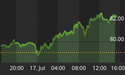
The Retail HOLDRs (RTH) sector has made a phenomenal move from the February low to the April high. The chart indicates that the consumer took over where stimulus left off. More money is getting into the system, people feel betterabout their jobs, and the outlook becomes more positive all around.
However, as fantastic as this chart looks, it's possible that we could say it looked good. Past tense. Why? Because it looks to me that the up-channel from the low of March 2009 to the high in April 2010 is done -- exhausted andin need of a rest.
Maybe in a much larger bull market this up-channel will continue after a pullback, but there's a pullback that's probably coming because the momentum has rolledover in a big way. The retailers are very overbought.
At the very least we can expect a move down to the sharply rising 50-day moving average, which right now is at 101.30, or 2 1/2% from Friday's 103.50 close.
It wouldn't surprise me if the RTH came down to the 50-day, held, and tried to bounce. If it doesn't bounce then it's coming down to the trendline at 96.77, or 7% off the Friday close and 11% down from its high for the day on Friday at almost 108.
The 200-day, prior support and other factors are the reason why retail maywant to take a breather here.
In short, basic materials is telling us that the demand for intermediate-term goods is probably tapering off, and now the consumer - as also seen from the individual Wal-Mart (WMT), Amazon.com (AMZN), J. C. Penney Company, Inc. (JCP) and Macy's (M) charts - appears to be starting to take a breather as well.
If that's the case, and China's chart looks vulnerable, and the bond market looks like it's made a huge base and is about to break out, it's difficult to be bullish on equities and on the data from Friday's jobs report.
See the complete video chart analysis on the ETFs and stocks mentioned in this article.


