


The good news is:
• New lows declined sharply last week.
The negatives
Indicators derived from downside volume and new lows offer the most timely indications of bottoms. Last week new lows all but disappeared but downside volume did not. When there is a discrepancy like this it is usually the other way around.
The chart below covers the past 6 months showing the S&P 500 (SPX) in red and a 5% trend (39 day EMA) of NYSE downside volume (NY DV) in brown. NY DV has been plotted on an inverted Y axis so decreasing NY DV moves the indicator upward (up is good). Dashed vertical lines have been drawn on the 1st trading day of each month.
Aside from the big rally Thursday NY DV has remained at a high level (negative).

New next chart is similar to the one above except it shows the March 09 bottom. NY DV moved up sharply for over the week following that low.

The next chart is similar to the 1st one except is shows the NASDAQ composite (OTC) in blue and OTC DV has been calculated from NASDAQ data. The pattern is similar to the NYSE chart.

The positives
New lows declined sharply last week. On Tuesday there were 126 new lows on the NYSE and 182 on the NASDAQ. On Friday there were 12 new lows on the NYSE (a 90% decline) and 32 on the NASDAQ (an 80% decline).
The chart below covers the past 6 months showing the OTC in blue and a 10% trend (19 day EMA) of NASDAQ new lows (OTC NL) in black. Like OTC DV, OTC NL has been plotted on an inverted Y axis so up is good.
It is too early to draw conclusions, but, at least, OTC NL is heading in the right direction.

The chart below is similar to the one above except it shows the SPX in red and NY NL has been calculated from NYSE data. The pattern is similar.

The next two charts cover the past year showing a 40% trend (4 day EMA) of the ratio of new highs to new highs + new lows (HL Ratio = NH / (NH + NL). Dashed horizontal lines have been drawn at 10% levels for the indicator, the line is solid at the neutral 50% level.
The first chart shows the SPX in red and the indicator calculated from NYSE data in black. After dipping to the low 20% level the indicator has recovered to slightly above the neutral line.

The next chart shows the OTC in blue and the indicator, calculated from NASDAQ data, in red. OTC HL Ratio dropped into the low teens, its lowest level since the March 09 bottom, and has recovered to about the 40% level.

Three days do not make a trend, but, at least, some of the important bottom indicators are heading in the right direction.
Seasonality
Next week includes the first 4 trading days of June during the 2nd year of the Presidential Cycle.
The tables below show the return on a percentage basis for the first 4 trading days of June during the 2nd year of the Presidential Cycle. OTC data covers the period from 1963 - 2009 and SPX data from 1928 - 2009. There are summaries for both the 2nd year of the Presidential Cycle and all years combined.
By all measures average returns have been positive over the coming week, however, during the 2nd year of the Presidential Cycle the OTC has not been up since 1994 and the SPX since 1998.
The first 4 days of June.
The number following the year represents its position in the presidential cycle.
The number following the daily return represents the day of the week;
1 = Monday, 2 = Tuesday etc.
| OTC Presidential Year 2 | |||||
| Day1 | Day2 | Day3 | Day4 | Totals | |
| 1966-2 | -0.65% 3 | 0.43% 4 | 0.60% 5 | 0.25% 1 | 0.63% |
| 1970-2 | 4.79% 1 | 1.44% 2 | 2.00% 3 | 2.47% 4 | 10.70% |
| 1974-2 | 1.10% 1 | 0.85% 2 | 0.54% 3 | 1.20% 4 | 3.69% |
| 1978-2 | 0.08% 4 | 0.57% 5 | 0.88% 1 | 0.61% 2 | 2.15% |
| 1982-2 | -0.66% 2 | 0.26% 3 | -0.40% 4 | -1.29% 5 | -2.09% |
| 1986-2 | -0.20% 1 | 0.03% 2 | 0.01% 3 | 0.20% 4 | 0.04% |
| Avg | 1.02% | 0.63% | 0.61% | 0.64% | 2.90% |
| 1990-2 | 0.69% 5 | 0.75% 1 | -0.21% 2 | 0.08% 3 | 1.30% |
| 1994-2 | 0.04% 3 | 0.54% 4 | 0.39% 5 | 0.14% 1 | 1.12% |
| 1998-2 | -1.80% 1 | 0.86% 2 | -1.11% 3 | 1.59% 4 | -0.46% |
| 2002-2 | -3.29% 1 | 1.00% 2 | 1.09% 3 | -2.53% 4 | -3.74% |
| 2006-2 | 1.88% 4 | -0.02% 5 | -2.24% 1 | -0.32% 2 | -0.70% |
| Avg | -0.50% | 0.63% | -0.42% | -0.21% | -0.50% |
| OTC summary for Presidential Year 2 1966 - 2006 | |||||
| Averages | 0.18% | 0.61% | 0.14% | 0.22% | 1.15% |
| % Winners | 55% | 91% | 64% | 73% | 64% |
| MDD 6/6/2002 3.77% -- 6/6/2006 2.57% -- 6/4/1982 2.08% | |||||
| OTC summary for all years 1963 - 2009 | |||||
| Averages | 0.31% | 0.34% | 0.18% | 0.11% | 0.93% |
| % Winners | 61% | 70% | 60% | 57% | 62% |
| MDD 6/6/1967 3.90% -- 6/6/2002 3.77% -- 6/3/1999 2.72% | |||||
| SPX Year 2 | |||||
| Day1 | Day2 | Day3 | Day4 | Totals | |
| 1930-2 | -0.37% 1 | -0.90% 2 | 0.45% 3 | -1.56% 4 | -2.38% |
| 1934-2 | -2.39% 5 | -0.32% 6 | 1.50% 1 | 2.42% 2 | 1.21% |
| 1938-2 | 3.24% 3 | -0.31% 4 | -1.26% 5 | 2.44% 6 | 4.11% |
| 1942-2 | 0.49% 1 | -0.12% 2 | 0.73% 3 | 1.33% 4 | 2.44% |
| 1946-2 | -0.68% 1 | -0.63% 2 | -0.58% 3 | -0.05% 4 | -1.94% |
| Avg | 0.06% | -0.46% | 0.17% | 0.92% | 0.69% |
| 1950-2 | -0.05% 4 | 0.11% 5 | -1.01% 1 | 1.51% 2 | 0.55% |
| 1954-2 | 0.00% 2 | -0.10% 3 | -0.03% 4 | -0.17% 5 | -0.31% |
| 1958-2 | 0.50% 1 | 0.34% 2 | 0.09% 3 | 0.11% 4 | 1.04% |
| 1962-2 | -0.42% 5 | -3.55% 1 | 0.52% 2 | 1.42% 3 | -2.02% |
| 1966-2 | -0.03% 3 | -0.16% 4 | 0.12% 5 | -0.74% 1 | -0.82% |
| Avg | 0.00% | -0.67% | -0.06% | 0.43% | -0.31% |
| 1970-2 | 1.69% 1 | 0.00% 2 | 0.87% 3 | -1.48% 4 | 1.08% |
| 1974-2 | 2.09% 1 | 1.17% 2 | 0.19% 3 | 1.83% 4 | 5.27% |
| 1978-2 | 0.06% 4 | 0.81% 5 | 1.84% 1 | 0.37% 2 | 3.09% |
| 1982-2 | -0.18% 2 | 0.32% 3 | -0.16% 4 | -1.58% 5 | -1.60% |
| 1986-2 | -0.93% 1 | 0.19% 2 | -0.64% 3 | 0.70% 4 | -0.68% |
| Avg | 0.54% | 0.50% | 0.42% | -0.03% | 1.43% |
| 1990-2 | 0.53% 5 | 1.17% 1 | -0.21% 2 | -0.46% 3 | 1.04% |
| 1994-2 | 0.25% 3 | 0.00% 4 | 0.54% 5 | -0.27% 1 | 0.52% |
| 1998-2 | 0.02% 1 | 0.18% 2 | -0.94% 3 | 1.12% 4 | 0.38% |
| 2002-2 | -2.48% 1 | 0.00% 2 | 0.88% 3 | -1.98% 4 | -3.57% |
| 2006-2 | 1.23% 4 | 0.20% 5 | -1.78% 1 | -0.11% 2 | -0.47% |
| Avg | -0.09% | 0.31% | -0.30% | -0.34% | -0.42% |
| SPX summary for Presidential Year 2 1930 - 2006 | |||||
| Averages | 0.13% | -0.08% | 0.06% | 0.24% | 0.35% |
| % Winners | 50% | 55% | 55% | 50% | 55% |
| MDD 6/4/1962 3.96% -- 6/6/2002 3.56% -- 6/2/1934 2.71% | |||||
| SPX summary for all years 1928 - 2009 | |||||
| Averages | 0.04% | 0.19% | 0.22% | 0.24% | 0.68% |
| % Winners | 51% | 62% | 52% | 54% | 60% |
| MDD 6/2/1931 6.30% -- 6/4/1962 3.96% -- 6/6/2002 3.56% | |||||
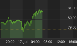
Money supply (M2)
The money supply chart was provided by Gordon Harms. Money supply has increasing sharply over the past 2-3 weeks.

June
Since 1963, over all years the OTC in June has been up 53% of the time with an average return of 0.3%. However, during the 2nd year of the Presidential Cycle June has been has been up only 27% time with an average loss of -1.4% (the last up June during the 2nd year of the Presidential Cycle was 1998).
The average month has 21 trading days. The chart below has been calculated by averaging the daily percentage change of the OTC for each of the 1st 11 trading days and each of the last 10. In months when there were more than 21 trading days some of the days in the middle were not counted. In months when there were less than 21 trading days some of the days in the middle of the month were counted twice. Dashed vertical lines have been drawn after the 1st trading day and at 5 trading day intervals after that. The line is solid on the 11th trading day, the dividing point.
The blue line shows the average of the OTC over all years since 1963 while the green line shows the average during the 2nd year of the Presidential Cycle.
Since 1928 the SPX has been up 53% of the time in June with an average gain of 0.8%. However, during the 2nd year of the Presidential Cycle the SPX has been up only 35% of the time with an average loss of 1.2% making it worst month of the worst year.
The chart below is similar to the one above except it shows the daily performance over all years for the SPX in May in red and the performance during the 2nd year of the Presidential Cycle in green.
Since 1979 the Russell 2000 (R2K) has been up 58% of the time in June with an average gain of 0.3%. However, during the 2nd year of the Presidential Cycle the R2K has been up only 29% of the time with an average loss of -1.5%.
The chart below is similar to those above except it shows the daily performance over all years of the R2K in June in green and the performance during the 2nd year of the Presidential Cycle in cyan.
Conclusion
The market has been following the average seasonal pattern for the 2nd year of the Presidential Cycle quite closely this year. That pattern calls for a rally through the end of next week followed by a resumption of the decline.
I expect the major averages to be higher on Friday June 4 than they were on Friday May 28.
Last week all of the major indices were up except the Dow Jones Industrial Average so I am calling last weeks positive forecast a tie.
This report is free to anyone who wants it, so please tell your friends. They can sign up at: http://alphaim.net/signup.html
Nelson Freeburg has been editing FORMULA RESEARCH "Quantitative Treatment of Financial Markets" since 1991, roughly the same period that I have been publishing timing systems and newsletters. His letter which was once sold as an annual subscription is now marketed as a 12 letter subscription. The wait between letters can be agonizing. His most recent letter (arrived last week) deals with the recent problems of systems with great 40yr - 50yr records and how to deal with them. If you are interested in technical analysis and do not already receive his letter I urge you to subscribe. Perhaps we can prod him into more frequent publication. A 12 issue subscription is $295 and a six issue trial is $175. You can reach him at: 901-756-8607.
Is the market rational? In his latest newsletter, Jerry Minton looks at the Efficient Market Hypothesis and some of its implications. You can read about it and sign up for a free subscription at Alpha's website: www.alphaim.net.
Thank you,


