


The good news is:
• All of the major averages closed at their highs for the year on Wednesday.
I do not follow sentiment very closely, but, I read comments by others that do and they are all concerned because sentiment has become extraordinarily bullish. Bullish sentiment is a negative because too many have gone all in and there are not enough people left to buy.
Peaks in new lows and downside volume occur when investors can no longer take the pain and bail. That characteristic makes these data sets good intermediate and short term bottom indicators.
Downside volume and new lows have not been useful as top indicators, but I had to go back 11 years to find a time when downside volume was as low as it has been for the last month or so. That was late 1999 and early 2000.
The chart below covers the 11 year period from December 1999 through last Friday. The S&P 500 (SPX) is shown in red and a 5% trend (39 day EMA) of NYSE downside volume (NY DV) is shown in brown. Dashed vertical lines have been drawn on the 1st trading day of each month. NY DV has been drawn on an inverted Y axis so decreasing downside volume moves the indicator upward (up is good).
We may be experiencing too much of a good thing. The last time NY DV was at these levels was around the time of a major top.

The level of NY DV may be irrelevant because total volume is lower now than it was 11 years ago.
The chart below covers the same period as the one above showing the SPX in red and a 5% trend of NYSE total volume (NY Tot Vol) in black. NY Tot Vol is plotted on a conventional Y axis.

The negatives
The chart below covers the past year showing the SPX in red and a 10% trend of NYSE new highs (NY NH) in green. Dashed vertical lines have been drawn on the 1st trading day of each month.
NY NH is lower than it was in early November which was lower than it was in April while the SPX hit a multi year high on Wednesday. Declining new highs means narrowing leadership which is a negative.

The next chart is similar to the one above except it shows the NASDAQ composite (OTC) in blue and OTC NH has been calculated from NASDAQ data.
OTC NH has been stronger than NY NH, but it is also below its April high.

The positives
Advance - Decline lines are a running total of declining issues subtracted from advancing issues and offer a perspective on how the broad market is performing relative to the, usually capitalization weighted, indices.
The chart below covers the past year showing the SPX in red and an advance - decline line calculated from all of the issues traded on the NYSE (NYSE ADL).
The NYSE ADL has been a little weak since its November high, but it hit a new all time high last week.

The next chart is similar to the one above except is shows the OTC in blue and OTC ADL calculated from NASDAQ data in green.
OTC ADL has a negative bias so it should be viewed as a short term indicator and its multi month high last week is a positive.

Cyclic highs in the AD lines imply higher prices ahead.
Seasonality
Next week includes the last 5 trading days of December during the 2nd year of the Presidential Cycle.
The tables below show the return on a percentage basis for the last 5 trading days of December during the 2nd year of the Presidential Cycle. OTC data covers the period from 1963 - 2009 and SPX data from 1928 - 2009. There are summaries for both the 2nd year of the Presidential Cycle and all years combined.
Returns by all measures have been positive.
Report includes the last 5 days of December.
The number following the year represents its position in the presidential cycle.
The number following the daily return represents the day of the week;
1 = Monday, 2 = Tuesday etc.
| OTC Presidential Year 2 | ||||||
| Day5 | Day4 | Day3 | Day2 | Day1 | Totals | |
| 1966-2 | 0.34% 5 | 0.04% 2 | -0.09% 3 | 0.07% 4 | -0.14% 5 | 0.21% |
| 1970-2 | 0.13% 4 | 0.44% 1 | 0.35% 2 | 0.57% 3 | 0.12% 4 | 1.62% |
| 1974-2 | 0.76% 2 | 0.99% 4 | -0.24% 5 | 0.07% 1 | 1.77% 2 | 3.35% |
| 1978-2 | 0.93% 5 | 0.64% 2 | -0.30% 3 | -0.03% 4 | 0.58% 5 | 1.83% |
| 1982-2 | 0.37% 1 | -0.43% 2 | 0.03% 3 | -0.43% 4 | 0.49% 5 | 0.04% |
| 1986-2 | 0.25% 3 | 0.11% 5 | -0.57% 1 | -0.20% 2 | 0.43% 3 | 0.02% |
| Avg | 0.49% | 0.35% | -0.14% | 0.00% | 0.68% | 1.37% |
| 1990-2 | -0.32% 1 | 0.00% 3 | -0.36% 4 | 0.04% 5 | 0.71% 1 | 0.07% |
| 1994-2 | 0.39% 5 | 0.54% 2 | -0.50% 3 | 0.95% 4 | 0.32% 5 | 1.70% |
| 1998-2 | -0.44% 4 | 0.80% 1 | 0.04% 2 | -0.65% 3 | 1.19% 4 | 0.93% |
| 2002-2 | -0.67% 2 | -0.33% 4 | -1.43% 5 | -0.65% 1 | -0.30% 2 | -3.38% |
| 2006-2 | -0.61% 5 | 0.51% 2 | 0.73% 3 | -0.23% 4 | -0.42% 5 | -0.02% |
| Avg | -0.33% | 0.30% | -0.30% | -0.11% | 0.30% | -0.14% |
| OTC summary for Presidential Year 2 1966 - 2006 | ||||||
| Averages | 0.10% | 0.30% | -0.21% | -0.04% | 0.43% | 0.58% |
| % Winners | 64% | 73% | 36% | 45% | 73% | 82% |
| OTC summary for all years 1963 - 2009 | ||||||
| Averages | 0.15% | 0.21% | 0.12% | 0.27% | 0.35% | 1.09% |
| % Winners | 61% | 70% | 52% | 65% | 76% | 83% |
| SPX Presidential Year 2 | ||||||
| Day5 | Day4 | Day3 | Day2 | Day1 | Totals | |
| 1930-2 | -2.00% 5 | -0.61% 6 | -0.27% 1 | 2.00% 2 | 1.86% 3 | 0.98% |
| 1934-2 | -0.55% 3 | 0.11% 4 | 2.00% 5 | 0.32% 6 | 0.64% 1 | 2.52% |
| 1938-2 | -1.01% 2 | 1.18% 3 | 1.94% 4 | 0.08% 5 | 0.53% 6 | 2.72% |
| 1942-2 | 0.21% 6 | -1.13% 1 | 0.00% 2 | 1.14% 3 | 0.10% 4 | 0.32% |
| 1946-2 | -1.04% 4 | -0.13% 5 | 0.20% 6 | -0.33% 1 | 0.86% 2 | -0.45% |
| Avg | -0.88% | -0.12% | 0.77% | 0.64% | 0.80% | 1.22% |
| 1950-2 | -0.75% 2 | 1.91% 3 | 0.39% 4 | 0.25% 5 | -0.10% 6 | 1.70% |
| 1954-2 | -0.85% 1 | 1.03% 2 | 0.87% 3 | 0.00% 4 | 0.67% 5 | 1.72% |
| 1958-2 | -0.54% 2 | 1.29% 3 | 1.16% 1 | 0.35% 2 | 0.51% 3 | 2.77% |
| 1962-2 | -0.02% 1 | 0.62% 3 | -0.14% 4 | 0.05% 5 | 0.22% 1 | 0.73% |
| 1966-2 | -0.27% 5 | -0.58% 2 | -0.48% 3 | -0.30% 4 | -0.05% 5 | -1.68% |
| Avg | -0.48% | 0.85% | 0.36% | 0.07% | 0.25% | 1.05% |
| 1970-2 | 0.57% 4 | 0.53% 1 | 1.09% 2 | 0.21% 3 | -0.13% 4 | 2.26% |
| 1974-2 | 1.39% 2 | 0.84% 4 | -0.44% 5 | 0.03% 1 | 2.00% 2 | 3.82% |
| 1978-2 | 1.69% 5 | 1.26% 2 | -0.88% 3 | -0.39% 4 | -0.18% 5 | 1.49% |
| 1982-2 | 1.76% 1 | -0.99% 2 | 0.33% 3 | -0.64% 4 | 0.22% 5 | 0.68% |
| 1986-2 | 0.17% 3 | 0.07% 5 | -0.91% 1 | -0.53% 2 | -0.49% 3 | -1.70% |
| Avg | 1.12% | 0.34% | -0.16% | -0.27% | 0.28% | 1.31% |
| 1990-2 | -0.56% 1 | 0.29% 3 | -0.77% 4 | 0.13% 5 | 0.46% 1 | -0.46% |
| 1994-2 | 0.03% 5 | 0.57% 2 | -0.35% 3 | 0.07% 4 | -0.41% 5 | -0.09% |
| 1998-2 | -0.18% 4 | -0.07% 1 | 1.33% 2 | -0.80% 3 | -0.22% 4 | 0.07% |
| 2002-2 | -0.55% 2 | -0.31% 4 | -1.60% 5 | 0.46% 1 | 0.05% 2 | -1.96% |
| 2006-2 | -0.53% 5 | 0.44% 2 | 0.70% 3 | -0.15% 4 | -0.45% 5 | 0.01% |
| Avg | -0.36% | 0.18% | -0.14% | -0.06% | -0.12% | -0.49% |
| SPX summary for Presidential Year 2 1930 = 2006 | ||||||
| Averages | -0.15% | 0.32% | 0.21% | 0.10% | 0.30% | 0.77% |
| % Winners | 35% | 65% | 50% | 60% | 60% | 70% |
| SPX summary for all years 1928 - 2009 | ||||||
| Averages | 0.03% | 0.16% | 0.26% | 0.43% | 0.18% | 1.04% |
| % Winners | 53% | 63% | 61% | 74% | 65% | 81% |
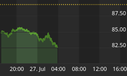
Money supply (M2)
The money supply chart was provided by Gordon Harms. Money supply growth continued to decline last week.

Presidential Cycle 3rd year
On average the 3rd year of the Presidential Cycle has been the strongest in the 4 year Presidential Cycle.
The charts below each show two plots; calculated by averaging the daily return of the indices over all years and during only the 3rd year of the Presidential Cycle. On any day the index moved more than 2% the change has bee reduced to 2% so the effect of the outliers has been limited. Dashed vertical lines have been drawn on the 1st trading day of each month.
Over all years since 1885 the Dow Jones Industrial Average (DJIA) has been up 65% of the time with an average gain of 7.0%. During the 3rd year of the Presidential Cycle the DJIA has been up 81% of the time with an average gain of 11.4%. The last time the DJIA had a down year during the 3rd year of the Presidential Cycle was 1939 when it lost 2.9%.
The chart below shows the average performance of the DJIA over all years in magenta and average performance during the 3rd year of the Presidential Cycle in green.

Over all years since 1928 the SPX has been up 67% of the time with an average gain of 7.3%. During the 3rd year of the Presidential Cycle the SPX has been up 89% of the time with an average gain of 14.9%. The last time the SPX had a down year during the 3rd year of the Presidential Cycle was also1939 when it lost 5.5%.
The chart below shows the average performance of the SPX over all years in red and average performance during the 3rd year of the Presidential Cycle in green.

Over all years since 1963 the OTC has been up 72% of the time with an average gain of 13.1%. During the 3rd year of the Presidential Cycle the OTC has been up 92% of the time with an average gain of 34.3%. The only down year for the OTC during the 3rd year of the Presidential Cycle was 1987 when it lost 5.3%.
The chart below shows the average performance of the OTC over all years in blue and average performance during the 3rd year of the Presidential Cycle in green.

Over all years since 1979 the Russell 2000 (R2K) has been up 70% of the time with an average gain of 11.3%. During the 3rd year of the Presidential Cycle the R2K has been up 75% of the time with an average gain of 22.8%. The R2K has had two down years during the 3rd year of the Presidential Cycle 2007, down 2.7% and 1987 down 10.3%.
The chart below shows the average performance of the R2K over all years in black and average performance during the 3rd year of the Presidential Cycle in green.

I have done research on the Presidential Cycle which is posted at: http://alphaim.net/research/Pres_Cycle/index.html
Conclusion
Seasonality is likely to dominate next week.
I expect the major averages to be higher on Friday December 31 than they were on Friday December 24.
This report is free to anyone who wants it, so please tell your friends. They can sign up at: http://alphaim.net/signup.html. If it is not for you, reply with REMOVE in the subject line.
In his latest newsletter Jerry Minton looks at the idea that continuous exposure to stocks is the way to get the "average" long-term return of the market. If you are retired or about to retire, you will want to read "Unnecessary Risks" at www.alphaim.net and sign-up for Jerry's free bi-weekly newsletter.
Thank you,


