


The good news is:
• Nothing about last week's pull back generated any longer term implications.
The negatives
The market is still overbought by any but the shortest term measures.
New highs expand in a healthy market. That expansion has been somewhat limited in the run up since last August. Although all of the major indices are significantly higher than they were at their highs in April 2010 the number of new highs has remained well below the levels reached last April.
The charts below all cover the past year showing an index and a 10% trend (19 day EMA) of new highs measured in various ways. Dashed vertical lines have been drawn on the 1st trading day of each month.
The 1st chart shows the NASDAQ composite (OTC) in blue and OTC NH calculated from published NASDAQ data in green.

The next chart shows the S&P 500 (SPX) in red and NY NH calculated from published NYSE data in green.

The next chart shows the SPX in red and NH, in green, has been calculated from the component issues of the SPX on a closing basis over the trailing 15 trading days.

The next chart shows the Russell 2000 (!RUT) in red and NH, in green, has been calculated from the component issues of the !RUT on a closing basis over the previous 15 trading days.

With modest variations, the above charts all show the same thing. As the indices have risen to multi year highs new highs, any way you measure them, have not. Leadership has been narrowing.
The positives
The diminishing number of new highs shows narrowing leadership, but any significant decline will be accompanied by an expansion of new lows and, so far, that has not happened.
The chart below covers the past year showing the OTC in blue and a 40% trend (4 day EMA) of NASDAQ new highs divided by (new highs + new lows), (OTC HL Ratio) in red. Dashed horizontal lines have been drawn at 10% levels of the indicator; the line is solid at the neutral 50% level.
Although the indicator dropped sharply last week, it is still in positive territory.

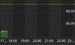
The chart below is similar to the one above except is shows the SPX in red and NY HL Ratio has been calculated from NYSE data. The indicator closed Friday above 86%, extremely strong.

Seasonality
Next week includes the last trading day of February and the 1st 4 trading days of March during the 3rd year of the Presidential Cycle.
The tables below show the return on a percentage basis for the last trading day of February and the 1st 4 trading days of March during the 3rd year of the Presidential Cycle. OTC data covers the period from 1963 - 2010 and SPX data from 1928 - 2010. There are summaries for both the 3rd year of the Presidential Cycle and all years combined.
Average returns for the coming week have been modestly positive by all measures and a little better during the 3rd year of the Presidential Cycle than other years. The OTC has not been up for the period during the 3rd year since 1995.
Report for the last day of February and first 4 days of March.
The number following the year represents its position in the presidential cycle.
The number following the daily return represents the day of the week;
1 = Monday, 2 = Tuesday etc.
| OTC Presidential Year 3 | ||||||
| Day1 | Day1 | Day2 | Day3 | Day4 | Totals | |
| 1963-3 | -0.52% 4 | -0.68% 5 | -0.23% 1 | 0.33% 2 | 0.07% 3 | -1.03% |
| 1967-3 | -0.86% 2 | 0.48% 3 | 0.56% 4 | 0.91% 5 | 0.44% 1 | 1.53% |
| 1971-3 | 0.11% 5 | 0.43% 1 | 0.06% 2 | 0.23% 3 | 0.70% 4 | 1.52% |
| 1975-3 | 0.65% 5 | 1.14% 1 | 0.51% 2 | -0.42% 3 | 0.16% 4 | 2.04% |
| 1979-3 | -0.07% 3 | 0.63% 4 | 0.28% 5 | 0.85% 1 | -0.23% 2 | 1.46% |
| 1983-3 | -0.67% 1 | 0.44% 2 | 0.60% 3 | 0.69% 4 | 0.28% 5 | 1.33% |
| 1987-3 | 0.70% 5 | -0.25% 1 | -0.08% 2 | 0.75% 3 | 0.53% 4 | 1.65% |
| Avg | 0.14% | 0.48% | 0.27% | 0.42% | 0.29% | 1.60% |
| 1991-3 | 0.49% 4 | 0.81% 5 | 0.96% 1 | 2.58% 2 | 0.16% 3 | 5.01% |
| 1995-3 | 1.18% 2 | -0.23% 3 | 0.23% 4 | 0.64% 5 | -0.13% 1 | 1.69% |
| 1999-3 | -1.67% 5 | 0.31% 1 | -1.58% 2 | 0.27% 3 | 1.22% 4 | -1.43% |
| 2003-3 | 1.03% 5 | -1.29% 1 | -0.95% 2 | 0.51% 3 | -0.88% 4 | -1.58% |
| 2007-3 | 0.34% 3 | -0.49% 4 | -1.51% 5 | -1.15% 1 | 1.90% 2 | -0.91% |
| Avg | 0.27% | -0.18% | -0.57% | 0.57% | 0.46% | 0.56% |
| OTC summary for Presidential Year 3 1963 - 2007 | ||||||
| Averages | 0.06% | 0.11% | -0.10% | 0.52% | 0.35% | 0.94% |
| % Winners | 58% | 58% | 58% | 83% | 75% | 67% |
| MDD 3/5/2007 3.12% -- 3/2/1999 2.91% -- 3/6/2003 2.59% | ||||||
| OTC summary for all years 1963 - 2010 | ||||||
| Averages | -0.09% | 0.22% | 0.00% | 0.33% | -0.14% | 0.31% |
| % Winners | 50% | 64% | 50% | 69% | 57% | 58% |
| MDD 3/5/2009 6.60% -- 3/6/1980 5.94% -- 3/6/1968 4.86% | ||||||
| SPX Presidential Year 3 | ||||||
| Day1 | Day1 | Day2 | Day3 | Day4 | Totals | |
| 1931-3 | -0.55% 6 | -2.29% 1 | -0.11% 2 | -0.91% 3 | 2.02% 4 | -1.85% |
| 1935-3 | -0.57% 4 | 0.57% 5 | 0.00% 6 | -0.80% 1 | -2.87% 2 | -3.66% |
| 1939-3 | 0.55% 2 | 0.00% 3 | -0.16% 4 | 1.42% 5 | 0.31% 6 | 2.13% |
| 1943-3 | 0.27% 6 | -0.73% 1 | -0.73% 2 | 1.29% 3 | 0.18% 4 | 0.29% |
| 1947-3 | -0.32% 5 | 0.06% 6 | -0.19% 1 | 0.00% 2 | 1.17% 3 | 0.72% |
| Avg | -0.12% | -0.48% | -0.24% | 0.20% | 0.16% | -0.48% |
| 1951-3 | 0.18% 3 | 0.23% 4 | 0.37% 5 | 0.05% 6 | -0.68% 1 | 0.14% |
| 1955-3 | 0.52% 1 | 0.19% 2 | 0.87% 3 | 0.38% 4 | 0.62% 5 | 2.57% |
| 1959-3 | 0.13% 5 | 0.58% 1 | 0.93% 2 | 0.18% 3 | 0.14% 4 | 1.96% |
| 1963-3 | -1.11% 4 | -0.30% 5 | 0.97% 1 | 0.03% 2 | 0.17% 3 | -0.24% |
| 1967-3 | 0.37% 2 | 1.04% 3 | 0.55% 4 | 0.15% 5 | -0.22% 1 | 1.89% |
| Avg | 0.02% | 0.35% | 0.74% | 0.16% | 0.01% | 1.26% |
| 1971-3 | -0.18% 5 | 0.26% 1 | -0.02% 2 | -0.03% 3 | 1.00% 4 | 1.03% |
| 1975-3 | 1.02% 5 | 1.76% 1 | 0.64% 2 | -0.79% 3 | 0.95% 4 | 3.58% |
| 1979-3 | 0.16% 3 | 0.64% 4 | 0.07% 5 | 1.12% 1 | -0.19% 2 | 1.80% |
| 1983-3 | -1.12% 1 | 1.90% 2 | 0.94% 3 | 0.77% 4 | 0.12% 5 | 2.62% |
| 1987-3 | 0.44% 5 | -0.42% 1 | 0.40% 2 | 1.58% 3 | 0.66% 4 | 2.65% |
| Avg | 0.06% | 0.83% | 0.41% | 0.53% | 0.51% | 2.34% |
| 1991-3 | -0.18% 4 | 0.93% 5 | -0.31% 1 | 2.00% 2 | -0.15% 3 | 2.29% |
| 1995-3 | 0.71% 2 | -0.36% 3 | -0.11% 4 | 0.06% 5 | 0.04% 1 | 0.35% |
| 1999-3 | -0.54% 5 | -0.17% 1 | -0.87% 2 | 0.18% 3 | 1.54% 4 | 0.15% |
| 2003-3 | 0.46% 5 | -0.75% 1 | -1.54% 2 | 0.96% 3 | -0.93% 4 | -1.80% |
| 2007-3 | 0.56% 3 | -0.26% 4 | -1.14% 5 | 0.00% 1 | 0.59% 2 | -0.25% |
| Avg | 0.20% | -0.12% | -0.79% | 0.64% | 0.22% | 0.15% |
| SPX summary for Presidential year 3 1931 - 2010 | ||||||
| Averages | 0.04% | 0.14% | 0.03% | 0.38% | 0.22% | 0.82% |
| % Winners | 60% | 55% | 45% | 70% | 70% | 75% |
| MDD 3/4/1931 3.83% -- 3/5/1935 3.64% -- 3/4/2003 2.28% | ||||||
| SPX summary for all years 1928 - 2010 | ||||||
| Averages | 0.05% | 0.17% | 0.16% | 0.22% | 0.13% | 0.70% |
| % Winners | 57% | 64% | 55% | 64% | 52% | 65% |
| MDD 3/5/2009 9.34% -- 3/6/2008 4.63% -- 3/6/1980 4.41% | ||||||
Money supply (M2)
The money supply chart was provided by Gordon Harms. M2 continued to expand at its elevated trend.

March
Since 1963, over all years the OTC in March has been up 63% of the time with an average gain of 0.6%. During the 3rd year of the Presidential Cycle March has been up 100% time with an average gain of 4.0%. The worst March ever, 1980 (-16.5%), the best 2009 (+15.6%)
The average month has 21 trading days. The chart below has been calculated by averaging the daily percentage change of the OTC for each of the 1st 11 trading days and each of the last 10. In months when there were more than 21 trading days some of the days in the middle were not counted. In months when there were less than 21 trading days some of the days in the middle of the month were counted twice. Dashed vertical lines have been drawn after the 1st trading day and at 5 trading day intervals after that. The line is solid on the 11th trading day, the dividing point.
In the chart below the blue line shows the average of the OTC in March over all years since 1963 while the green line shows the average during the 3rd year of the Presidential Cycle.

Since 1928 the SPX has been up 60% of the time in March with an average gain of 0.4%. During the 3rd year of the Presidential Cycle the SPX has been up 65% of the time with an average gain of 0.5%. The best ever March for the SPX was 2009 (+13.8%) the worst 1938 (-25.8%). There has not been a down March for the SPX during the 3rd year of the Presidential Cycle, since 1959.
The chart below is similar to the one above except it shows the daily performance over all years for the SPX in March in red and the performance during the 3rd year of the Presidential Cycle in green.

Since 1979 the Russell 2000 (R2K) has been up 66% of the time in March with an average gain of 1.0%. During the 3rd year of the Presidential Cycle the R2K has been up 100% of the time with an average gain of 3.1%. The best ever March for the R2K, 2009 (+14.9%), the worst 1980 (-17.9%)
The chart below is similar to those above except it shows the daily performance over all years of the R2K in March in black and the performance during the 3rd year of the Presidential Cycle in green.

Since 1885 the Dow Jones Industrial Average (DJIA) has been up 59% of the time in March with an average gain of 0.5%. During the 3rd year of the Presidential Cycle the DJIA has been up 55% of the time with an average gain of 1.0%. The best March ever for the DJIA 2009 up 12.5%, the worst 1938 (-24.2%).
The chart below is similar to those above except it shows the daily performance over all years of the DJIA in March in Magenta and the performance during the 3rd year of the Presidential Cycle in green.
There is obviously a problem with this chart because it shows almost no gain during the 3rd year when it should be double the gain of all years. Looking at the daily data, nothing stood out, however prior to 1953 when the market traded 6 days a week many of the days in the middle of the month were excluded in the calculations for this chart and that would be over half of the data. Prior to 1953 there were often 27 trading days in March.

Here is what the chart looks like when you use only post 1953 data.

Conclusion
The market worked off a little of its overbought condition last week with the major indices falling 3% - 4% in 2 days. There was no notable technical damage.
I expect the major averages to be higher on Friday March 4 than they were on Friday February 25.
Last weeks positive forecast was a miss.
This report is free to anyone who wants it, so please tell your friends. They can sign up at: http://alphaim.net/signup.html. If it is not for you, reply with REMOVE in the subject line.
In his latest newsletter, Jerry Minton looks at the way the current election cycle "power zone" is unfolding compared to past returns. To read about it and subscribe to his free newsletter go to www.alphaim.net. To see how your favorite mutual fund stacks up against Alpha's strategies try the investment "challenge" on the home page.
Thank you,


