


I have often contended that there are two ways to interpret sentiment data. The first is as a contrarian. Figure out when too many investors are on one side of a trade and bet the other way. This is the "traditional" way most interpret this kind of data. The second method of interpretation is based upon the fact that investor sentiment will track the movements of price. So as prices move higher, we would expect bulls to increase; as prices move lower, we would see investors express their bearishness. It is the rare situation (believe it or not) where investor sentiment and price actually deviate. To read more on variant uses of sentiment click here and here.
As you know, the "Dumb Money" indicator (see figure 1) looks for extremes in the data from 4 different groups of investors who historically have been wrong on the market: 1) Investors Intelligence; 2) Market Vane; 3) American Association of Individual Investors; and 4) the put call ratio. If we use the second method of interpreting investor sentiment, we note the following regarding this week's "dumb money" indicator: 1) at point 1, the indicator and price both made new peaks simultaneously (remember sentiment tracks price); 2) at point 2, the indicator made a lower higher while price made a new high; this is a negative divergence; 3) the indicator has completed an "M" type top. In essence, the "dumb money" indicator, which follows prices higher and lower, is now deviating from price and leading prices lower, and this is suggestive of a market where sellers are starting to out number buyers.
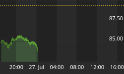
Figure 1. "Dumb Money"/ weekly
Figure 2 is a weekly chart of the SP500 with the InsiderScore "entire market" value in the lower panel. From the InsiderScore weekly report: "A nearly 44% week-over-week increase in the number of buyers market-wide was more illusion than substance as the growth was driven almost solely by insiders at micro-caps. The more than 14% sequential increase in the number of sellers during a shortened week is a more accurate measure of the continued week sentiment that insiders are showing as a group. Insiders in the Technology, Healthcare and Industrial Goods sectors are sending the strongest signals, with a near record number of sellers in the Technology sector, where Semiconductor industry insiders are showing little hesitation when it comes to pulling the trigger. Last week we said that we felt that insiders were sending a signal that they were worried about valuations and this past week's action did little to change our opinion."
Figure 2. InsiderScore "Entire Market" Value/ weekly
Figure 3 is a weekly chart of the SP500. The indicator in the lower panel measures all the assets in the Rydex bullish oriented equity funds divided by the sum of assets in the bullish oriented equity funds plus the assets in the bearish oriented equity funds. When the indicator is green, the value is low and there is fear in the market; this is where market bottoms are forged. When the indicator is red, there is complacency in the market. There are too many bulls and this is when market advances stall.
Currently, the value of the indicator is 70.68%, and this indicator is at its highest level in 10 years of data. Values less than 50% are associated with market bottoms. Values greater than 58% are associated with market tops.
Figure 3. Rydex Total Bull v. Total Bear/ weekly
Improve your market timing with Premium Content from TheTechnicalTake.
The Premium Content service is the best $104 you will ever spend on market research. The daily report is meant to keep you on the right side of the market and improve your market timing. That's 40 cents a day!
Even in this confusing market environment, The Premium Content service has been useful in identifying trading opportunities. The indicators have functioned as expected!!!
To learn more about this service click here: Premium Content


