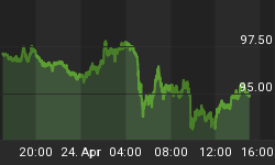
My bond model has been positive since March 11, 2011, and this move in bonds has been at odds to what other market mavens (Pimco's Gross, Warren Buffet, and Jim Rodgers) had originally thought. I have contended that this signal emanating from the model has foretold of economic weakness, and I think that is pretty much been the case. The move in bonds was accelerated in the lead up to the Fed's announcement to conduct Operation Twist, but since that time 4 weeks ago, bonds have languished.
But despite the poor price action, the bond model remains positive. 6 months ago when we were talking about bond strength, investors were only beginning to recognize the weakness in the economy. Now most would acknowledge the weakness, and the question seems to be are we entering a recession. If the US economy is entering a recession (high likelihood), this deflationary event should be bond positive. Is the bond model "predicting" further weakness in the US economy? Or like August, 2010, will the Fed's monetary operations interrupt the "normal" economic cycle and forestall the inevitable?
Our bond model utilizes over 40 years of data from the Dow Jones Composite Bond Index. This index is highly correlated with the Vanguard Total Bond Market ETF (symbol: BND) that trades about 1.5 million shares per day. As mentioned, the price action in the DJ Composite Bond Index has been poor, and over the last three weeks of "equity mania" or the "risk on" trade, bonds hit their highs and sold off. As expected, bonds are now very oversold.
So how has the DJ Composite Bond Index fared when the model is positive yet bonds are oversold? I have constructed a strategy of buying the oversold dips when the model is positive, and positions are held until the model turns bearish. The best way to look at the results of such a strategy is with the maximum adverse excursion (MAE) graph. (See figure 1.) MAE looks at every trade from this strategy, and it measures the angst factor. You put on a trade, and if you are like most traders, you will have to endure a little bit or a lot of pain while the trade moves adverse to its point of entry. This is the MAE, which is measured in percentage terms. MAE always persists until the trade is either closed out for a loser, or the trade turns positive and is closed out for a winner. As an example, take the trade shown inside the blue box in figure 1. This trade has an MAE or trade drawdown of 0.28% (x axis) before being closed out for a 1.74% (y axis) winner. We know this was a winning trade because the caret is green.
Figure 1. MAE Graph
![]() Larger Image
Larger Image
This strategy generated 12 trades in 36 years. 7 were profitable. But the most important thing is the drawdown or MAE as 10 out 12 trades were limited to less than 0.6%. These are the trades to left of the orange line in figure 1. So in 10 out 12 trades, your angst factor was less 0.6% before the trade was closed out. 11 out of 12 trades were either winners or lost less than 0.26%.
So my interpretation of this limited data set is twofold. One, this is a low risk entry point. Two, failure of the bond model at this juncture would be consistent with continued strength in equities.


