• 321 days Will The ECB Continue To Hike Rates?
  • 322 days Forbes: Aramco Remains Largest Company In The Middle East
  • 323 days Caltech Scientists Succesfully Beam Back Solar Power From Space
  • 723 days Could Crypto Overtake Traditional Investment?
  • 728 days Americans Still Quitting Jobs At Record Pace
  • 730 days FinTech Startups Tapping VC Money for ‘Immigrant Banking’
  • 733 days Is The Dollar Too Strong?
  • 733 days Big Tech Disappoints Investors on Earnings Calls
  • 734 days Fear And Celebration On Twitter as Musk Takes The Reins
  • 736 days China Is Quietly Trying To Distance Itself From Russia
  • 736 days Tech and Internet Giants’ Earnings In Focus After Netflix’s Stinker
  • 740 days Crypto Investors Won Big In 2021
  • 740 days The ‘Metaverse’ Economy Could be Worth $13 Trillion By 2030
  • 741 days Food Prices Are Skyrocketing As Putin’s War Persists
  • 743 days Pentagon Resignations Illustrate Our ‘Commercial’ Defense Dilemma
  • 744 days US Banks Shrug off Nearly $15 Billion In Russian Write-Offs
  • 747 days Cannabis Stocks in Holding Pattern Despite Positive Momentum
  • 748 days Is Musk A Bastion Of Free Speech Or Will His Absolutist Stance Backfire?
  • 748 days Two ETFs That Could Hedge Against Extreme Market Volatility
  • 750 days Are NFTs About To Take Over Gaming?
  1. Home
  2. Markets
  3. Other

The Beauty Of Symmetry

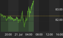
There are no other words to describe the symmetry between these two chart patterns than simply beautiful.

I purposely left the scale and dates off the charts as to not distract your eyes. It is simply too powerful to ignore yet that is what many have done, self included over the past two weeks as the 200MA blurred our vision. A somewhat meaningless number took our eyes off the pattern playing out before us.

Again as to not distract your eyes I color coded three distinct phases (phase 1 in orange, phase 2 in purple and phase 3 in blue). Notice the symmetry once again. But to me what is most powerful at this very moment is the position of the last few candles and the moving averages.

Notice the big move down to take out the 100MA (orange line) followed by the next candle that is a failed back test.

Lastly and most important notice the position of the moving averages. Red (200MA) sits above green (20MA) which sits above purple (10EMA) which sits above orange (100MA) which sits above the lower Bollinger Band.

I will not tell you what comes next once again as to not distract your eyes. You can pull up an SPX daily yourself and see. I even left off the dates 2008 VS 2011. Can you tell which is which?

Market Analog
Larger Image


Back to homepage

Leave a comment

Leave a comment