


Precision timing for all time frames through a multi-dimensional approach to technical
analysis: Cycles - Breadth - P&F and Fibonacci price projections
and occasional Elliott Wave analysis
"By the Law of Periodical Repetition, everything which has happened once must happen again, and again, and again -- and not capriciously, but at regular periods, and each thing in its own period, not another's, and each obeying its own law... The same Nature which delights in periodical repetition in the sky is the Nature which orders the affairs of the earth. Let us not underrate the value of that hint." ~ Mark Twain
Current Position of the Market
SPX: Very Long-term trend - The very-long-term cycles are in their down phases, and if they make their lows when expected (after this bull market is over), there will be another steep decline into late 2014. However, the severe correction of 2007-2009 may have curtailed the full downward pressure potential of the 40-yr and 120-yr cycles.
Intermediate trend - The uptrend from 1343 appears to have topped
Analysis of the short-term trend is done on a daily basis with the help of hourly charts. It is an important adjunct to the analysis of daily and weekly charts which discusses the course of longer market trends.
TOP FORMATION IN PLACE
Market Overview
The SPX tried to make a new all-time high last week, but could not quite make it, topping at 1573.66 before reversing. That left it less than three points shy of its 2007 high of 1576.09. After this failed attempt, it's unlikely that it will try again before experiencing a correction to recharge its batteries.
Friday's disappointing jobs report provided the catalyst needed to get a decline in gear, but it was only partially successful. A strong support level at 1539 combined, with other factors, to stop the opening free-fall of 19 points. By the end of the hour, prices were already on the mend and upward progress continued until the end of the day with the index losing only 6.70 by the close.
By rallying back above 1543, SPX failed to confirm the beginning of an intermediate correction. Had it closed below that level, it would have gone beyond the low of 1543.55 attained on 3/21 and this would have signaled a confirmed downtrend. Some analysts would probably argue that closing under 1538.57 (the intraday low of 3/19) will be needed for confirmation. No matter, it's only a question of time before both levels are penetrated.
Before this happens however, the SPX may first expand its topping formation. The bounce off Friday's low could lead to a re-test of the high in some form, whether it makes it back to the actual top tick, or falls short by a few points. Only after this action has been completed would SPX be able to start its corrective action in earnest. The alternative is that the decline resumes on Monday's opening.
Of the four indices I follow, Russell is the weakest. Next comes Nasdaq 100, then SPX, and finally the DOW industrials. The DOW is so strong that it could even make a new high by a few points before starting its correction. No matter which index you analyze, a lack of heavy distribution is characteristic of this market top. This warns us that the market correction should be fairly mild and that there is virtually no chance that it represents the end of the bull market. This is in perfect accord with my view (based on P&F analysis) that higher prices are in store for the SPX and other indices.
Chart Analysis
We'll start by looking at a weekly chart of SPX (courtesy of QCharts) underneath which I have placed the weekly McClellan summation Index (courtesy of StockCharts.com). This will enable us to verify the two statements made in the previous paragraphs: 1) We are ready for a correction of intermediate proportion, and 2) This top is very unlikely to be the end of the bull market.

For the first premise, let's look at the bottom chart indicator and the NYSI. The SRSI has turned down and broken below a previous level (represented by a blue bar) which I have marked with a small red asterisk. This shows that the upward momentum is spent, and the start of a decline is probably taking place. Above, I also mentioned that we'll need to confirm this forecast with the SPX closing at a lower low, which it has not done, yet. Perhaps it will by the end of next week.
The same pattern can be observed in the NYSI where it is even more pronounced and was preceded by negative divergence.
The top oscillator on the chart (MACD) made a new high in the last couple of weeks, in conjunction with the price. This gives us a high degree of assurance that we have not seen the top of the bull market, since a long-term market top is normally associated with negative divergence in this indicator. Note also that, with the strong uptrend in weekly prices which occurred in the recent weeks, there is no visible sign of momentum loss in the price, only in the indicators which are more sensitive to trend changes. And look at how far from the bottom trend line the price currently is! There is a flagrant lack of deceleration in the long-term trend.
Since we claim to be at a some sort of a top, let's look at a chart which tells us that a price reversal is in process. This is a 60m chart of the SPX (also courtesy of QCharts).
The market phase which we believe we are about to correct starts at 1343. There are several signs that we've come to a top. To begin with, the uptrend consists of five distinct phases and there is every reason to believe that the last phase -- itself being made up of 5 waves -- is also complete. The final wave pattern is in the form of an ending triangle, which typically occurs at the end of a trend.

There was advance warning from the indicators: the top one (MACD) showed us double negative divergence at the top before it became negative -- which is where it remains as of Friday's close, intimating that the correction is probably not over. The SRSI (just below) gave a sell signal when it broke its uptrend and it, too, remains negative as of Friday.
The lowest oscillator is the A/D. In this one, the loss of price momentum reflected in the ending triangle was made apparent by the string of lower highs taking place for the past two weeks. Finally, the trend line was broken and the indicator had its deepest negative penetration since early March.
The price chart shows why, on Friday, we held the previous low. Not only did SPX find support at the starting point of the ending diagonal, but it was also stopped by the trend line from the beginning of the uptrend, as well as by the 200-day MA (red). That was too much support, even for a strong selling wave like the one witnessed on Friday morning, and this is why we cannot say for certain that we have a legitimate reversal until all that support is penetrated. Nevertheless, everything technical points to the fact that it will only be a matter of time before this occurs.
Cycles
The 7-wk cycle, which is scheduled to bottom next week, will have a chance to close SPX below 1543 and confirm the reversal. We've also discussed the regular yearly pattern of April tops which have taken place since the beginning of the bull market. That should give the bears some ammunition for their battle against the bulls.
Breadth
The McClellan Summation Index was shown under the weekly chart so here, I will only show the McClellan oscillator (courtesy of StockCharts.com) below.
After hanging for several days around neutral, the oscillator finally went negative. This, as we saw above, turned the weekly NYSI down after it showed negative divergence. Note that the indicator is not oversold and, therefore, the correction has room to extend.

Sentiment Indicators
If you have any doubt about how un-ready this market is to make a major top, just look at the position of the SentimenTrader (courtesy of same)
Just a tiny consolidation in the indices has already sent it back into the neutral zone. I suspect that as the correction unfolds it will descend once again into the green in anticipation of the resumption of the long-term uptrend.

VIX
You could not get a better affirmation that the market is ready to reverse than the action of the VIX for the past three weeks. Look at its refusal to make a new low as the market was making a new high. This kind of positive divergence has normally signaled market top.
On the P&F chart, VIX has accumulated enough of a base to move up to 20. It will, however have to print 16 in order to confirm that it is ready to go there.

XLF (Financial SPDR)
Last week, I showed how XLF was also confirming that SPX was at a top. The divergence in the financial index had become as noticeable as it is in the VIX. On this chart, you see the same 5 waves coming to completion and then, the beginning of a retracement which is well ahead of the SPX and which has already broken below the level comparable to 1543. But if you think this is not conclusive, wait until you see the next chart!

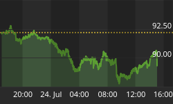
BONDS
Now THAT's a break-out! The index came out of two important channels and took out the 200-DMA all at once. This is powerful evidence that the equity market has peaked for now.
The short-term P&F chart calls for a move to 128, but it is possible that much higher prices are in store over the long-term. I am able to come up with some P&F projections which are difficult to accept as viable. Let's see what happens after it touches 128.

GLD (ETF for gold)
GLD continues the correction which started at 174 (defined by the red channel on the chart) but last week, it reached significant support created by the juncture of several major trend lines (oval). This has arrested its decline for now -- and perhaps for some time -- as the index is now likely to form a sideways pattern which will either turn out to be a base from which it can eventually challenge its intermediate channel or, if this fails, will turn out to be a re-distribution phase from which it can drop to new lows once it trades below 149. Time will tell us which of the two it is, but let's not forget that the P&F chart gives us targets to the low 140s.

UUP (dollar ETF)
UUP is in a slowly rising broad uptrend which started in August 2011. It recently corrected after reaching the top of that broad channel down to the bottom trend line and, after forming a base, is resuming its climb within the broader channel.

The base which it created after its inner channel correction is capable of taking it to 23.40 (the top of the channel). From there, it is likely to start another correction within its major uptrend. That major uptrend, however, has a corrective profile which warns that this may only be a correction in a very long-term trend decline which has yet to come to an end. The USD has a projection to 86.40.
USO (United States Oil Fund)
USO is performing according to the scenario that I previously proposed: a triangle consolidation pattern which may have been completed last week. This scenario will be confirmed if USO moves out of the blue triangle on the downside and breaks the short green support line.
Should the analysis be correct, USO should move down to about 27.50 over the short-term. The P&F projection, however, calls for a move down to 25 initially, and then 22-23. This is a longer-term projection.

Summary
After reaching my target zone (1571/1581) the uptrend which started at 1343 is now ready for a correction. The Russell 2000 is leading the market on the downside and the SPX is expected to follow after it has successfully penetrated the significant support level which stopped the massive wave of selling that took place at Friday's opening.
The DOW is showing remarkable resilience and could even make a slightly new high before capitulating to the bearish forces which appear to be building up over the short-term. Another reason to believe that this will only turn out to be an intermediate top.
FREE TRIAL SUBSCRIPTON
Market Turning Points is an uncommonly dependable, reasonably priced service providing intra-day market updates, explanations, and commentary, plus detailed weekend reports. It is ideally suited to traders, but it can also be valuable to longer-term holders since price projections are provided using Point & Figure analysis along with best-time estimates obtained from cycle analysis.
For a FREE 4-week trial, Send an email to: ajg@cybertrails.com
For further subscription options, payment plans, weekly newsletters, and for general information, I encourage you to visit my NEW website at www.marketurningpoints.com. By clicking on "Free Newsletter" you can bring up the latest newsletter which is normally posted on Sunday afternoons (unless it happens to be a 3-day weekend; in which case it could be posted on Monday). If you bring up last week's newsletter, please refresh your browser in order to bring up the current one.
The newsletter will remain free for a limited amount of time.


