


"Where are the charts?!"
Yes, yes - - they're everyone's favorite, myself included! We will get to the charts in just a moment, but I wanted to take a moment first to talk about technical analysis. According to StockCharts.com:
"Technical analysis is the examination of past price movements to forecast future price movements."
Simple enough. We're looking for a pattern. There are many well-known and well-tested technical patterns out there. If you've been in the market scene for any length of time, you can't help but have heard of "head and shoulders" or a "double top (or bottom)". There are triangles, cups with handles, wedges, gaps, candlesticks and countless others to choose from - - but all we're doing is searching for a pattern. Most pattern-searchers stick with the known formations - and usually this serves them well. But the search shouldn't stop there! Patterns abound in the markets, and all you have to do is look.
Some patterns unfold in hours, others can take decades or even centuries - - the timeframe you choose to analyze should match your trading habits. If you are a day trader, you care little about a 5 year chart - your needs are met with a chart spanning 1-3 months, or perhaps as little as 1-3 days! If you are a long-term investor, the opposite holds true. Watching the daily/weekly charts will make you question your position because you become wrapped up in the irrelevant price fluctuations from day to day. How many times have you caught yourself selling at the bottom and buying at the top? You don't need to shout it from a mountain top, but you must be honest with yourself. Without that honesty, you doom your chances of success before you even begin. Here's a little tip - - when you trade, don't just write down the date and price - write down your thoughts. For example:
- Why did you make this purchase?
- Was it for technical or fundamental reasons? Name them.
- How long do you plan to hold it?
- What is your stop-loss?
- When will you sell?
If you do not have very specific answers to these questions, you should take your money and head to Las Vegas - - your luck will be better. For example, telling yourself you will sell "when I make some money" is open-ended and subject to your greed. Setting a target gain of 10% is a much more solid goal. Will you miss 500% gains? Maybe - - but probably not. Did you win the lottery last week? Why would you win now? Is buying and hoping any different from spending $10 on the lottery each and every week, each time thinking, "THIS time I just might win!" A fool and his money are soon parted - don't be one of the fools!
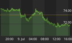
Whew! That was quite a tangent! Back to technical analysis, and on to the charts!

Here we see the price of gold in a solid uptrend. We've all seen this before, but when playing the gold sector it is important to keep it at the front of your mind. All gold mining shares depend heavily on the POG, so it is impossible to make an intelligent decision in regard to their purchase without taking the base component into account! So rememeber this - - as of today, the trend is up, and the trend is unbroken. Now, let's look at what it is that I really wanted to point out - - the HUI.

This chart of the HUI dates back to November of 2000 - - roughly the start of the PM shares bull market. I've marked three distinct short(er) term trendlines - - each trendline is less steep than the one preceeding it. While it would be nice to think about how rich we'd all be if the first trendline had held (with the HUI at 400 or 500) that kind of ascent just isn't sustainable. As a bull market matures, the mid-term uptrends level off a bit. This is not to say there aren't explosive upside moves and devastating crashes, simply that the market is devloping much as the body grows....it is in constant flux. But I digress (again)...
The important thing to note here is that at each interval where the mid-term trendline was broken, it was trumpted as "The End of the Gold Bull" - - yet as we can see here, it clearly was NOT the end! It was capitulation. It was a bottom. It was time to back up the truck and load it with quality PM shares.
That's the pattern - let's call it "The Dip". Draw your own conclusions.


