


A shout-out to I M Vronsky and his crew, [Gold-Eagle], for reaching its 475 Millionth view since it began on 1 January 1997. Congrats!
This is a singular look at silver because of its current position on the charts that may be giving our first hint of potential bottoming activity. It is a "fashionable sport" for many to call a bottom, or a top, even though "they" are consistently wrong. No one can tell what has not yet happened, aka the future.
Charts speak the loudest, [admittedly, not always the clearest, but for a reason], and they never lie. Why do charts never lie? They just are. A chart is the true record of all buy and sell decisions executed, coming from the most informed to the least informed. Most of the problems lie with those who form an opinion, andhow they choose to impose it onto what any given chart "says."
We prefer to follow the message of a chart, not lead or predict what it may, or may not do. There is a high degree of logic in charts, and we try to draw conclusions from them, just not always successfully. As a road map, reading charts is superior to fundamentals, opinions, and mechanical technical tools which all use past tense information, impose it on the present tense, and expect it will divine the future tense.
It appears that silver is at a potential bottoming area, and very close attention to how price develops from today forward may provide key information from which one can profit. To start, everything in a chart is potential until it is confirmed. The adjective bottoming, as in ongoing, is used because a bottom of any market is a process. It does not happen in just one day, and it can sometimes take several months to reverse a down trend. Always keep that in mind, and let the market prove itself to prevent needless risk exposure for those insisting to be first.
It can be seen from the Quarterly chart that the current correction has run deep, but price is nowhere near taking out the 2008 swing low, from which the bull move up began. Few ever look at a Qtrly chart, but the few who do are in the "smart money" category. Smart money does not care about daily charts,[ as most everyone else pays such close attention to them.], because they are only interested in major moves, and it is these longer term charts that show them best.

Longer term charts are used for context, to put a market into a perspective, ultimately for making a trade determination. Clearly, the trend in silver, and gold, is down. What we can learn from the monthly is the fact that price has reached an important support area.
The current price has entered the identified support, and we explain that support is an area, not just a specific line or price. Consequently, what becomes important, as the lower time frame charts provide greater detail, is to watch how price responds/reacts to the target area. What we are looking for are clues in a change of behavior, for it is a change in behavior that leads to a change in a trend.

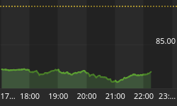
The weekly more clearly shows the area of support at which silver has now reached. The daily reveals much more.

A support line was drawn only on the weekly to show the importance of the $26 level, but $26 shows up on each of the higher time frames, and from that, we know when $26 is retested, it should offer resistance, certainly the first time around. We also noted how the Ease of Downward Movement, [EDM], sliced right through it, once broken.
Price is always important, but when coupled with volume, it can be the most telling of all information, and it is always right up to date, for everyone to see as it develops. Whenever you see high volume moves, it is your key that smart money, [SM], is active in the market. SM moves in such volume, sometimes it just sticks out. For the most part, SM tries to hide its intent, but it is almost impossible to do at important market turns.
The public and speculators do not create high volume; they react to it. Everyone knows it is axiomatic that SM sells tops and buys bottoms. The public is always on the other side.
Here is where the logic comes in. Note the first high volume bar in June. [We were off one bar to the left when we drew it in]. Price is breaking under a small congestion area. The next highest volume bar, just to the left of the oval, is sharply higher than the first. It is when price broke under 21 and 20 on the same day. So many weak longs and stops were washed out. [Guess who was on the other side?]
Within the oval, there are four trading days to discuss. Red volume bars means the close on that day was lower than the day before. Compare the first red price and volume bar with the one 4 days earlier, when price broke under 21 and 20. The volume of the first bar within the oval is almost equal to the down volume bar from 4 days ago, but compare the size of the trading range. The first price bar in the oval is much smaller. Why?
Volume increased sharply, and the bar was smaller. What the market is letting us know is that buyers entered the market and were more than matching the effort of sellers. Were that not true, the price range would have extended lower.
The 2nd bar in the oval is much less subtle. Volume was greater than the day before, but look at the tiny price range. Buyers stopped sellers cold! It was like opening a basket at the 18.50+ area, and the buyers said, "We will take as much as you have to offer." For all of that increased effort, [volume], sellers were totally spent. Buyers were totally in control at a price level and trend that had been dominated by sellers. There is more!
Next day, the highest contract volume and highest volume in months produced a price bar that rallied and closed on the high, producing an Outside Key Reversal Day, [OKR]. This could be the bottom. It needs to be confirmed. If it is not the bottom, the market is telling us we are very close to seeing one. Either way, what we saw two weeks ago was an important change in market behavior.
If we were ego-driven and wanted to impress, we could say this is the bottom. It may be, but we still will wait for confirmation.
We are seeing a price change from weak hands into strong hands, [in the paper market]. The 4th bar in the oval was another up day. Volume was the smallest of the 4, and note how the price range narrowed, and the location of the close was under mid-range the bar. Buying had been expended is what that bar was saying, and we see price corrected right after. Most of the buying has been from short-covering.
The last bar on the chart shows a down day, wide range and high volume. While price did decline, it did not make a new low for the increased effort. We now get to watch more developing market activity that will confirm, or not, the logical conclusions extracted from the market itself. Now news. No opinions. No mechanical tools. Just price and volume that have combined to tell the story, straight from the market's mouth.
Silver stackers, these lower prices are a gift you should keep on taking. Stay tuned.


