


I'm going to start this article the same way I'll end it, and that's by saying, "one day does not make a trend". When dealing with candlesticks, that would be: "one candlestick does not a trend make".
Although not technically part of Classical TA, candlesticks have gained such popularity over the years - a popularity that I think is somewhat fraught with misconceptions and unrealistic expectations - that it would be almost negligent to ignore them when presenting TA basics. In my opinion, the greatest shortcoming to candlestick analysis are the unrealistically high expectations in the face of the limited information they provide. Now that's not to discard them however, not in the least. I'm just "toning it down" a bit with respect to setting reasonable expectations: in spite of their widespread popularization over the years, I think they're somewhat overrated.
It's true that a daily Doji candlestick represents an open and a close very close to one another, and an intraday range above and below, but is that really that valuable? As an isolated case, I would say it isn't. Is the information provided substantially different from traditional open-high-low-close bars? The only significant differences (other than the body of literature on their interpretation ... which isn't exactly small potatoes) are hollow red and solid green (or black) sticks (lower close but above the open, and higher close but below the open, respectively). They give us basically the same information as the traditional open-high-low-close bar, but in a format that's much easier to visually digest (and much better documented), and when talking about the standout sticks and combinations, like a Long Legged Hammer, or a Morning Star, when appearing at lows relative to recent price trends, and especially when clustering with other similar type candlesticks, the information they provide us is certainly worth noting.
In keeping with my use of the Dow Jones Industrial Average as my principle showcase in this short series of articles, today I'm going to introduce you to some of the more frequently occurring of the standout candlesticks and candlestick combinations that have appeared on the INDU weekly chart over these last few years. Keep in mind that the vast majority of candlesticks aren't even classifiable to begin with given that possible candlestick variation is quite ample, and, as such, the majority of "sticks" appearing on any given chart have little, or no, individual significance from a candlestick analysis point of view. Take a look at the following chart and focus first on the huge number of candlesticks left completely unidentified.

Since the majority of sticks are lost in their similarities, it's the relatively singular candlesticks, the standouts as I've called them, that we pay attention to, but even then, as I've also already forewarned, we need to be careful with interpretations in isolation. Take the Long White stick for example, with its open near the lows and its close near the highs, that tells us that the bulls didn't look back. In isolation, there's not a lot there. Strong buying pressure during one period of time that gives us little inference for the next. Let me explain with this real life example: check out the chart above and look for all the green LW labels you can find. You'll notice that the task of deciding just where "long white" begins is quite subjective (what is the starting point in size?). Have you noticed how many had asterisks indicating engulfing characteristics - "engulfing" happens when price reverses recent price action by completely erasing the previous period or periods immediately before it - and their overall positive performances? Have you also noticed the LW sticks that I didn't label but highlighted in cyan instead? All those cyan circles actually highlight 11 examples of LW sticks immediately preceding weakness (several cases just before important sell-offs). Do you see what I mean when I say that the long white in isolation signals next to nothing? The long white candlestick can just as easily come at the end of a trend as it can come at the beginning! The LW stick means practically nothing in isolation! We need to put candlesticks into context in order to gain meaningful information from them!
The Long Red is the opposite of the Long White, and shares the same basic characteristics. When considering its position within the longer term context, if it has engulfing aspects, the likelihood of it coming early in a trend and seeing continued follow through is much better than if price is breaking to new lows (or breaking to new highs in the case of the long white).
Talking about putting things into context, how do we tell an Inverted Hammer from a Shooting Star (both trade well above the opening price only to give up most or all gains and close in the same vicinity as the open)? Or a Hammer from a Hanged Man (both trade well below the opening price only to regain most or all losses and close in the same vicinity as the open)? I submit that we can tell the difference between each pair only by putting them into trend context.
The Dark Cloud Cover (the Bullish Piercing counterpart), with it's 2 period character is obviously better than just a single candlestick, and the Morning Star and Evening Star formations actually make up legitimate patterns, yet still very small and limited, since they are comprised of 3 candlesticks showing a short term reversal, but we still need to put them into context in my opinion - you can readily see that the difference between morning and evening star performance on this chart had a lot to do with whether or not you were trading with or against the larger underlying trend.
Okay, now that I've "hammered" home the idea that I think candlesticks are always dependent on the larger context, I should be just as unequivocal in saying that in context, they do provide us with some rather nice information! When looking at all the bullish engulfing sticks, or bullish engulfing stick combinations, during this bull market, we see that the vast majority of the bullish engulfing sticks, or combinations, led to higher prices and were immediately profitable trades! The same can be said for the majority of the bearish engulfing setups as well, and even for many of the dark cloud cover combinations, but you needed to be much quicker and nimbler.
Clusters of significant sticks at price extremes, like those I've boxed on the chart, also provide us with valuable information, as you can easily see. When you see long tailed sticks at a selling extreme, you might be witnessing one indication of a bottom and have reason to start looking for other corroborating TA to confirm that idea. You still need to put things into a longer term context though, as you can readily see by going back in time and looking at the 2008 decline where you can see more than a couple long lower shadow sticks that didn't mean much in that downtrend, even when coming in clusters.
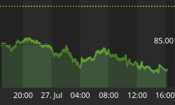
The last 4 days trading on the DAX gives us another nice example, closer to the present, to emphasize the importance of keeping candlesticks in context, and remembering that, even then, sometimes that's not even enough either. On Thursday, July 4th, the DAX daily chart looked like this with an engulfing, long tail island hammer, morning star reversal.

Longer term trend indicators signaled a rising trend on both the long and intermediate term time frames, price bounced off of intermediate confluence of support, things were looking good, and that candlestick pattern sure seemed to be icing on the cake, especially when coming on the heels of a Three White Soldier pattern the week before.
Then, Friday, July 5th.

And bamm, so much for that! Even with other positively corroborating TA, that particular pattern was dealt a serious blow in the form of a long red engulfing stick. This, of course, could simply be a sell spike buying opportunity, or, on the other hand, it might indicate more weakness than previously thought. The coming days should give us much more information on that. Keep an eye on it. It should be interesting!
When dealt with correctly, and with reasonable expectations respectful of their real capabilities, candlesticks do provide us with information worth taking into consideration. If we've got the longer term trends, levels, momentum and patterns correct, and we're correctly interpreting candlesticks within that previously defined larger context, what they tell us about price action, especially when similar sticks are clustered together in groups, can represent another respectable TA helping hand in bringing the odds even further in our favor. The key is to always remember that one candlestick does not a trend make.
By the way, did you notice the additional confirmation that candlesticks give us for the rising wedge pattern on the Dow chart? Do you see the bull-bear battles that have taken place on the weekly chart with like candlesticks clustering right at the upper and lower boundaries of the rising wedge?
Here's the same chart, with the rising wedge, just in case. ;-)

Related Study Materials:
http://en.wikipedia.org/wiki/Candlestick_pattern
http://stockcharts.com/school/doku.php?id=chart_school:chart_analysis:introduction_to_cand
http://stockcharts.com/school/doku.php?id=chart_school:chart_analysis:candlestick_pattern_dictionary
http://www.thepatternsite.com/CandleEntry.html


