


This week's Chart of the Week video looks at the divergence between the iShares iBoxx $ High Yield Corporate Bond ETF (symbol: HYG) and the SP500.
So let's get technical.
This is a monthly chart of the HYG showing our basic set up. These are key pivot points which are the best areas of buying and selling or support and resistance. The pink labeled price bars are negative divergence bars and these are suggestive of slowing upside price momentum. And this is your simple 10 month moving average.
The monthly close below the lows of the negative divergence bar is bearish and along with this trend line break is a warning flag that the trend is changing. And if the trend is changing for HYG, it is likely changing for the SP500.
Once again, this is a monthly chart comparing HYG in the top panel to the SP500 in the bottom panel. The iShares iBoxx $ High Yield Corporate Bond ETF seeks to track the investment results of an index composed of U.S. dollar-denominated, high yield corporate bonds. It is highly correlated with the SP500. Since the 2009 equity market lows, new lows and new highs have occurred simultaneously in both issues. But since the May - June global market sell off, a curious divergence has developed between the two issues.
Going back to our original monthly chart of HYG, not only is the bearish break down noted, but HYG has also failed to make a new high. On the other hand, the SP500 is making new highs. This negative divergence is noteworthy considering that HYG and the SP500 have been traveling hand in hand over the past 4 years.
So what's the message? US Equities continue to diverge from the underlying fundamentals and most asset classes. Quantitative easing continues to distort market signals and market relationships. At the very least, HYG needs to recapture the simple 10 month moving average by month's end. The inability of HYG to confirm the highs in the SP500 is another instance of the froth in the US equity markets.
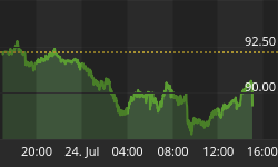
Want more TacticalBeta? See our pricing chart and upgrade today. Get Started Now


