


When we review some of the performance trends since the Fed's initial taper in December, the silver:gold ratio sticks out as one of the biggest outliers for us. While inflation expectations have largely improved since the Fed's first cut, the silver:gold ratio has bucked the trend of its inflationary counterparts and rolled over with the equity indexes. This likely is a result of the cross currents stemming from the two separate currency crises that have broken out concurrent with the Fed's tapering. Generally speaking, with these kinds of events gold initially outperforms silver as risk is squeezed in the system. What's interesting to note, however, is that the higher beta mining derivatives of both precious metals have widely outperformed other assets - with the silver miners (SIL) ETF even marginally outperforming gold's (GDX). The takeaway for us is that although silver has caught a bit of the Turk-en-tina flu, the outlook for the precious metals complex overall still looks greatly compelling.

Notwithstanding our bearish leanings on the dollar, we maintain the perspective that yields will revert from last years extreme and provide a tailwind for precious metals throughout 2014.


What's interesting to note with respect to both the Fed cycle and our USDX comparative, is the congruences in trend and momentum with yields to 1994/1995 - and the juxtaposition of recent pressures broadly exerted across emerging markets.

The chart below shows the current rate and momentum structure overlaid on the 10-year's cycle high from the early 1980's. The comparative profile has been inverted (h/t @VictorKerezov & @mjb4632) - which loosely matches with each cycles respective pivots and retracements.


As much as the Aussie has trended with gold, it's immediate concerns have hitched themselves with the issues surrounding China and emerging markets. After finding long-term support last week, the currency has bounced spritely with the Red Giant.

A consequence to the Fed maintaining QE over a prolonged period is that it can focus the markets attention and galvanize different hovering concerns when they move to withdraw support. We witnessed it in 2010 and 2011 when both of the initial QE programs ended and the considerable sovereign debt concerns still working against Europe sparked a greater fire abroad in the financial markets. While the debate over the positive and negative affects/effects of QE will likely go on well into our children's lifetimes, it seems reasonable to agree that the programs had at the very least the behavioral bias of maintaining hearty risk appetites - despite what weather conditions the markets were navigating through.
Today, in the wake of both the December and January tapers, the equity markets are confronting several different motivational concerns, some of which in our opinion have been overstated (China and emerging markets) - and some that have been understated (Japan, Spain and the US). The bottom line, however, is that during this kind of market environment - differentiation won't show up until the markets work through the respective cross currents. As often the case, the worst performers going through a correction many times become the leaders on the way out. Look most recently at bank stocks coming through the fall of 2011 or even the precious metals miners today.

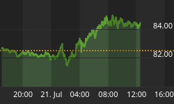
The Nikkei appears to be loosing the bottom rail of support this week that has maintained its exceptional performance trend over the past year.


Our general take on the SPX coming into this year was that we didn't expect long-term support defined by the Meridian to fail, but would be looking for a frustrating and consolidating range to develop above it throughout the year. While the 95' breakthrough pointed out early last year to the current range ~ 1800, we have been looking for the market to diverge early this year from the comparatives trend.


In Europe, we view Spain's IBEX as a leading proxy and see the top of a consolidating range now established. We're expecting Spain to follow in the footsteps of another economy that encountered deflationary forces on the brighter side of the cycle, namely Japan - circa 2004.


Just as divergent as the silver:gold ratio is with rising inflation expectations, is the performance of Chinese and emerging equity markets with their underlying debt profiles and overarching - yet rising, commodity sector. While the yen and the Nikkei look to inflict more collateral damages, these two equity markets offer the most compelling long-term valuations in our opinion.


