


Charts created using Omega TradeStation 2000i. Chart data supplied by Dial Data
It seems as if it has been for months that we have been warning about the broader stock market being at seemingly lofty levels. It seemed, though, that every time I noted that fact that the stock market moved to new highs. Sure enough this past week the US stock indices made new highs. Well at least the Dow Jones Industrials (DJI), Dow Jones Transportation (DJT) and S&P 500 made new all-time (nominal) highs. Many other indices did not. And it wasn't as if the markets went "screaming" to new highs. Instead, they made slight new highs and then the next day sold off.
This is not the sign of a healthy market. It appears to be a market that is churning, moving to new highs then immediately turning around and selling off. Over the past several months there has been increased signs that the public is "getting into the market" even as the so called "smart money" is exiting. There are signs that the amount of money in money market funds is falling even as the stock market churns higher. The chart below is of the number of S&P 500 shares each billion of money market funds can purchase shows this relationship. What this chart suggests is that liquidity has dried up and there is little available to fuel a further rise in the stock market.

Source: www.sentimentrader.com also seen at Lamensdorf Market Timing Report May 13, 2014
What the lead in chart suggests is that the broader small cap stock world is trailing the large cap stocks. The Russell 2000 is a small-cap stock market index of the bottom 2000 stocks in the Russell 3000 Index. The Russell 2000 is widely used by mutual funds that identify themselves as small cap whereas the S&P 500 is the index widely followed for the large cap stocks. What the chart is suggesting is that even as the large cap stocks are making new highs the small cap stocks are breaking down. Normally in bull markets it is the small cap stocks that outperform. To date the Russell 2000 is up 222% but the S&P 500 is only up 183%. But the Russell 2000 was up 253% at its recent top. The Russell 2000 is down 9% from that top.
This is a potentially important divergence. The large caps are making new highs but the small caps appear to be on the verge of breaking down given they have closed once again under the 200 day MA. This is a reminder of the famous "nifty-fifty" rally of late 1972. Back then, the large cap stocks were running to new highs even as the small cap stocks at the time were in the process of breaking down. What followed was the bear market of 1973-1974 where the indices fell roughly 50%. This is a divergence worth noting.
Many believe the current rebound, which is now in its 62nd month, has been a major move. Everyone would be surprised to learn that the current bull market is actually below average in both duration and magnitude. The chart below shows this as it looks at all of the major rallies over the past 114 years. The rally is defined as an advance following a decline of at least 30%. Today's rally as impressive as many would like to believe is actually below the average and well below famous rallies following collapses in 1933, 1921, 1987, 1907, 1974 and the best of the bunch 1942. I confess, however, with no disrespect for the chart that the 1942 rally appears to ignore the 1946 collapse. However, the 1946 collapse was only 25% so it did not satisfy the 30% threshold.

Source: www.chartoftheday.com
The market is facing a number of conflicting signals. Bradley Lamensdorf in his article "Market Timing- Momentum stocks crack - Are the Index's next?" pointed out that margin debt recently hit an all-time high; insider selling has been prominent and high; stocks as a percentage of household assets are at their highest level since the market peak of 2007, yet is below the peak hit in 2000; and, numerous IPO's are trading below their issue price with over 80% of these IPO's having negative earnings. On the other hand, technical indicators such as the Arms Index (TRIN), the put/call ratio and the MacLennan Oscillator are not showing signs of a top. Bullish sentiment has been higher.
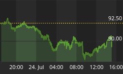
Maybe the last word should go to the bank stocks. One would think that bank stocks would be making new all-time (nominal) highs along with the market. That is not the case at all. The chart of the PHLX KBW Bank Index shows that the bank stocks are actually down 7% from their high seen on March 21, 2014. They are showing signs of possibly breaking down under their 200 day MA. The RSI index has been making a series of lower highs even as the Index made higher highs. That is a negative divergence. The KBW Index is down almost as much as the small cap Russell 2000 Index but then the Russell 2000 does not contain some of the largest banks in the world. If the bank stocks cannot keep up with the major index represented by the S&P 500 then there could well be a problem.

Charts created using Omega TradeStation 2000i. Chart data supplied by Dial Data


