


The Aussie dollar has staged a good comeback in recent months which begs the question - is this the start of a new bull market or just a bear market rally? Let's start with the big picture yearly chart and work our way down from there.
YEARLY CHART

My first impression after looking at this chart is - what a beautiful uptrend! Certainly the correction that has been taking place the past few years appears to be just your average run of the mill correction within a long term structural bull market. It might not feel like that if you're following the daily chart but that's why I really like the long term charts. It puts everything in perspective.
I have let the great Italian pioneer of the past, Fibonacci, have first crack at predicting where the correction might end. We can see the price of the correction low so far is just above the 50% retracement level of the upleg from the 2008 low to 2011 high. The other options beyond that are the 61.8% level at 79.5c and the 76.4% level at 72.1c. Personally I favour the 61.8% level because the major low in 2008 was pretty much a direct hit on the 76.4% retracement level of the upleg from the 2001 low to 2008 high. Generally the next major retracement in a bull market shouldn't go so deep but that's just my own speculation.
So let's delve deeper and have a look at the monthly chart and see what that tells us.
MONTHLY CHART

There are a couple of interesting observations to be made here. Firstly, there appears to be a downtrend channel in play as shown by the two parallel black lines. Price seems to have encountered resistance there recently which is not a good sign, well not for the bulls anyway.
Secondly, I have put some Bollinger bands on the chart. In downtrends, price will cling to the lower band with rallies bouncing back to either the middle band or upper band depending on the strength of the rally. In this case price has only rallied back to the middle band indicating weakness in the rally. And let's not forget this is the monthly chart and the longer the time frame the stronger the indicator.
So these two observations are clearly bearish and it would seem a break of the recent rally high at 94.4c is needed to change that outlook.
Now let's move onto the weekly chart to see if anything can be gleaned from that.
WEEKLY CHART

Once again there are two interesting observations to be made. Firstly, I have drawn an Andrew's Pitchfork from the all time top. It can be clearly seen that when price started falling off a cliff from the April 2013 high of $1.05 it has generally stayed in the top half of the downtrending pitchfork. Looking at the circled area an interesting development has occurred in the last few weeks whereby price tried to break out to the upside of the pitchfork but that attempt appears to have failed and it has come back inside the pitchfork formation. A false break of the pitchfork shall we say? This is a bearish development and while price looks to be having another crack at breaking out, unless the recent rally high of 94.4c can be taken out shortly it does not bode well for the bulls.
The second observation has to do with my use of the Parabolic Stop and Reverse (PSAR) indicator which pertains to the dots on the chart. The PSAR is actually one of my favourite indicators and is great when a clearly defined trend is in play. In the example of a downtrend, which we have here, two ways it could be used are to take short positions when price breaks below the dots and cover short positions when price breaks above the dots. In the circled area we can see the dots were broken to the downside and then price rallied back up but failed to break the dots to the upside. So we have another bearish indication in which a break above the recent rally high is needed to change this negative outlook.
Now keep in mind my explanation of the PSAR is simplifying things. I view technical analysis as more of an art than a science. There is no 100% foolproof system to be had from any one indicator or combination of them and anyone that tells you so is having themself on. Need I remind you of the story back in the 90's of Long Term Capital Management?!
Now let's look at the daily chart just to firm up the analysis already undertaken.
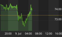
DAILY CHART

The rectangle which I have drawn seems to be containing a consolidation pattern. Price recently bounced off the bottom of the rectangle and now appears headed for the upper boundary. This can also be seen with the Bollinger bands. Price is bouncing between the lower and upper bands. This is very common during trend changes. Price dillies and dallies while it makes up its mind which direction will be next.
Now an interesting observation is that this consolidation pattern is taking place beneath the recent high of 94.4c. Now a general rule is that price will leave a consolidation pattern in the same direction price came into the pattern. In this case down. This may take another couple of attempts before successfully busting support.
One last indication of the bears beginning to reassert control is the Relative Strength Indicator (RSI). Now in the most recent move down the RSI made an extremely low reading showing a value around 14. In bull markets, the RSI will generally stay above the 30 line during pullbacks. Just as in bear markets the RSI will generally stay below the 70 line during rallies. Just study the history of this very chart to see what I'm talking about. So this another negative development and is one of the first signs that a smackdown is in the midst.
So taking our bearish conclusions from both the monthly, weekly and daily analysis, we can return to the yearly chart and surmise from Fibonacci that more likely correction ending points are the 61.8% level at 79.5c and if that fails the more extreme 76.4% level at 72.1c. But there's plenty of time to investigate that further in the future. For now it's springtime and the bears are growling.


