


The good news is:
• The blue chip indices closed at all time highs on Friday and the NASDAQ composite (OTC) closed at a multi year high.
The negatives
The market is overbought. Most of the major indices have been up for 6 consecutive days.
New highs picked up last week, but remain closer to their lows of the past 2 years than their highs.
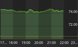
The chart below covers the past 6 months showing the OTC in blue and a 10% trend (19 day EMA) of NASDAQ new highs (OTC NH) in green. Dashed vertical lines have been drawn on the 1st trading day of each month.
OTC NH is far from confirming Friday's high.

The next chart is similar to the first one except it covers the past 2 years.

The next chart is similar to the first one except it shows the S&P 500 (SPX) in red and NY NH has been calculated from NYSE data.
NY NH has been stronger than OTC NH.

The next chart is similar to the one above except is shows the past 2 years. NY NH is also closer to its low of the past 2 years than its high.

The positives
Volume picked up last week, but remains relatively low. Down side volume and new lows have been practically non existent. There is not much buying, but no selling.
The chart below covers the past 6 months showing the SPX in red and a 40% trend (4 day EMA) of NYSE new highs divided by new highs + new lows (NY HL Ratio), in blue. Dashed horizontal lines have been drawn at 10% levels for the indicator, the line is solid at the neutral 50% level.
NY HL Ratio rose to an extremely high 95%.

The next chart is similar to the one above except it shows the OTC in blue and OTC HL Ratio, in red, has been calculated from NASDAQ data.
OTC HL Ratio was unchanged at a very strong 79.5%.

Seasonality
Next week includes the 5 trading days prior to the 4th Friday of June during the 2nd year of the Presidential Cycle.
The tables below show the change, on a percentage basis, of the OTC and SPX for the 5 trading days prior to the 4th Friday of June during the 2nd year of the Presidential Cycle.
OTC data covers the period from 1963 to 2013 while SPX data runs from 1953 through 2013. There are summaries for both the 2nd year of the Presidential Cycle and all years combined. Prior to 1953 the market traded 6 days a week so that data has been ignored.
Average returns for the coming week have been modestly negative by all measures.
Report for the week before the 4th Friday of June.
The number following the year is the position in the Presidential Cycle.
Daily returns from Monday through the 4th Friday.
| OTC Presidential Year 2 | ||||||
| Year | Mon | Tue | Wed | Thur | Fri | Totals |
| 1966-2 | -0.03% | 0.22% | 0.30% | 0.27% | -0.82% | -0.06% |
| 1970-2 | 0.87% | -0.03% | -2.69% | -0.34% | -1.10% | -3.29% |
| 1974-2 | -0.29% | 0.60% | -1.36% | -1.84% | -1.13% | -4.03% |
| 1978-2 | -0.62% | -0.72% | -1.15% | 0.04% | 0.05% | -2.40% |
| 1982-2 | -0.30% | 0.63% | 1.07% | 0.15% | -0.37% | 1.18% |
| 1986-2 | -0.01% | 0.53% | 0.83% | 0.16% | 0.16% | 1.67% |
| 1990-2 | -1.45% | -0.06% | 0.06% | 0.10% | -0.42% | -1.76% |
| Avg | -0.53% | 0.19% | -0.11% | -0.28% | -0.34% | -1.07% |
| 1994-2 | -1.44% | -1.40% | 0.56% | -1.67% | -1.01% | -4.96% |
| 1998-2 | 1.38% | 2.14% | 1.79% | -0.77% | 0.33% | 4.88% |
| 2002-2 | 1.34% | -2.49% | 0.38% | 2.09% | 0.27% | 1.60% |
| 2006-2 | -0.92% | -0.16% | 1.62% | -0.85% | -0.07% | -0.38% |
| 2010-2 | -0.90% | -1.19% | -0.33% | -1.63% | 0.27% | -3.78% |
| Avg | -0.11% | -0.62% | 0.80% | -0.57% | -0.04% | -0.53% |
| OTC summary for Presidential Year 2 1966 - 2010 | ||||||
| Avg | -0.20% | -0.16% | 0.09% | -0.36% | -0.32% | -0.94% |
| Win% | 25% | 42% | 67% | 50% | 42% | 33% |
| OTC summary for all years 1963 - 2013 | ||||||
| Avg | -0.17% | 0.08% | 0.12% | -0.10% | -0.09% | -0.17% |
| Win% | 40% | 62% | 53% | 60% | 54% | 52% |
| SPX Presidential Year 2 | ||||||
| Year | Mon | Tue | Wed | Thur | Fri | Totals |
| 1954-2 | 0.07% | 0.07% | 0.17% | 0.45% | -0.21% | 0.55% |
| Avg | 0.07% | 0.07% | 0.17% | 0.45% | -0.21% | 0.55% |
| 1958-2 | -0.36% | -0.38% | 0.25% | 0.47% | 0.13% | 0.11% |
| 1962-2 | -0.27% | -0.36% | -1.37% | -2.17% | -1.70% | -5.87% |
| 1966-2 | -0.03% | 0.27% | 0.16% | -0.40% | 0.09% | 0.08% |
| 1970-2 | -0.53% | -2.45% | -1.06% | 0.07% | -0.74% | -4.72% |
| 1974-2 | 0.26% | 1.47% | -1.47% | -1.55% | -0.36% | -1.65% |
| Avg | -0.19% | -0.29% | -0.70% | -0.72% | -0.51% | -2.41% |
| 1978-2 | 0.07% | -1.01% | -0.52% | 0.24% | -0.41% | -1.62% |
| 1982-2 | -0.07% | 1.03% | 1.70% | -0.28% | -0.63% | 1.74% |
| 1986-2 | -0.94% | 0.72% | 0.77% | -0.08% | 0.35% | 0.82% |
| 1990-2 | -1.66% | 0.45% | 0.18% | 0.38% | -1.40% | -2.06% |
| 1994-2 | -0.65% | -0.91% | 0.39% | -0.76% | -1.52% | -3.45% |
| Avg | -0.65% | 0.06% | 0.50% | -0.10% | -0.72% | -0.91% |
| 1998-2 | 0.24% | 1.48% | 1.20% | -0.32% | 0.35% | 2.94% |
| 2002-2 | 0.36% | -1.67% | -0.27% | 1.76% | 0.00% | 0.18% |
| 2006-2 | -0.91% | 0.00% | 0.97% | -0.53% | -0.09% | -0.55% |
| 2010-2 | -0.39% | -1.61% | -0.30% | -1.68% | 0.29% | -3.69% |
| SPX summary for Presidential Year 2 1954 - 2010 | ||||||
| Avg | -0.32% | -0.19% | 0.05% | -0.29% | -0.42% | -1.14% |
| Win% | 33% | 47% | 60% | 40% | 36% | 47% |
| SPX summary for all years 1953 - 2013 | ||||||
| Avg | -0.22% | 0.15% | 0.05% | -0.08% | -0.15% | -0.23% |
| Win% | 39% | 57% | 53% | 52% | 43% | 52% |
Money Supply (M2)
The money supply chart was provided by Gordon Harms. Recently M2 has been growing slightly below trend.

Conclusion
The market has been surprisingly strong for a seasonally weak period.
I expect the major averages to be lower on Friday June 27 than they were on Friday June 20.
Last weeks negative forecast was a miss.
This report is free to anyone who wants it, so please tell your friends. They can sign up at: http://www.stockmarket-ta.com/signup.html. If it is not for you, reply with REMOVE in the subject line.
These reports are archived at: http://www.safehaven.com/
Good Luck,
YTD W 8/L 9/T 8


