


I was originally going to do the Weekend Report on the very long term charts for the markets but after last Friday's trading I decided to mix it up a bit with some shorter term charts. It seems like everyone is either looking for that 10% to 15% correction right here before the stock markets can go higher or many looking for the top that will lead to a bear market. That is possible but I would like to show you some charts that maybe saying this correction is over and the next impulse leg up is now getting underway. You never know 100% for sure if you are right until you can look back in hindsight. With that said lets look at some charts starting with the INDU.
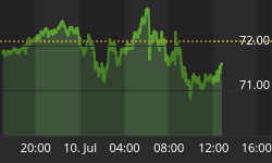
Last week I posted some inverse H&S bottoms that broke out on Friday only to have a strong backtest based on some negative information from the Ukraine. It was a wild day with big price swings. For the most part the necklines held their ground with some having what I call a strong backtest. The two hour chart for the INDU shows you what I mean.

That little inverse H&S bottom, on the 2 hour chart above, doesn't look like a big deal when you see it in isolation but when you put it in context of the daily chart it takes on a whole new meaning. I can guarantee you no one is looking at the INDU as the chart below shows. That small inverse H&S bottom on the 2 our chart may very well be the 4th reversal point in a much bigger bullish rising wedge consolidation pattern.
I know many of you are thinking another bullish rising wedge, how can that be? As I have shown you many times in the past these type of patterns show up in strong bull markets which the INDU has been in since the 2009 low that no one can deny. When you look at the daily chart below I would like you to compare the indicators from reversal point #2 to our current 4th reversal point as shown by the dashed purple vertical lines. The red circles shows how this pattern has morphed into the bigger bullish rising wedge by failing to reach the top and bottom rails. When you build charts in real time the original bottoms were where the red circles are. Triangles can do the same thing when they morph into a bigger triangle. The originally interpretation of the rising wedge was correct but it just morphed into a bigger rising wedge. Same pattern just bigger. This happens a lot with triangle also. Note how the bottom rail of the rising wedge lies right on top of the 200 dma.

Lets now take a look at the weekly chart for the INDU that goes back to the 2011 bottom that shows this bullish rising wedge isn't at all unusual. Keep in mind this pattern won't be complete until the top rail is broken to the upside. The little inverse H&S bottom maybe giving us an early heads up that at least a move up to the top rail maybe in play. It's possible we get a 5th and 6th reversal points before the pattern is completely matured. We just have to follow the price action. A sell/stop can be place just below the possible 4th reversal point if things don't work. Note how the RSI 50 has been holding support for the last year or so, red arrows.

Perspective is everything when it comes to the markets. It's always important to know where you've been in order to have an idea of where your at in the big picture. This next weekly chart goes back to the beautiful H&S top that formed back in 2007 which led to the big crash. It was as plain as the nose on your face back then but few grasped the consequences of how important it would be. I knew back then that the INDU was topping out but I didn't know the markets would crash like they did. I just knew a top was being put in place and the uptrend from the 2002 low was being reversed. Note the beautiful inverses H&S bottom that formed in 2009. An interesting fact about that 2009 inverse H&S bottom is that it's the same height as the 2007 H&S top. The 2007 H&S top took longer to build out but both H&S patterns ended up being the same height.
I suspect many analysis are looking at our current blue raising wedge as a bearish rising wedge which could be the case but until that bottom rail is significantly broken to the downside I'm sticking with the bullish scenario as I have seen too many of these patterns form in bull markets. Just think of these bullish rising wedges as a running corrections to the upside until proven otherwise. One last note on the chart below. The INDU has pretty much made higher highs and higher lows since the 2009 bottom which is an uptrend, Chartology 101.

Lets look at another chart for the INDU which is a long term monthly look that shows you how a bullish rising wedge, that developed back in the 2002 to 2007 bull run, formed right in the middle of that bull market as a halfway pattern in both time and price. Will history repeat?

This last chart for the INDU I use for looking for bottoms. At the bottom of this chart it shows you two different volume bars. The green volume bars shows you the up volume vs the down volume which I don't use. The beauty of this chart is the red volume bars that shows you the down volume vs the up volume. I have two dashed lines on the red volume bars. The upper one is at 8.5 and the lower one is at 3.35. If you recall the INDU was down over 300 points several weeks ago which looked like the beginning of a big correction. Note how the down to up red volume bar expanded up to 8.5 which suggested a low maybe forth coming. About 4 days later we got another capitulation bar that made it up to 3.35 giving us another clue an important low maybe at hand. As you can see several days later the low did come in for this down move so far. Keep in mind that little inverse H&S bottom I showed you on the first 2 hour chart above which maybe the the 4th reversal point in the bullish rising wedge on the daily chart. Again, you can see how critically important I'm viewing this potential bottom in here. It makes sense from a Chartology perspective.

Lets take a look at the COMPQ as it has been one of the stronger US markets. As you can see Friday's price action completed the 4th reversal point in a potential bullish expanding falling wedge. The only question is do we get a breakout right here or do we go back down to form a 5th and 6th reversal points? The MACD and HISTO are now positive with the slow stoch moving up.

I'm going to move right on the the monthly chart for the COMPQ that shows its beautiful bull market. Lets start on the left side of the chart that shows the red bullish rising flag that formed as a halfway pattern that helped me get out of the markets in plenty of time to lock in my profits in a stock called Rambus that was a life changer for me. If you think riding this bull market is difficult it pales in comparison to the move from the low in 1995 to the top in 2000. Unlike this current bull market where everyone is looking for this bull market to crash and burn the move in 1995 to the top in 2000 was just the opposite. A lot analyst were saying we were going to 20,000, 30,000 even higher as we were in a new paradyme. IPO's were going through the roof on their opening day. It was a time to behold but as always the party must end and end it did.
Next lets look at the big blue 10 year triangle consolidation pattern that I'm viewing as a halfway pattern at present. Notice the H&S bottom that formed the last reversal within the blue triangle. That blue triangle took 10 years to work off the access from the huge bull market. I've labeled the old bull market high in 2000, that comes in at 5132, which I think will be the first place we may see a pause that refreshes.

Next I would like to look at a couple of different sectors we took positions in last week. First lets look at the BTK, Biotechnology index which has been by far the strongest sector in the markets. The first chart is a 2 hour chart that shows the little blue triangle that broke out last week with a backtest on Friday.

Now we need to put that little 2 hour triangle in context by looking at a longer term daily chart. As you can see on the chart below our little 2 hour triangle is part of a much bigger daily triangle which both broke out of last week. A backtest is possible to confirm the breakout.

The BTK has been the strongest performing sector since the 2008 crash. Note the beautiful blue triangle that formed as a consolidation pattern between the 2000 high and the 2008 low on the monthly chart. Compare it to the COMPQ's blue triangle consolidation pattern. These huge consolidation patterns are the reasons why the stock markets are so strong. After 10 years of consolidation it was time for their big moves to the upside. Note the beautiful breakout and backtest before it ran up to the next consolidation pattern the red bullish rising wedge. This is what a bull market looks like.

I would like to take a close look at the other sector we bought last week, the SOX. The SOX held its ground last Friday during the big swings back and forth with the neckline holding support. I could make a case that the SOX is making a double inverse H&S bottom with the second neckline still waiting to be broken to the upside.

Below is a weekly chart with just a few annotations that shows its uptrend channel that has been forming since the end of 2012. Again our little inverse H&S bottom of the 2 hour chart above would be at the last reversal point in the uptrend channel.

This last chart shows the SOX big 10 year bullish falling wedge that finally broke out in 2010. Note the little red bull flag that formed just below the top rail of the falling wedge just before the big break out. After the breakout the SOX went on to form the blue triangle consolidation patterns as the backtest. The last bit of resistance was finally over come at the horizontal black dashed line made off the big blue flat top triangle that formed inside the falling wedge. Keeping an open mind, it's possible we could still see a backtest to the 546 area that should now offer strong support. At any rate this long term chart for the SOXs looks extremely bullish. When you look at this chart below ask your self how would you have handled the rally that started in 1998 at 185 to the top in 2000 at 1350. It looks easy when you look back in hindsight but could you have held on for the ride of a lifetime or would you have taken your profits at the first opportunity looking for a place to get back in that never happened?

There are many individual stocks that back up the big 10 year consolidation patterns that I've shown you above. It's just as hard riding a bull market up as it is shorting and riding a bear market down. I have to admit I'm just as guilty as the next guy trying to call an intermediate term top in these bull markets that seems to be a loosing proposition. In a strong bull market there is always the wall of worry which keeps most investors on edge but if you can look at the big picture it should help in controlling ones emotions. All the best...Rambus


