


Originally published September 1st, 2014.
Gold and silver are at a critical juncture - either they break down to new lows soon or a major new uptrend is about to start. Which is it? - while we cannot be 100% sure either way, we can certainly attempt to figure which way they are likely to break.
Many have been tempted to conclude, because of the dismal response to date by the Precious Metals to the growing geopolitical tensions in various regions of the world, that this is an indication of intrinsic weakness, and that they are therefore destined to break down soon, but there is another way of looking at it.
The vast majority of investors have no idea just how dangerous the worsening situation with Russia really is. The West is looking for trouble with Russia - and like most people who go looking for trouble, they are going to find it - this is a situation that could quickly lead to a World War. They have made it obvious that they are not interested in compromise - they want to overcome and subdue Russia, and the consequences are likely to be grave - especially for Europe which is on the front line. We have gone into this in detail on the site and will not look at it further here, but it deserves to be mentioned at the outset, because this could drive a meteoric rise in Precious Metal prices - and it could start with a big move that seems to come out of nowhere.
With this in mind let's now move on to look at the latest gold charts.
We will start by looking at gold's long-term chart, as we need an overall perspective from the start. On gold's 15-year chart we can see that despite the rough time it has had over the past 3 years, it still hasn't broken down from its long-term uptrend - and if this uptrend is valid, then it is clear that a huge upleg could be in prospect from here. If it were to run to the top of its major uptrend channel again, it would result in a massive increase in the price to the $4000 - $5000 area. Of course, the pattern that has formed over the past year could be a continuation pattern to be followed by a breakdown and another steep drop, but this doesn't look like it is on the cards as it would require a significant easing of geopolitical tensions, considered highly unlikely, and a deflationary implosion, which the money printers will "move heaven and earth" to avoid. Volume indicators on gold's long-term chart look positive relative to price, with Accum-Distrib line in particular looking strong. This chart makes plain that we are at a critical juncture here.

On its 4-year chart we can see that gold has pushed right into the apex of a "Fish Head" Triangle, which is a type of Symmetrical Triangle, where the boundary lines slope inward. The fact that it has pushed into the apex of the Triangle without a clear breakout is a sign of extreme indecision, and is often followed by a period of erratic price swings before a clear trend becomes established - what sometimes happens is that it breaks out in one direction, a false move, that is followed by a violent reversal in the other direction. At this point we are still in the overall neutral trend that began over a year ago.

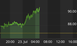
The main reason for the 1-year chart below is to enable direct comparison with the COT chart for gold shown immediately below it, which goes back about a year.


Gold's COT chart has been unfavorable for many weeks, as we can see below, which is a big reason, along with the strong dollar, why it has been so weak in the recent past. Last week we saw a marked improvement for the 1st time, and while there is clearly room for further improvement, we should keep in mind that it does not have to drop back to a low level before gold can turn up again.
On the 6-month chart we can see that recent action has been rather messy and indecisive. We called the top in July to the day in a Gold Market update at the time, and also the later breakout from the Falling Wedge a few weeks later early in August, and said that it wouldn't get far before turning down again, and it didn't. Overall the action from early July doesn't look bearish, and looks like a reaction to correct the sharp advance in June, pending a more bullish setup for gold. This is still a neutral picture overall and a breakout above the downtrend will be clearly be a bullish development - and all the more so if it should with a big move on strong volume.

The dollar's recent strength is of course a big reason for gold's recent weakness, and while it doesn't look to be over, it might take a breather soon as it is overbought. It is a tragic irony that by doing Washington's bidding and going on the warpath against Russia, Europe is "digging its own grave" not just militarily, since it is in the frontline should a major war erupt, but economically as well - already mortally weakened by years of bureaucratic bungling and incompetence, it is facing the collapse of the euro and disintegration. This is a big reason for the dollar's strength as investors leg it out of Europe to the relative security of the US. On the 6-month chart for the dollar index we can see its robust rally of the past 2 months, and its latest advance out of a bull Flag, which has almost hit target. We didn't see this last upleg coming in the latest Gold Market update, but did in an update on the site before breakout from the Flag occurred. The dollar is heavily overbought here and thought likely to consolidate for a while - it is considered unlikely that it will react back much, if at all, because of funds fleeing beleaguered Europe. Here we should note that continued dollar strength is unlikely to stop gold advancing, as both will be considered safe havens as the global geopolitical situation continues to rapidly deteriorate.

What about gold stocks? We have been concerned for some time that another top may be forming in PM stocks indices, partly because of the continuing high volume as they tracked sideways after their June - early July runup, but volume has dropped right back in recent weeks as we see on the 6-month for GDXJ below. This is a positive sign suggesting that the strong June - early July upleg was an impulse wave, i.e. a move in the direction of the primary trend. If it was then another strong upleg is likely to start soon. The support shown in the $40 area must hold, and it can be used as a general stop-loss.

The long-term 8-year chart for the S&P500 index continues to look like a catastrophe waiting to happen, a huge bubble searching for a pin. We can see that the massive bearish Rising Wedge that has formed from the early 2009 lows is closing up and volume has continued to dwindle to a very low level - in this situation if heavy selling emerges there will be no bids, and the market will plunge vertically - you sure don't want to be around when that happens. It looks about done here and is considered to be at a good point for shorting/Puts. With Puts you adopt a "swing till you hit" mentality. You might see the 1st or 2nd tranche expire worthless and then hit the jackpot when it caves in. Go for cheap out-of-the-money ones, so you don't lose much if it doesn't work out.


