


Precision timing for all time frames through a multi-dimensional approach to technical
analysis: Cycles - Breadth - P&F and Fibonacci price projections
and occasional Elliott Wave analysis
"By the Law of Periodical Repetition, everything which has happened once must happen again, and again, and again -- and not capriciously, but at regular periods, and each thing in its own period, not another's, and each obeying its own law... The same Nature which delights in periodical repetition in the sky is the Nature which orders the affairs of the earth. Let us not underrate the value of that hint." ~ Mark Twain
Current Position of the Market
SPX: Long-term trend - In 1932 and 1974, the 40-yr cycle was responsible for protracted market weakness. The current phase is due this year but where is the weakness? Has man (Federal Reserve) finally achieved dominance over universal rhythms or has it simply delayed the inevitable?
Intermediate trend - We are looking for the move from 1905 to end, after which a much more serious correction should start.
Analysis of the short-term trend is done on a daily basis with the help of hourly charts. It is an important adjunct to the analysis of daily and weekly charts which discusses the course of longer market trends.
CORRECTION UNDERWAY
Market Overview
The current market profile does not fit that of a major top - although it could eventually develop into one. For now, selling is moderate and controlled. It does not exhibit a rush to the exit. Also, the correction does not look complete.
Let's get a sense of where we are by dissecting the pattern made by the SPX:
Momentum: The weekly MACD reflects an increasing loss of upside momentum which could suggest that an important top is under construction. But there is still no confirmation that it is complete. A weekly close below 1975 would be a small red flag. A weekly close below 1940 would be a larger one, and a close below 1905 would tell us that a severe intermediate correction is underway. The daily MACD is suggesting that the decline should continue. It has made a lower low followed by a lower high, both resulting in negative divergence to the price. Its two moving averages have made a bearish cross and the gap is getting wider. However, by closing at 8.61 on Friday, it is still strongly positive, indicating that only a correction is underway - for now!
Breadth: The McClellan Summation Index rolled over after making a secondary top at about 585 and has just started to decline, but with a reading of 433.85, it is still positive and, at this time, it only indicates that a correction is in progress. Keep in mind, however, that its primary top was above 1000; the secondary top made along with an all-time high in SPX has created severe intermediate negative divergence. This too is a red flag! The McClellan Oscillator made a new low on Friday. This is a sign that the correction is not over.
VIX: After making a higher low when SPX made a new high (positive divergence) VIX started a controlled uptrend which made a slightly new high on Friday closing on its 200-DMA. It has now retraced 50% of its former decline, and its action reflects skepticism on the part of traders that we have started an important correction. (Perhaps this is a good reason to believe that the correction is not over!)
Structure: The best reading of EW at this time is that we are engaged in wave 4 of 5 (from 1905). But the structure could evolve into a totally different pattern, so we won't bet the house on this analysis.
Accumulation/distribution: The SPX continues to add to its P&F formation but this may not alter the original count.
Chart Analysis
The daily SPX chart (courtesy of QCharts.com) graphically supports the observations made above.
The MACD is a good way to observe the loss of momentum in the chart, but the graph itself tells you that this is taking place.

By connecting the lows from 1343, we get a good representation of the trend from that price to the present with the various lows pretty much in a straight line. But if we attempt to connect the tops, we have to adjust downward the slope of the trend lines several times. This is a sure sign that the price trend is losing its upside momentum, which means that there is shift taking place between the ratio of buyers to sellers. At some point, this ratio will achieve equilibrium and then the balance will begin to favor sellers over buyers, and we will have a market top. We are not quite there, yet!
A good representation (on a smaller scale) of this process taking place is the section which is outlined in blue lines. You can see a short but strong buying period starting at a steep angle, a consolidation, then the longer, more moderate uptrend under way which eventually starts to lose momentum, angling closer and closer to the trend line. The trend line is finally broken and the correction begins. This section (which is the mid-section of a larger pattern) can, with some slight modifications, illustrate the process which takes place as a bull market progresses. It can also, if you wish, be used as a fractal for both larger and smaller bullish patterns.
Based on this analogy, there is a good chance that our current uptrend from 1905 may not yet be complete and that a clearer pattern of deceleration needs to be formed at the top as the index eventually draws nearer to the trend line and finally breaks it. If I am correct about depicting how an uptrend begins, evolves, and eventually ends with the breaking of the principal trend line, it is not likely that we will see the top of this bull market anytime soon. The SPX is currently more than 400 points above its bull market trend line; if anything, it still appears to be accelerating upward.
What we should be looking for is an intermediate decline of a hundred and fifty points or more (primary wave IV), which could start as soon as the move from 1905 has ended (end of primary wave III), preceding the final phase of the bull market (primary wave V). This will undoubtedly take several more months to complete, so don't expect an early end to the bull market!
Getting back to our chart, the purpose of all indicators is to identify the various phases of a market trend and its end. The MACD performs this task well, as the process of deceleration is clear in that oscillator. Divergence to price, crossing of its averages, and whether it is bullish or bearish all play a part in this analysis. According to the current position of the daily MACD, there is no indication that we are at the beginning of a major correction -- nor, for that matter, that the correction is finished.
The A/D oscillator pretty much tells the same story as the MACD. By making a new low last Friday, it has said as much.
The SRSI is oversold and has made a small bullish divergence pattern. If it holds on to it for a few more days and turns up, we can look to a potential end of the correction.
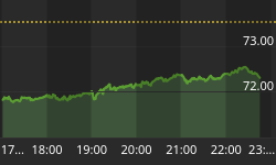
Let's see what the hourly chart (also courtesy of Q.Charts.com) tells us.
Here you can see the blue channel in more detail: the sharp start which was the trigger, the leisurely advance, and then the deceleration phase which led to the breaking of the trend line.
I have encased the current correction phase between two red trend lines. Note that on Friday, the index failed to go all the way to the bottom of the red channel, and then rallied into the close instead of closing on its low. This could be a warning that we are ready to challenge the top of the channel line; unless this turns out to be a false start and we begin to head down on Monday morning.
Also take notice of the (red) 200-hr MA. It usually provides a support or resistance level to the price. In this case, the index held just above it at the opening on the 10th and, although it dipped slightly below on Friday the 12th, prices recovered quickly. We'll see if we open above or below it on Monday!
This is a level (1982/83) that has provided support to prices on three separate occasions. If it holds and if the index can develop enough upside momentum from here, it could be the starting point of a new uptrend. Breaking it will most likely extend the correction.
Judging by the oscillators' performance on Friday, Monday could be an important day. All three of them either started to turn up, or showed some deceleration/divergence.

Breadth
The McClellan Oscillator and the Summation Index appear below (courtesy of StockCharts.com).
The McClellan Oscillator went from oversold to overbought, and has headed straight down to mildly oversold, again. The level marked by the green line is the area where a normal retracement occurs during short-term corrections in that index. If it stops there and turns back up, it will be an indication that the market correction may be coming to an end.
The Summation Index has turned down just before reaching its 200-day moving average. This is a sign of weakness, especially since the indicator has formed significant negative divergence with the SPX. That does not mean that we are ready for an immediate intermediate correction. As the McClellan Oscillator turns up, the current decline should be arrested and NYSI could meander upward without nullifying is divergence and negative reading.


Sentiment Indicators
The SentimenTrader (courtesy of same) long term indicator remains at 60 for the fourth consecutive week. This is another reason to believe that the SPX has not yet reached the top of wave 5 from 1905. It may have to see a reading of 70 once again before we see the top of the move.

VIX (NYSE Volatility Index) - Leads and confirms market reversals.
VIX is pretty much non-committal at this time. It made a higher low when the SPX made a new high revealing support that an important level may have been reached that the index will have difficulty overcoming, and that a decline could start from that level. However, it seems to lack conviction that this is the correct scenario, being cautious of not making a premature move, as it has in the past.
From a technical perspective, it is in a declining channel and has already tested its upper bounds. It may do so again in the near future if the market correction continues, but it will not progress into a break-out of its channel unless the prospects for a more protracted decline become clearer.

IWM (iShares Russell 2000) - Historically a market leader.
In spite of its relative weakness to the SPX over the intermediate term, IWM has handled the correction rather well. Of course it is benefiting from the support provided by both the 50 and 200-DMAs. Should it break below both and should they cross, it would be an important warning that the correction is getting worse, and that it is more than a simple consolidation in an uptrend.

TLT (20+yr Treasury Bond Fund) - Normally runs contrary to the equities market.
TLT has had quite a run since the beginning of the year and it is entitled to a rest. We can also superficially count five waves up from the beginning of the move, so this is an appropriate time to take a breather. Let's see if what follows is simply a rest stop or something more severe.

GLD (ETF for gold) - runs contrary to the dollar index
GLD has had an extensive consolidation in a downtrend and now is showing signs of resuming its long-term decline. If the P&F chart is to be believed, GLD is likely to reach about 100, probably by the time that its 25-wk cycle makes its low in late November. As long as the dollar remains in a strong uptrend, GLD and other commodities will continue to underperform.

UUP (dollar ETF)
UUP is in a strong uptrend which is most likely a break-out from a multi-month base. However, it has reached its 22.50 initial target discussed in previous letters and is also close to the top of its consolidation channel. In other words, it is entitled to a rest before continuing on its upward journey.

USO (US Oil Fund)
Following chart courtesy of QCharts.com
USO is close to reaching the major trend line which has its start in 2009. Its performance during the bull market has been dismal, but we expected no less, as has been stated week after week. While there could be some holding action as a result of this major support line, prospects for holding above it are not bright.

Summary
SPX has started what (for now) appears to be a consolidation pattern which does not look complete. We will need at least another week to evaluate whether it deteriorates into a bona fide correction with lower targets. An accelerated decline would add to the perception that 2011 was an important top (completion of primary wave III). But then, SPX would eventually have to break below 1905 to confirm this view. Structurally, there are several possibilities which will be revealed as we move forward.
FREE TRIAL SUBSCRIPTON
Market Turning Points is an uncommonly dependable, reasonably priced service providing intra-day market updates, explanations, and commentary, plus detailed weekend reports. It is ideally suited to traders, but it can also be valuable to longer-term holders since price projections are provided using Point & Figure analysis along with best-time estimates obtained from cycle analysis.
For a FREE 4-week trial, Send an email to: ajg@cybertrails.com
For further subscription options, payment plans, weekly newsletters, and for general information, I encourage you to visit my NEW website at www.marketurningpoints.com. By clicking on "Free Newsletter" you can bring up the latest newsletter which is normally posted on Sunday afternoons (unless it happens to be a 3-day weekend; in which case it could be posted on Monday).


