


Taken from October 2014 Monthly Newsletter
There looks to be a solid opportunity arising to get involved on the long side here. Let's investigate taking a top down approach beginning with the yearly chart.
30 Yr US T-Bonds Yearly Chart

What a monumental bull market! The low was all the way back in 1981 at 42.34. It hit an all time high in 2012 at 153.34. Since then, there has been quite a bit of chatter that interest rates are now on the way up. Bollocks to that, is what I say! Keep in mind that interest rates go up when bond prices go down. While price has come down since the high, I can see no damage done at all to this bull trend. Zilch. Nada.
I have drawn a black uptrend line to show the solid standing of the bull market. There has been no real threat to this uptrend line in 33 years. Incredible stuff!
However, there are some ominous signs developing that potentially have extremely serious consequences in the coming years.
Firstly, I have added a Momentum indicator which shows momentum declining since 1991. So, while there remains room to go up to new highs in the coming years, time appears to be ticking.
The Relative Strength Indicator (RSI) shows its previous high was weaker than the high before that - a bearish divergence. However, another new high looks like it will be accompanied by a triple bearish divergence. That would be bearish indeed and on the yearly chart no less.
A common topping pattern is three consecutive spike highs - a "three strikes and you're out" top. There are already two highs in place denoted by the numbers 1 and 2. Now all that is required is the third and final spike high. Once that high is in we could expect a big drop in bond prices that would send shockwaves throughout the world.
30 Yr US T-Bonds Monthly Chart

I have added Fibonacci retracement levels of the move up from major swing low to all time high. We can see the pullback was a virtual hit on the 61.8% level. Nice.
The Bollinger Bands show price moving away from the lower band and hitting the upper band a couple of months ago. Price seemed to find good support at the middle band and if price is now in an uptrend then we could expect to see it cling to the upper band.
The Parabolic Stop and Reverse (PSAR) indicator is in a bullish position with the dots under price. If this is indeed the start of the next leg up then those dots should get steeper before being challenged again.
The Moving Average Convergence Divergence (MACD) indicator is bullish with the blue line above the red line while the Momentum indicator shows momentum building. Price seems to be in a very solid position going by these indicators.
I have drawn a blue horizontal line labelled Support which denotes the previous swing low. Breaking this level now would be bearish. I doubt it. The September low pulled up without really threatening it.
Taking all this into consideration, I have drawn voodoo style what I think the October candle will look like. The September candle looks like a standard corrective month and I expect the month of October to be a big, positive continuation candle.
30 Yr US T-Bonds Weekly Chart

I have drawn an Andrew's Pitchfork which pertains to the three green parallel lines. The recent low was a direct hit on the lower channel line before turning back up immediately. Nice.
I have also drawn a Fibonacci Fan which shows the recent low bouncing off the 61.8% fan angle.
So there appears to be some very nice symmetry about this low which is shown in the green highlighted circle. Price looks to be moving up now but I favour one last test of the low, or at least the lower pitchfork channel and fan angle. After that we could expect a nice move higher.
The RSI shows a triple top in place. This appears against the trend and as the trend is up perhaps we could expect a strong move higher in price that would help bust the tripe top. That really would demonstrate the strength of the uptrend.
Let's wrap it up with the daily chart as we hone in on the long opportunity.
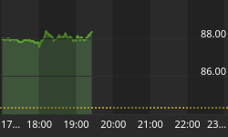
30 Yr US T-Bonds Daily Chart

We can see the recent low was a spike down that left a gap. This gap is shown in the green highlighted circle. The high of the low day is 136.21 while the low of the day before the gap is 136.62. I expect price to come back down and close that gap or at least get close before resuming higher. Price may fall just short of getting down to 136.21 but should certainly trade below 136.62. One might need to be nimble to get positioned near the low.
The Bollinger Bands show price moving away from the lower band and now trading around the middle band. I expect a move back towards the lower band before the next upleg really kicks into gear. It is possible that price now heads to the upper band before moving back to the lower band.
The Fibonacci retracement levels show price finding support around the 76.4% level. Perhaps one more test of that level will be required before the next move higher begins in earnest.
The RSI shows strength is building while the MACD indicator is bullish with the blue line clearly above the red line.
A break below the recent spike low would call in to doubt the uptrend continuation while a move below the previous swing low of 134.34 would signify something else is happening.


