


I'm going to divide this Weekend Report up into two parts, the stock markets and the precious metals complex. Both of these markets are on the move right now so we need examine them for clues to see if this is just a short term trading strategy or something more long lasting. Lets start with some US stock markets that had a rough week with many indexes breaking below their 200 dma.
I was first able to build out this rising wedge on the Dow Jones when it put in the August low that formed a small inverse H&S bottom at reversal point #4. It then rallied back up to the top trendline of the rising wedge at 17,300 where it found resistance. As you can see, Friday's move, closed below the bottom rail and the 200 dma. This is negative price action. We now have a clear line in the sand that is the bottom rail of the rising wedge. A backtest would come in around the 16,725 area which will represent critical resistance.

The next chart is a longer term daily chart for the Dow that shows the consolidation patterns since the 2012 low.

The long term weekly chart for the Dow shows the 2007 H&S top and the 2009 inverse H&S bottom that launched the 5 1/2 year bull market that maybe culminating with our blue 5 point rising wedge. It's still too early to say yet if this is the end of the bull market but it does look like we are in for a decent correction. One of the first big clues will be if the Dow takes out the August low which would then start a series of lower lows. We would then have to see a counter trend rally that makes a lower high to really setup a downtrend.

This long term monthly chart shows how I've been following the Dow since the bear market bottom in 2009. If you start at the bear market bottom in 2009 you can see the Dow has formed higher highs and higher lows virtually all the way up including this months bar. This is why it's important to see if the Dow can take out the August low which would then setup the first lower low.

Another very long term monthly chart for the Dow shows the giant blue expanding triangle that started to form at the 2000 bull market peak. Note how the last high on this chart the Dow tried several times to break above the top rail of the expanding triangle only to fail. You can see the last bar on this chart kinda stands out all by itself below the blue top rail of the expanding triangle and the bottom rail of the rising wedge. Note how it took five months and the backtest to the underside of the black bearish rising wedge, that formed the right shoulder in 2007, for the Dow to actually start its impulse move lower. It shows you you can be right on buying the breakout from the rising wedge but it would have been hell holding on during the 5 month backtesting process that formed the right shoulder.

Lets take a look at a few charts for the SPX to see how this index is doing. Back in the spring of this year the SPX built out a H&S consolidation pattern which reached its price objective at the black arrow. As I have shown you on the long term charts for gold and silver you can extend the neckline out into the future and it's surprisingly how well it still works. Here I did the same thing which helped me locate the August low and we got our rally. During our current decline the neckline extension rail was tested strongly last week but finally gave way on Friday. I had to respect that the neckline extension rail was still valid until it was broken to the downside. Now it should act as resistance on any backtest which would be around the 1925 area.

The monthly chart for the SPX shows a flat top triangle that was broken to the upside in 2013. It has been trapped inside the rising wedge since the bull market started in 2009. If the price action breaks below the bottom rail of the rising wedge the first real area of support would be the top rail of the flat top expanding triangle at 1550 or so.

The 30 year monthly chart with the 10 month moving average.

The SPX quarterly chart going back to 1940.

This last monthly chart for the SPX shows you what I'm look at for a longer term sell signal. It's very close but not quite there just yet. I did get a whipsaw in 2011 but that is the only false sell signal since 1994. The only other 2 sell signals came at the 2000 and 2007 tops so buy and sell signals don't come around very often. First lets look at the indicators at the bottom of the chart. The first thing we need to see is the blue Histogram below zero which we now have. Second we need to see the MACD crossover to the downside which is almost there. Third we need to see the Slow Stoch crossover to the downside which it has. And the last piece of the puzzle is we need to see the pink 6 month ema crossover the 12 month simple moving average which is getting close. So basically we are waiting on the moving averages to crossover to get a long term sell signal.

Now I would like to look at the Russell 2000 which has been the weakest sector in the US stock markets. This first daily chart shows the brown shades support and resistance zones we've been tracking for some time now. There really is some nice symmetry as shown by the two H's at the top of the chart and the two big S's that are the same height on the left and right side of the two big H's. The bottom brown shaded support zone was decisively broken on Friday's big move down and now should act as resistance on any backtest.

This next daily chart for the RUT shows a 9 point Diamond reversal pattern. Sir Fullgoldcrown, who has been following my work longer than anyone else on the planet, came up with this Diamond reversal pattern that is beautiful in its symmetry. If we are truly entering a new secular bear market, which remains to be seen yet, I would expect the RUT to reverse symmetry down in similar fashion as to how it went up.

The long term monthly chart for the RUT shows some interesting things. First there is the huge black rising expanding wedge that has held support and resistance since the bottom rail was touched way back in 1996. As you can see the bottom rail has had four touches and the top rail is currently working on its third reversal point. What is interesting is that each major top is forming seven years apart with the first one in 2000 the second one in 2007 and our current one in 2014. This long term monthly chart shows the first real support area would be at the top of the blue triangle around 865 or so.

Lets now turn our attention to some foreign markets and see how their charts are looking . The weekly chart for the CAC broke below its neckline last week competing an unbalanced H&S top.
France

The weekly chart for the DAX shows a similar unbalanced H&S top on the weekly look.
Germany

The long term monthly look at the DAX has a more bullish look to it as the H&S pattern, on the weekly chart above, is building out above the top rail of a blue triangle. Key support will be the top rail of the big blue triangle.

The weekly chart for the FTSE broke below the red five point triangle reversal pattern two weeks ago on the weekly chart. You will see why the red trendline, that makes up the top rail of the red triangle, is horizontal when I show you the monthly chart.
U.K.

This monthly chart shows you why the top rail of the red triangle is horizontal. It just couldn't bust through the bigger and badder top rail of the 15 year rectangle.

Next we will look at some other Countries through their ETFs.
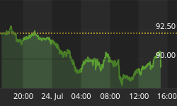
The weekly chart for ATG has broken down out of a bearish rising wedge.
Greece

EWA broke out of a 7 point bearish rising wedge last week.
Australia

EWC built out a small double top on the weekly chart.
Canada

EWI broke out of a H&S top last week.
Italy

EWJ is testing the bottom rail of the 5 point blue triangle reversal pattern.
Japan

The RSK broke below the blue triangle consolidation pattern then had some wild moves around the breakout point which formed a H&S pattern.
Russia

The EUFN, European Financial Sector, broke out of a H&S top last week.

The EUR, European Top 100 index, broke out of a bearish rising wedge last week.

These charts should give you a good feel for what is taking place in the world right now. I think the deflationary pressures are taking hold and it's going to be hard for most economies of the world to escape its wrath. I'll have part 2 on the precious metals complex tomorrow. All the best...Rambus


