


In April of this year I attended a conference hosted by Altegris in La Jolla, California. With the wealth of investment experience and expertise, for my 20 years in the business, it was by far the best investment conference I have ever attended.
The first speaker, Mark Finn of Vantage Consulting Group, has been advising Fortune 500 companies for over 30 years. At the end of his talk, he said something very interesting. He stated that the current environment was an "asset allocator's nightmare". One of the reasons that his words caught my attention was that I had come across a piece by Jeremy Grantham (principal of GMO, a global investment firm managing in excess of $74 billion that has worked with institutions since the 1970's) where he voiced similar apprehensions. In Grantham's third quarter 2004 letter to the investment committee, he has a section titled "The Nightmare for Asset Allocators: What on Earth Can We Do to Prevent Losses?" In his 7 year forecast, speaking about "every equity and fixed income asset class," he notes "therehas never been a more broadly overpriced mix of assets." 1
While one may not be familiar with these men and their careers, anyone looking at market charts over the last two years can easily see why these men, and others like them, are concerned. The charts and tables presented in this piece make it painfully clear that this is beyond a doubt an asset allocator's nightmare.
Before we look at what is actually happening, let's stop and review how this is supposed to work theoretically.
The world of modern finance refers to diversification as the use of non-correlating assets. The College of Financial Planning's Investment Planning textbook teaches that, "Diversification and the reduction in unsystematic risk require that assets' returns not be highly positively correlated. When there is a highly positive correlation, there is no risk reduction. When the returns are perfectly negatively, risk is erased. This indicates that combining these assets whose returns fluctuate exactly in opposite directions has the effect on the portfolio of completely erasing risk." 2 In short, assets that move in step with each other have more potential risk than assets that move in opposite directions from each other. My purpose here is only to say that true diversification can be useful in reducing certain types of risk.
Our common sense and life experiences tell us as much. We have all heard the old saying, "Don't put all your eggs in one basket." We all agree that if we have five people each carrying a basket with one egg, we have less chance of all of them getting broken than if we had one person carrying all five eggs in one basket. The problem is that the current situation appears to be more like 5 people running a race with their legs tied together on a rainy day after the staying up all night at a keg party.


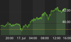
Charts courtesy of Ed Swendlin's, www.decisionpoint.com.
It would be an understatement to say that the last 24 months have produced many positive results. Indeed, the effect is that bullish sentiment has grown to historical lengths. A closer look at these euphoric charts should leaveus more concerned for what will happen in the next 24 months.
A cursory look reveals that all of these markets are moving in the same direction. This convergence essentially reduces the benefits of diversification. For example, how is it that the price of commodities has gone up and the price of the 30-year government bond has gone up as well? This is inconsistent. As the price of commodities (stuff) goes up, people usually demand a higher yield to offset inflation, causing the price of bonds to go down. How can gas and oil prices go up so much, and retail stocks, a sign of consumer spending, rise sharply too? If health care goes up and insurance costs climb, how does the consumer have more money to spend on retail products, much less a purchase as large as a house? Why are small caps, large caps, the Russian stock market, the German stock market, the Singapore stock markets, and the Mexico stock market all up so strong? How can all of these non-correlating markets move up together? More importantly, is this sustainable?
Before we address this conundrum, let's look at one more troublingaspect of our current market situation.
If we look at 20-year periods on the S&P 500 from 1919 to the present, we notice that the highest average 20-year return was 13.4. However, if the average Price to Earnings ratio (P/E) was 19, the average return was only 3.2%, and I assure the reader that there were some years of heavy losses in those 20-year timeframes. 3 The current average P/E, obtained from theS&P 500's website, is 20.7. 4
| Decile | S&P 500 Decile Avg. | Avg. Begin P/E | Avg. End P/E |
| 1 | 3.2% | 19 | 9 |
| 5 | 6.7% | 14 | 14 |
| 10 | 13.4% | 10 | 29 |
| Current - Crestmont | 26 | ??? | |
| Current - S&P | 20.70 | ??? |
As an aside, in speaking with Ed Easterling, founder of www.crestmontresearch.com and author of Unexpected Returns: Understanding Secular Stock Market Cycles, he thought it important that the reader understand that these P/E ratios are based on trailing earnings, which is the original way P/Es were calculated. The powers that be have since changed the P/E calculation. The calculations of the Leading Economic Indicators and the Consumer Price Index and many other government and market supplied numbers have been changed as well. But that is another topic that I will address as a separate issue on another day.
For now, let us look at the price changes in the previously mentioned indices and see where we stand today.
| Index/Asset | Price 7/28/03 | Price 7/28/05 | % Change |
| $CRB/Commodities | 234.71 | 312.0 | 32.9 |
| $USB/30 Govt. Bond | 105.86 | 115.31 | 8.9 |
| $XOI/ Oil | 463.11 | 942.85 | 103.6 |
| RTH/Retail | 80.45 | 102.72 | 27.7 |
| $HMO/Health Care | 792.73 | 1479.14 | 86.6 |
| IYR/Real Estate | 43.25 | 67.8 | 56.8 |
| $SML/Small Cap | 231.31 | 352.90 | 52.6 |
| $SPX/Large Cap | 989.28 | 1234.18 | 24.8 |
| $RTSI/Russian | 459.84 | 779.18 | 69.4 |
| $DAX/Germany | 3411.37 | 4886.50 | 43.2 |
| $STI/Singapore | 1580.88 | 2352.56 | 48.8 |
| $IXX/Mexico | 7240.57 | 14409.7 | 99.0 |
Price data collected through www.stockcharts.com
So as you can see from these numbers, with the exception of the 30-year government bond, over the last 2 years all of these indices have exceeded the highest 20-year average returns of the S&P 500.
To see what has caused all of these indices to move in step with stellar returns for the last two year, we need look no further than the monetary policies of the Federal Reserve. We are floating on a sea of liquidity. From June 28, 2003 to July 18, 2005 the money supply, as measured by M3, has grown by $836 billion dollars from $8.913 trillion to $9.749 trillion. 6 From the indices presented here and the GDP and other numbers coming from the government, one would think that we have, once again, inflated our way to victory. As for the debt that has been created along the way, (don't worry) we'll inflate that away too.
However, oddly, since the first Federal Funds Rate increase was announced on June 30, 2004 and in spite of its inflationary monetary polices, the 30-year government bond is up from 105.61 to 115.31. This is what we would expect to see if the Fed had cut interest rates or kept money supply growth to a minimum. As we are all aware, the Federal Reserve has raised its rate from 1% to 3.25%. When government bonds go up almost 10% in an environment where the Fed Funds Rate is increasing, this does not bode well for future economic prospects. The predominant theme in history has been that when an economy has grown weaker, bonds prices have gone up. When inflation concerns are tame and business prospects are bleak, we see a flight to the safety and returns of the government bond. When the economy picks up, business prospects expand, and inflation heats up, bond prices fall. So while the stock market churns out high returns, the bond market does not seem the least concerned with inflation or a stronger economy. Once again, something is wrong.
So based on our common sense, modern financial theory, and decades of price history on the S&P 500, we know that the real world is screaming a story far different than pretty pie charts of average annual returns produced to give investors a false sense of security. Coloring the eggs differently will not make investment portfolio returns safer. A lot of eggs are about to be broken.
Sources:
1. "The Countdown Continues & Letters to the Investment Committee 1" October 2004, Jeremy Grantham
2. College of Financial Planning: Investments – An Introduction 7th Edition (2002), Herbert B. Mayo Pg. 166
3. http://www.crestmontresearch.com/pdfs/Stock%2020%20Yr%20Returns.pdf
4. http://www2.standardandpoors.com/spf/xls/index/sp500pe_ratio.xls
5. http://www.crestmontresearch.com/pdfs/Stock%20Matrix%20Index5%208-5x11.pdf
6. http://federalreserve.gov/releases/h6/


