


While there are numerous reasons for recent volatility in asset prices, the market has primarily focused on concerns related to economic weakness in Europe, the possibility of a widespread Ebola outbreak, and the Federal Reserve. The chart below shows the performance of stocks relative to the VIX Fear Index over the past seven months. The orange lines show three recent "fear spikes", with the spike in the middle (Ebola) being larger than the other two (Europe & Fed).

Bullish Chart Patterns
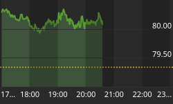
The chart above has some common characteristics found in a potentially bullish formation known as an inverse head-and-shoulders pattern. A break of the orange neckline will improve the odds of the current rally in equities carrying quite a bit further. The chart above is not alone in terms of the potentially bullish look. In this week's stock market video, we cover similar patterns in small caps (IWM), stocks (SPY) vs. bonds (IEF), and the broad NYSE Composite Stock Index.
Investment Implications - The Weight Of The Evidence
The market sold off prior to last week's Fed meeting on the expectation the removal of "considerable time" would signal a sooner-rather-than-later rate increase. Instead, the Fed delivered a more stock-friendly message and equities took off in the other direction. As of Monday's close, the market's risk-reward profile allows us to hold an equity-heavy allocation. Given the recent wild swings between confidence and fear, we will continue to take things day-by-day while remaining flexible to both bullish and bearish outcomes.


