


Conviction Drives Pricing
When the conviction to own stocks is higher than the conviction to sell stocks, markets tend to rise. Therefore, we can learn something in any market by focusing on the fact that all trades have a buyer and a seller.
A Bullish Triangle For The Bulls
The S&P 500 recently broke above previous resistance (see green arrow in chart below). The series of higher lows prior to the breakout told us buying conviction increased at higher and higher levels within the period of consolidation, which leans bullish. Has the concept of higher lows been helpful? Yes, a May 1 video clip covered the "higher lows allow for some patience" strategy in detail.

The study of charts is not a form of voodoo or witchcraft, but rather a way to monitor the actions of human beings within the context of simple and easy to understand economic principles. The formal name of the S&P 500's recent pattern is an ascending triangle. From stockcharts.com:
An ascending triangle has a definitive bullish bias before the actual breakout...the horizontal line represents overhead supply that prevents the security from moving past a certain level. It is as if a large sell order has been placed at this level and it is taking a number of weeks or months to execute, thus preventing the price from rising further. Even though the price cannot rise past this level, the reaction lows continue to rise. It is these higher lows that indicate increased buying pressure and give the ascending triangle its bullish bias.
Consumers Drive The Economy
If we felt like we were about to lose our job or felt like it may be difficult to pay our mortgage, we probably would not be planning a discretionary family trip. The projections for travel this year also align with the market's recent push to new highs. From Bloomberg:
About 37.2 million Americans will travel 50 miles or more from home during the upcoming holiday weekend, the most in 10 years, according to AAA, based in Heathrow, Florida. This 4.7 percent projected increase from 2014 includes trips by car, air, cruise, train and bus in the May 21-25 period. Memorial Day provides "a good indication of what's ahead" because the holiday marks the unofficial start of the peak vacation season, said Julie Hall, a spokeswoman for the largest U.S. motoring association. This "very positive forecast" should continue throughout the rest of the summer, she said.
More Than Just Shampoo
As we covered in detail in Is The Smart Money Running For Cover?, the ratio of growth-oriented small caps vs. defensive-oriented Treasuries had a "risk-off" look during the 2008 financial crisis. The chart below aligns with economic common sense and was helpful in terms of reducing risk between the October 2007 high and March 2009 low in stocks.

The 2015 version of the same IWM:TLT ratio has been trying to form a constrictive base since September 2014 (see below). Bottoms can form after sellers have been "shaken out" in a pattern of fear, followed by a larger spike in fear, and then one last, but more shallow, bout of fear.

The formal name of the pattern above is an inverse head-and-shoulders. From stockcharts.com
As a major reversal pattern, the Head and Shoulders Bottom forms after a downtrend, and its completion marks a change in trend. The pattern contains three successive troughs with the middle trough (head) being the deepest and the two outside troughs (shoulders) being shallower.
Confidence Returning To Credit Markets?
In the ETF world, if you are experiencing maximum economic fear (think 2008), then you believe three things:
- The economy is nowhere close to recovering,
- Stocks will be losers for some time, and
- The Fed is not even remotely close to raising interest rates.
Under maximum fear conditions, return of principal is more important than yield and longer maturities are more attractive to "lock in your coupon rate", which means there tends to be great demand for Treasuries (TLT) backed by the full faith and credit of the United States government. If return of principal is more important than yield, then high-yield bonds (JNK) with higher default rates are much less attractive than TLT. The JNK:TLT ratio also has a head-and-shoulders bottom look in 2015.

Yes, we understand there is a maturity mismatch between JNK and TLT in the chart above; maximum confidence means the economy is stronger and rates may go up - therefore, you want to diversify maturities by adding some shorter-term bonds to the mix. We are looking at max confidence vs. max fear.
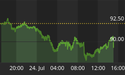
Stocks Outpacing Bonds
The ratio of stocks (SPY) to bonds (TLT) also supports the recent breakout by the S&P 500.

How did the same SPY:TLT ratio look in 2008? Answer - quite a bit more fearful (see below).

How About A Cup Of Coffee?
The 2015 weekly chart of financial stocks (XLF) has a potentially bullish formation known as a "cup with handle".

Like some of the previous charts, markets often need to shake out investors with doubts to bring investors with greater bullish conviction into the mix, which is what is happening in the cup and in the handle above. From Investopedia:
"A pattern on bar charts resembling a cup with a handle...As the stock comes up to test the old highs, the stock will incur selling pressure by the people who bought at or near the old high. This selling pressure will make the stock price trade sideways with a tendency towards a downtrend... then it takes off. "
Housing Provides Some Economic Hope
Charts have people and economic data behind them. The most recent read on housing aligns with the bullish economic case and charts above. From CNBC:
U.S. housing starts jumped to their highest level in nearly 7-1/2 years in April and permits soared, offering a glimmer of hope for an economy that is struggling to regain strong momentum after a dismal first quarter. Groundbreaking surged 20.2 per cent to a seasonally adjusted annual pace of 1.14 million units, the highest since November 2007, the Commerce Department said on Tuesday. The per cent increase was the biggest since February 1991.
What Could Spoil The Bullish Party?
If you want something to be concerned about, look no further than the Fed and interest rates. If market rates rise too quickly, it could spook both the stock and bond markets similar to 1994.
Investment Implications - The Weight Of The Evidence
The charts above are part of the weight of the evidence tracked by the CCM Market Model. Nothing really new to report - the hard evidence is still calling for an equity-heavy portfolio via a mixture of U.S. and foreign stocks. If the evidence shifts, we are happy to make the necessary adjustments, but we need to see it rather than anticipate it. If you want to expand on these concepts, this week's stock market video compares 2015 to a pre-correction period for stocks in 2011.


