


Gold & Silver
Report
Economy
The Commerce Department reported that retail sales, excluding autos, rose 1%. Retail sales account for about half of total consumer spending. Consumer spending accounts for more than two-thirds of gross domestic product (GDP). In 2006, retail sales were up 6%. In 2005 they gained 6.9%.
The Labor Department also reported that average hourly earnings rose 0.5% last month. Wages for all of 2006 were up 4.2%. 167,000 employees were added to payrolls last month.
Bonds stumbled after the report, as speculation was rife that the Federal Reserve will NOT cut interest rates this quarter. Some are even calling for a rate INCREASE.
Sounds like everything is just hunky-dory in paper fiat land. Wages are up, jobs are being added, inflation is under control, the housing market has slowed without any ill effects - what more could one ask for? Not much, and that's the problem. The markets are priced for perfection. Let's took a look at a chart and see what is says.
Notice that in the chart there are two components or variables:
-
real consumer spending
-
real personal disposable income
The chart is not complete doom and gloom, but it does show that everything is not quite so perfect. In many of the months consumer spending is way above the dollar amount of disposable income. So if the consumer is spending more than they make, where are they getting the money to pay for this excess consumption?

[chart courtesy of the Labor Dept.]
Pimco's Bill Gross had an interesting discussion on this very topic last week. You can access the full version by clicking on: Investment Outlook By Bill Gross, January 2007.
Bill Gross: "Well sure it is. When you realize that the average cost of debt in the bond market - and therefore in the economy and this includes mortgages - it is about 5.5%. If you can only grow your wealth and service that debt at 3.5% rate (referring to GDP growth - my note), then that has serious implications. When you go back to 1965, Merrill [Lynch] did this study - in terms of asset prices during periods of time when nominal growth grew less than 4%. Risk assets have been negative in terms of their appreciation and actually bonds have done pretty well. The question becomes why hasn't that happened yet, and I think we're simply in a period of time where there are leads and lags that are much like the leads and lags of Federal Reserve policy."
I'm not saying I agree with every nuance, but he does raise some very good points and observations, however, the cause and effect dynamics may not quite work that simply, but perhaps.
All of which is a perfect lead into the next chart.

[chart courtesy of the Labor Dept.]
This chart has three different components:
-
Gross Domestic Product
-
Goods Producing Sector
-
Services-producing Sector
What is this chart telling us? It shows that less manufacturing or product of physical goods is no longer the dominant contributing forces to overall GDP growth as it once was - now the service sector is taking up more of the GDP.
This is caused by two main factors, although there are others involved - these are the two most dominant.
Global collectivists have outsourced manufacturing to China and other countries where there is cheap labor, less environmental issues, less safety - less everything
The global elite prefer to deal in paper, in financial paper, i.e. credit and debt issuance: the rackets. They sell dreams, promises, obligations, and false hope to all who believe their charlatan ways. They have the world addicted to debt, and they are the pushers supplying the fix. May God damn the pusher man.
The above charts showed us that the United States consumes more than it produces. This is easily detected in the balance of goods and services trade report. Below is a chart.

As illustrate, the Department of Commerce reported that exports totaled $124.8 billion, while imports came in at $183.0 billion: resulting in a goods and services deficit of $58.2 billion.
Plain and simple - we consume more than we produce, and we spend more then we earn. Our savings are non-existent, which only leaves one alternative as to where the money comes from to service the over consummation we do - it's a four letter word: DEBT.
The U.S. inflation rate slowed sharply during the second half of last year as oil prices fell. The Labor Department's consumer price index rose 2% from a year earlier in November, compared with 4.3% in June.
Core inflation, which excludes energy and food prices, remained high. Core prices rose 2.6% from a year earlier.
Stocks
The Dow was up 1.3% this past week, while the S&P 500 rose 1.5%. The Transports gained a very solid 3.2%, cutting into its new high divergence with the Dow. The Utilities declined 0.8%. The NASDAQ 100 added a tidy sum, up 3.3% for the week.
The Standard & Poor's 500 Index was up 1.5% to 1430.73, which is the highest close in six years.
The Dow tacked on another 1.3% to a record close of 12,556.08. The Nasdaq Composite Index, which gets more than two-fifths of its market value from computer derived sales, had the largest gain with a 2.8% increase to 2502.82.
Saudi Arabia's Tadawul All Share Index gave up another 215.25 points, or 2.9%, as the patient remains in death throes. The Kuwait Stock Exchange Index did not fare much better: falling 1% to 9,996.9 points.
Last year, the Tadawul was the worst performer of all equity bourses losing 53%. So far in 2007 it has lost an additional 7.6%. Asian stocks continued the carnage: Indonesia's market coughed up 8.4% for the week that was.
We have often queried in the past few months as to what it means that the nations whose coffers should be overflowing from oil profits have the worst performing stock markets. What we come up with is that the sea of liquidity sloshing around the world, arrived on the door steps of the oil rich kingdoms first.
The profits were used for investment in their stock markets. Another asset bubbled caused and created by the mismanagement of our monetary system by the Federal Reserve: the consummate vehicle for wealth transference and monetary debasement. Whatever the final reason is - it can't be good.
Time for some charts to illustrate the points.

The nasdaq has yet to recover half of its bear market lows. The Dow made new highs but the transports have not yet confirmed. The oil rich nation's stock markets are imploding. Something is amiss.
The next chart plots the performance of the Dow Industrials against gold. Let's see who wins the contest.

As good as the Dow has done - it's still no contest. Gold has far out performed the market. So if you think the stock market is the way to go - look again at the above chart. Are you really increasing your buying power, WITHOUT THE USE OF DEBT?
Bond
Treasury yields were up across the board. Two year government yields were up 13 bps to 4.88%. Five year yields gained 12 bps to 4.76%. Ten year Treasuries added 13 bps to 4.77%. The 30 Year Long-bond rose 12 bps to 4.86%. The spread between the two year and 10 year closed the week inverted 10.5 bps.
The 10-year yield exceeded 4.72 percent, a level that was expected to attract buyers because it was last month's high and also represented a 38% reversal of the market's rally from last year's high yield of 5.25 percent to 4.40 percent on Dec. 1, as the charts below show.

The chart is pretty self-explanatory. It shows that interest rates are rising and that the yield curve remains, at least for now, inverted. We have the feeling that this will not remain so in the second half of 2007.
Higher interest rates are not what anyone wants: not the Fed, not the administration, and not the consumer, especially one involved in the mortgage side of the market.

Say What
Toshihiko Fukui, Governor of the Bank of Japan, was quite coy in his response to questions concerning the possibility of upcoming interest rate hikes by the BOJ.
"We are committed to supporting sustainable economic growth by closely examining data and implementing policy appropriately,' stated Fukui. So there you have it - they will do whatever they do. What could be more clearer?
Not so with the United Kingdom's (U.K.) Bank of England (BOE), as they stunned traders by unexpectedly raising the benchmark rate to a five-year high. Traders responded by selling bonds, which drove the U.K. pound to new highs against the euro.
The best remark of the week, however, goes to Japan's Finance Minister Koji Omi in a speech he gave in England on all things financial. He very clearly said that the Bank of Japan should help sustain expansion of Japan's economy - "even as it struggles with abnormally low interest rates".
Since interest rates are 0.25% in Japan - Omi could have gotten away without saying anything about rates, and just act dumb (CB's main asset) and make believe that they didn't exist. I don't think anybody would have even noticed. We will discuss this later in the report.
The Gap Conundrum
China's trade gap ballooned 74% to a record of $177.5 billion in 2006. Our genius Congressmen here in the U.S. accuse China of keeping its currency, the yuan, artificially low to help exports.
U.S. 10-year Treasury notes fell on speculation, the operative word here being speculation, that the Federal Reserve will not lower interest rates any time soon. Some have even suggested they may be FORCED to raise them.
Forced by who you might be wondering - ahh, by none other than Mr. Market himself. Ben meet Mr. Market. Mr. Market meet Ben. Please to meet you - hope you guess my name. No reason why you should play my game. Indeed - in deed.
The Hook
An important part of this equation is world wide interest rates, as well as world wide currency exchange rates. It's not all black and white, but many shades of gray as well.
If other countries are offering a significantly higher rate of interest to entice buyers to buy their Treasury Bonds or debt - they mostly likely will succeed. In other words, interest rates have to remain competitive and within a reasonable range of one another, otherwise you will not find a market for your bonded debts. Both inflation and exchange rates play their roles in all this.
The yield premium on U.S. 10-year Treasuries versus the same time-frame maturity Japanese government bonds widened to 3.04% last week. Japanese 10-year JGB yields rose 2.5 bps to 1.73%. I guess that answers the question as to why Japan buys such much of are bonded debt - that and the protection racket.
Not Alone
We are not alone in facing rising interest rates. It is starting to have affect around the world. It cannot be helped - it is as they say: inevitable. Such is the curse of paper fiat debt-money.
European Government Bonds declined for the sixth week in a row, based on the assumption that global inflation are beginning to accelerate, which will force the ECB to raise rates to stem the tide.
Japanese five-year notes had a third weekly decline after the Bank of Japan issued a statement last week through its chief economist, who alluded to the probability that the BOJ will raise interest rates next week when they meet. Investors squared and took positions accordingly.
China's trade gap ballooned 74% to a record of $177.5 billion in 2006. Our genius Congressmen here in the U.S. accuse China of keeping its currency, the yuan, artificially low to help exports.
Whose To Blame
The audacity of our representatives, unless mitigated by pure ignorance of any economic, financial, and monetary understanding, which we are saddened to say, is more than a passing possibility: is beyond reason and begs the limits of sane, rational thought.
The United States is the one who fostered the Bretton Woods Agreement of the rest of the World. His majesty Lord Keynes is the one who forced fed floating exchange rates upon the world, with a little help from monetarist Milton Friedman - may his soul rest in peace.
President Nixon RENEGEG on our CONTRACTUAL OBLIGATIONS to pay our debts to foreign nations in gold bullion as we had solemnly promised and agreed to: in the infamous year of 1971.
This was the second time the Federal Reserve declared bankruptcy of our nation - bankruptcy that their banking policies had caused, and for which they were supposedly created to stop.
The first time was when President Roosevelt confiscated private property holdings of all gold coin: THE THEN CURRENT CIRCULATING CURRENCY AND LEGAL TENDER of our country. History is rife with many instances of less dire circumstances that led to revolt and replacement of the exiting body politic.
Currencies
The dollar gained 0.5% to 84.82. The British pound was up 1.6%. The Japanese yen lost 1.4%. The US dollar set a new yearly high against the yen this week, fueled by speculation that the Fed will not raise interest rates in the near term.
The dollar rose 1.4% to 120.32 yen, and reached as high as 120.74 yen. It advanced 0.6% to $1.2923 per euro.
The U.S. currency has been range bound from April 27 through Nov. 24 at $1.2405 per euro to $1.2979 per euro. The euro has fallen from a 20-month high of $1.3368 last month. This action is simply a counter-trend rally be the US dollar which is in the mother of all bear markets.
The British pound was up 2.2% versus the euro this past week, as the Bank of England unexpectedly raised interest rates.
The South African Rand has fallen 3.5% this year against the US Dollar. This is very bullish for the SA Gold stocks whose costs are denominated in the SA Rand, but gold prices are in U.S. Dollars.
Time to check out some charts.


As the chart indicates - the dollar is burnt toast. It has had a counter trend rally and that it is. It will soon align itself back to the long term trend, which is the trend that matters the most. The trend is your friend.
Fed Foreign Holdings of Treasury Debt was up $7.2 billion for the week, setting another record of $1.77 Trillion.
International reserve assets, not counting gold, were up $770 billion or 18.8% to a new record of $4.85 Trillion.
Next up is a chart of the euro. The dollar and euro pretty much trend opposite to one another. The euro tends to tract fairly closely to gold, while the dollar tracts the opposite of gold. Following on the heels of the euro is a chart of the Swiss Franc.

The chart illustrates that the recent correction was a counter-trend rally. The long term trend is still up for the euro and down for the dollar. That was on HUGE gap that had to be filled. And now it has been.
Stochastic indicator turning up with a positive cross over, and RSI is turning up as well. Slowly the energy is gathering for the next leg up.

The charts show that the Swiss Franc tracks opposite of the dollar. However, the Swiss Franc has been weaker then gold and the euro, as indicated at the bottom of the chart above.
Commodities
The CRB index gave back a small 0.2%. Copper took back 3% of its recent drubbings. Crude lost another $3.36 to end the week at $52.88. Gasoline fell 4.3%, and Natural Gas rallied a very significant move that we did not catch - up 7.4%.
Corn prices were up to 7%, a new ten year high, based on the smallest global supplies in 29 years, supposedly because demand for ethanol uses up more of the corn crop; which we decipher as not that supplies were down - but that demand was up relative to supplies, some of which was finding its way into consumption (ethanol production) that in previous years did not command such a demand.

Wheat prices were up 5% based on speculation that supplies will drop. Cotton prices rose on speculation a grain rally will prompt farmers to plant more corn and wheat.
Energy
Crude oil rose more than $1 a barrel on profit taking and short covering, and somewhat by longs speculating that the downside has been a bit overdone.
Crude is down 13% so far this year. OPEC President Mohamed al-Hamli yesterday said that oil below $53 a barrel was "unacceptable". However, part of the problem is that most, if not all, of the OPEC members are not abiding by the reduced production quotas.
Natural gas rose in New York as buyers moved to take advantage of yesterday's 6.9% price decline. Now to the charts.

So we watch and see whether this is just a dead cat bounce, or the start of a new leg up. So far the long term trend is up, and the long term bull is in effect until it isn't, and so far that hasn't happened.
Precious Metals
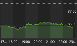
Gold prices in New York were up last week, as a decline in the value of the dollar boosted the demand for the metal. Gold closed at 626.90 up $20.00 dollars for the week, just over a 3% gain. This was the highest price for the last seven weeks, and the highest weekly close in nine weeks.
Let's go straight to the charts to see what's up.

So gold has many positives, as well as some negative indicators that need to change before a new leg up begins. The indicators are mixed: some are in good shape, while others remain not so good.
The above daily chart shows that gold has broken out of its downtrend and come back and successfully tested the break out area and is now moving up again. That's the good news. The not so good news is that MACD is negative and needs to turn and register a positive cross over.
The low for this move is most likely to be $542.27 from back in June of 2006. So far there have been four higher reaction lows put in place as gold builds up its energy. $655 needs to be broken through before any new long term up leg can begin.
The weekly chart below shows gold is above both its 50 and 200 ma's. RSI has turned up and is positively headed. Gold is sitting in the middle of its trading range of 655-600 at 626.90.

Next up is the monthly chart of gold.

The above chart shows gold convincingly breaking above its rising trend line. Four times it has come back and tested the continuing rising trend line, which has held each time.
From the monthly chart, gold is acting very bullish - rising from the bottom left hand corner of the chart up to the top right hand corner of the chart, all in a stair step pattern of higher lows and higher highs: a bullish signature.
It now needs to clear above resistance at $655, which will then turn from resistance to support. Both RSI and MACD needed to turn positively up. This work could take a few weeks of backing and filling action to occur. When $655 becomes support the next leg up can begin.
Silver
Silver closed at $12.41, up 0.18 cents or +1.47%. Silver has recently been under performing compared to gold. We take this as a bullish sign for gold, and the pm complex in general, however, there are valid points to both sides of that opinion.

The above chart shows silver recently bouncing off its 200 ma. It has a lot of work to do before a new leg up can begin. Its MACD needs to turn up and put in place a positive cross over. RSI needs to turn up as well.
Once these occur the 50 ma $13.10 needs to be taken and turn support, and from there an assault of the upper trend line at $14.37 needs to occur. Once again, all of this work may take a couple of weeks of backing and filling. Next up is the weekly chart of silver.

On the weekly chart the false break out is clearly distinguished. The retest of the break did not hold, which registered a negative MACD cross over. However, silver has not broken below its rising channel.
Presently the price is sitting right in the middle of its recent trading range between $13 and $12. It will soon have to decide which way it breaks: up or down.
Next is the monthly chart of silver.

The above monthly chart shows a bullish signature of a rising trend of higher lows and higher highs. MACD had a positive cross over, however it needs to turn back up.
The histograms are headed BACK DOWN towards zero. This is a hint that work needs to still be done by backing and filling, which could take from 2-4 wks time.
All in all it's a bullish chart that is saying it still has some technical damage to be repaired before it launches into its next intermediate term leg up. Now to the gold and silver stocks.
XAU
The weekly chart shows the false breakout and break back below the upper trend line. However, presently the price is banging its head on the upper trend line and is much closer to breaking out then down.

Next is the monthly chart for GDX, the market vectors gold miners index. It shows the long term resistance which has been successfully cleared and become significant support.
It too is closer to breaking its upper trend line then breaking below its lower trend line. The chart has a distinct bullish signature to it.
Right below the GDX chart is the HUI Index that since February of 2006 has been under performing gold over the long term, with intermittent periods where the HUI has out performed gold. It appears that a change to out performance by the HUI may be starting to occur.


HUI Index
The daily chart below shows a mixed bag of indicators. Some are positive and some are negative.

The chart shows where twice now overhead resistance has repelled any attempted breach. The 330 level needs to be taken out, which would just be for starters.
Presently the index sits just above half way between its recent trading range of 330-300, now at 320.12. RSI has positively turned up, now the MACD indicator needs to do the same.
The lower support zone is clearly indicated and the probable low has most likely been set back in June 2006 at 270.54.
There remains so work to be before the index is off and running on its next leg up. Patience is required and will be rewarded. Now to the weekly chart.
A mixed bag is also found on the weekly chart below. The false break out is evident, as are rolling over RSI and MACD indicators, both of which need to be worked on and to turn up with a positive cross over.

Resistance between 350-340 is clearly marked. Once again the low of 270.54 appears most likely to have been the low for this corrective phase. 350 and 362 and then 369 await the assault on resistance, which one broken will be the start of the next intermediate term up leg.
HUI Monthly
The monthly chart below clearly identifies the line drawn in the sand at the 258 level. This was once HEAVY resistance that has now become HEAVY support.
A series of higher lows are in place, however, now higher highs above the overhead resistance levels between 340-350 need to occur before the next stage up can start.
The bottom trend line comes in around 275 and the index now sits at 320.12. The low for this corrective phase presently is at 270.54. The index is much closer to breaking out then form breaking down. It's a bull market until it isn't.

The last chart compares the performance of the South African Rand to the US Dollar. This chart is very important to the SA Gold Miners: Harmony & GFI standing out. Production costs at these mines are denominated in the SA Rand, while gold is priced in US Dollars.
The Rand has steadily under performed the US dollar, which means additional profits because of the currency exchange factor favoring the dollar. This is a very important and significant trend change that began in 2005.
Prior to that time the SA Rand was outperforming the US Dollar, causing bleeding to the bottom profit line of the miners. This is not of any small significance, if the trend continues WHILE the price of gold goes up, the SA miners will show excellent profits - all other things being equal.

Summary
At this juncture in time, the most important issue are interest rates. The Fed has gotten its coveted inverted yield curve from behind which it can hide and appear anomalous.
However, having the inverted yield curve and holding on to it may well prove to be similar to winning the war in Iraq but failing in keeping the peace.
Now interest rates are rising on all ends, leaving the curve inverted, but nonetheless with higher rates. The housing and mortgage markets are not going to be able to tolerate higher rates for any length of time. Once the October high of 48.48 gets taken out - fireworks will begin to go off.
Consumer spending is up, while disposable income and savings are down - not a good mix. It means that more and more debt is being taken on to allow for over consumption. Savings and income are being used just to service the debt that continues to grow and accumulate.
It is much like the junkie that continually needs his fix to just stay even. Ever larger doses are required until the user kicks the habit or the habit kicks him. Such is paper fiat land - the land of illusions and delusions, where black is white and white is black. Be not deceived, things are not as they so appear to be.
Overall stocks are doing well, but the questions still remain: what of the non-confirmation of the transports; what of valuation - is the market overvalued or undervalued, which leads into the next question: is the market closer to a top or closer to a new bull market.
The long term trends in commodities, energy, and the precious metals have been undergoing severe testing, however, as of now no long term damage has been done. The casualties are in the intermediate and short term time frames, which are now repairing and correcting as needed.
We still prefer and see more value in the precious metals as compared to other commodities and energy. Oil and natural gas may, however, be about ready to have a rally off prospective bottoms.
The precious metals are ahead of energy and the other commodities, having already put in a solid bottom, and are now attempting to break out from their recent trading range.
Invitation
Stop by our website and check out the complete market wrap, which covers most major markets. There is also a lot of information on gold and silver, not only from an investment point of view, but from its position as being the mandated monetary system of our Constitution - Silver and Gold Coins as in Honest Weights and Measures.
There is also a live bulletin board where you can discuss the markets with people from around the world, as well as many other resources too numerous to list. Our gold stock portfolio where all trades in our own personal account is in the public domain for viewing is also available.
We put our money where our mouth is - wrong or right. We do not tell others how to spend their hard earned money. We simply publicly share how we spend or invest ours. We have learned over the years that talk is cheap. Only the walk gets you anywhere different from where you are now. Drop by and check it out.
Good luck. Good trading. Good health. And that's a wrap.

Come visit our new website: Honest Money Gold & Silver Report
And read the Open Letter to Congress
COMING SOON: A REQUEST FOR AN AUDIT OF US GOLD RESERVES


