


Dear Speculators,
The following article was first published at The Agile Trader on Sunday, February 11, 2007.
In the Index Options markets the Dynamic Trading System has closed trades for gross gains of +34%, +8%, +15%, and +31% for a gross total of +88% in position gains with no losing trades. In 2006 the System grossed +682% in position gains. (Of course, gross portfolio performance depends upon asset allocation.) If you would like to read more about The Agile Trader Index Options Service, CLICK HERE. And if you would like a free 1-month trial to the service (offered for a limited time), CLICK HERE and then click SUBSCRIBE.
To begin, let's revisit the lynchpins of our baseline market forecast for 2007.
- Cyclically speaking we're bullish on stocks for the better part of '07 with an upside price target of SPX 1550-1600.
- Earnings growth will slow during the coming year.
- The yield curve (10-Yr Treasury Yield (TNX) minus Fed Funds Rate (FFR))will tend toward disinverting and then steepening, probably on rising long-term interest rates.
- Equity Risk Premium (the difference between the SPX Forward Earnings Yield and TNX, now at 1.88%) will decline toward 1-1.5% on both the rising TNX and lower SPX yield (which entails cheaper bonds and a higher stock-market P/E ratio).
- Market volatility will increase and the slope of the rally off the July low will continue to moderate.
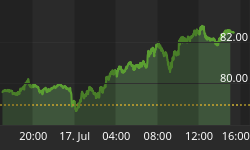
Assuming that the new 4-year cycle in the SPX began on July 17 (our working assumption until we see some reason to believe otherwise), we are now entering into roughly a 7-week period of the cycle that tends to be flattish.

The uptrend has become somewhat shallower since late October, and that slope is likely to decelerate further or reverse at least a bit through February and deep into March.
While the trends in our 3 measures of earnings growth remain positive, we are seeing a decline in earnings projections for the coming 52 weeks.

Indeed almost $1 has been shaved off the consensus estimate for forward earnings (blue line above) over the past 3 weeks. Trailing Earnings (yellow line) continue to climb as companies have tended to beat the consensus estimates for 4Q06, and Reported Earnings (pink line) are keeping pace, indicating that the quality of earnings is solid.
We can see which sectors have taken hits to their earnings estimates in this next chart.

The Energy, Consumer Discretionary, and Information Technology sectors have seen some downward revisions from analysts. And those revisions have pulled the aggregate SPX consensus growth estimate (thick black line with squares in it) down to +8.1% for the coming 52 weeks.
Growth looks like it will generally remain robust in Telecom Services (royal blue), Information Technology (lime green) and Healthcare (purple), despite some lumpiness in those lines.
Now the sixty-four-million-dollar question...one that the market has been quite reactive to... is, What will the Fed be doing during '07?
We've looked at this next chart before, but it bears further examination. It's a bit busy, but let's spend a little time with it.

- The correlation between the Y/Y change in the Fed Funds Rate (red line) and the Y/Y change in the consensus forward earnings estimate (blue line) has been quite strong since 1995.
- During the period highlighted in blue the Fed left rates low despite soaring profit growth. During the period highlighted in pink the Fed kept raising rates despite decelerating profit growth. In both cases the Fed was acting counter-cyclically to a greater extent than usual. First (blue) to kick start the economy and then (pink) to sop up excess liquidity left over from the blue period.
- At this point (as shown in the enlarged yellow box) the Y/Y change in the Fed Funds Rate (red line) is back in sync with the Y/Y change in the consensus earnings estimate (blue line). Both are descending toward their mean Y/Y Changes (0% and 7% respectively).
- As long as earnings growth continues to decelerate toward the long-term trend near 7%, and as long as the Fed wants to remain relatively neutral, they will likely hold rates steady, allowing the red line to dip toward 0% (unchanged).
- If earnings growth re-accelerates, then the Fed will likely tighten further.
- If earnings growth drops below 7%, then the Fed will likely loosen rates.
These last 3 bullet points are not particularly my opinions per se. They are what is suggested by the data from which the above chart is drawn. But they are predicated upon economic conditions NOT requiring that the Fed take drastic counter-cyclical action. Either an unexpected economic shock or a sudden surge in inflation could force the Fed to deviate again, in one direction or the other, from generating the normal correlation between earnings growth and the Fed Funds Rate.
As far as those 2 risks go (recession and inflation), many a bearish pundit has been predicting economic catastrophe riding into town on the back of the weakening housing market. We've all familiar with the well-documented bursting of the housing bubble. But the big question raised by the subject is how the consumer maintains his robust patterns of consumption even as his prior source of liquidity (cash extraction from the inflating value of his home) has dried up. And the answer lies in the "Johnny Come Lately" acceleration of Real Compensation of Employees.

Since the beginning of 2006 growth in Real Compensation of Employees (nominal compensation adjusted for inflation) has been growing well above the trend of +2.9%, now +4.1%. And Real Personal Income (a somewhat broader measure that probably tips toward the wealthy) is up +5.9% in the same time period.
Comparing the size of the increase in personal income during 2006 to the size of home equity extraction, growth in personal income is probably on the order of half the size of home equity extraction on an economy-wide basis. (Personal Income was up $621 billion in '06 while the latest data I could find estimated that about $511 billion was extracted from home equity in the first half of '06.)
But, generally, extraction of home equity is a one-time thing (or once per some number of years). But, I would hypothesize that an increase in income is likely a more durable increase. So, for instance, someone whose income rises by $10,000 per year is likely to feel somewhat more secure in increasing his spending than is someone who has extracted $20,000 from a REFI.
I do not offer the above discussion as a prescription for how the consumer should spend. Simply as a description of what has thus far been keeping the consumer and the economy afloat during what has been predicted to be a monstrously disastrous housing-bubble collapse.
As long as Real Personal Income, and especially Real Compensation of Employees, remains robust, the housing slowdown's negative impact on economic growth should remain somewhat muted.
Last week we looked at a variety of market indices and internal metrics that augured generally bullish for the broad market. This week, let's look at the Exchange Traded Funds (ETFs) that track the variety of sectors in the SPX.
The Relative Strength line on each of these charts is derived by dividing the ETF price by the SPX price. When the Relative Strength line is rising, that ETF is outperforming the SPX. When the Relative Strength line is falling, that ETF is underperforming the SPX.
This first bank of charts shows our market outperformers.

Both the Utilities and the Materials sectors are showing clearly solid relative strength trends, although the Utilities' outperformance has really only show up since mid January.
While the Consumer Discretionary sector has been performing well since late August, we're seeing deceleration of that outperformance more recently.
The underperforming sectors are clearly in Tech and Consumer Staples.

That's curious, as Tech is generally speculative while Staples tend to be defensive. The solution to this riddle may be that Staples are underperforming only very recently, since the late-January SPX surge. Prior to that the Staples had been more or less creeping along with the broad market.
Taken in aggregate these 5 charts present fairly defensive picture. We don't normally imagine a durable and prolific bull market being led by Materials and Utilities stocks. Nor do we expect Tech to lag in a strong market (the sector led nicely from July into November).
The remaining bank of charts shows the SPX along with the 4 sector ETFs that appear to be market performers for now.

Financials and Industrials show no strong biases on their Relative Strength lines. Energy and Health Care may be showing some nascent strength, but nothing to write home about at this point.
We would like to see Financials and Industrials leading in a truly robust market.
The lack of leadership in Financials, Industrials, and Tech especially, suggests to us that the market continues to be ripe for a period of consolidation. And that interpretation fits hand-in-glove with our cyclical work in the first chart above, which suggests a shallower slope and increased volatility in the market over the next 6-8 weeks.
Best regards and good trading!


