

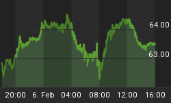


By now you should know that one of my favorite aspects of the Rydex data is the amount of assets in the bullish and leveraged funds versus the amount of assets in the leveraged and bearish funds. Not only do we get to see what direction these market timers think the market will go, but we also get to see how much conviction (i.e., leverage) they have in their beliefs. See figure 1 a daily graph of the S&P500 (symbol: $INX) with the Rydex leveraged bulls (green line) versus the leveraged bears (red line) in the lower panel. Typically, we want to bet against the Rydex market timer even though they only represent a small sample of the overall market.
Figure 1. Rydex Bullish and Leveraged v. Rydex Bearish and Leveraged/ daily
As of yesterday's close, the amount of assets in the bullish and leveraged funds was 2.53 times that in the bearish and leveraged funds, and this represents the highest value since November, 2004.
Figures 2 through 8 are daily charts of the S&P500. The indicator in the lower panel is the ratio of bullish and leveraged assets to the bearish and leveraged assets. The horizontal pink line (over the indicator) is set to a level of 2. Figure 2 runs from October, 2001 to October, 2002; figure 3 runs from October, 2002 to December, 2003; figure 4 runs from December, 2003 to December, 2004; figure 5 runs from December, 2004 to December, 2005; figure 6 runs from December, 2005 to December, 2006; figure 7 runs from December, 2006 to December, 2007; figure 8 is December, 2007 to the present. The gray vertical lines identify those times when the ratio is greater than 2 or above the horizontal pink line.
Figure 2. October, 2001 to October, 2002
Figure 3. October, 2002 to December, 2003
Figure 4. December, 2003 to December, 2004
Figure 5. December, 2004 to December, 2005
Figure 6. December, 2005 to December, 2006
Figure 7. December, 2006 to December, 2007
Figure 8. December, 2007 to Present
I look at this data and many other pieces of data and I ask: where do we go from here? Even if we go higher and even if the sentiment data is wrong, I am convinced I will have a better - more risk adjusted opportunity - ahead of me. That's my story for now!


