


Over the past year, I have most often discussed the composite indicator constructed from the trends in gold, crude oil, and yields on the 10 year Treasury in the context of high readings. Collectively, when these trends are strong and rising, stocks tend to under perform. This has been the case over the past 25 years and over the past 10 months during this epic bull run. But what happens to equities when this indicator registers a low reading - as in the trends in gold, crude oil, and yields on the 10 year Treasury are weak and falling?
Figure 1 is a weakly chart of the S&P500 with the composite indicator in the lower panel. With the recent sell off in gold, crude oil and yields on the 10 year Treasury (i.e., higher bond prices), the composite indicator is registering an extreme, low reading, and this may be a good sign for equities.
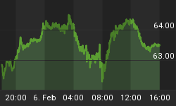
Figure 1. S&P500/ weekly
How good? Let's develop a strategy and run some numbers.
In this strategy, I will "buy" the S&P500 when the indicator is less than or equal to the green line on the chart in figure 1. I will "sell" the S&P500 when the indicator rises above this green line. The study will go back to 1984, and it will be frictionless as slippage and trading costs are not considered.
Since 1984 such a strategy generated 50 trades yielding 238 S&P500 points. Buy and hold netted 900 S&P500 points. 68% of your trades were winners, and the time spent in the market was only 10%. In other words, your strategy made 1/4 of buy and hold with only one-tenth of the time in the market. This is actually quite good because when you are in the market with this strategy, you are seeing your money grow at an accelerated rate.
The equity curve for this strategy is shown in figure 2. For the most part, the curve is appealing especially because of the nice 45 degree rise between 1984 and 1998. From 1998 to 2001, the curve is a bit choppy and then the curve peaks in 2006. After that, significant draw downs were seen especially during the market crash of September and October, 2008 when all assets became highly correlated.
Figure 2. Equity Curve
Now let's look at this strategy a little bit more closely, and to do this, we will look at the strategy's maximum adverse excursion (MAE) graph. See figure 3. MAE assesses each trade from the strategy and determines how much a trade had to lose in percentage terms before being closed out for a winner or loser. You put on a trade and if you are like most traders, the position will move against you. MAE measures how much you have to angst and squirm while you are in that position. Because once you close the position out for a loss or a win, you are done worrying about it. As an example, look at the caret in figure 3 with the blue box around it. This one trade lost 6% (x-axis) before being closed out for a 3% loser (y-axis). We know this was a losing trade because it is a red caret.
Figure 3. MAE Graph
The first thing we notice about this strategy is that over 85% of the trades had MAE's less than 4%. This is to the left of the blue line. That's extraordinary. You put on a trade and 85% of the time you don't even lose more than 4%. How sweet is that?
But let's look to the right of the blue line where we see that 5 out of the 50 trades had excessive (>10%) MAE's. I have labeled these trades and as you can see, 3 are from late 2008, and 2 are from other notable periods in market history. Of the 5 trades with an excessive MAE, one recovered to be a winner; 3 recovered slightly but still lost money; and there was one trade -look to figure 3 in the upper right corner - that lost 18% after a 24% draw down or MAE. Ouch!
So what conclusions can we draw so far?
One, from 1984 to 1998, when the trends in gold, crude oil and yields on the 10 year Treasury were weak and falling, this was a buying opportunity for equities. Inflationary headwinds -real or perceived - were non-existent and stocks continued on their bull market ways. This seems to be most pronounced from 1984 to 1998 or during a secular bull market.
Two, during times of market stress, like 1998, 2001 and 2008, it appears that all assets are vulnerable. Weakness is seen in stocks as well as gold, crude oil and yields on the 10 year Treasury bond (i.e., bonds go higher).
So that begs the question: is this indicator now flashing bullish or bearish? Based upon this data (as opposed to the recent sentiment data), I don't have an answer. It appears to be one of those situations where we won't know until we know. If this was a bull market, then I would state that "this is a buying opportunity"; I am bullish on the S&P500 for 2010, but it is more of a recognition that I cannot get too bearish on equities as the first major pullback where sentiment turns bearish (i.e., bull signal) will be bought. I would prefer to wait until that happens or at the very least, I could see taking a cautious or graded approach at this juncture - you don't need to go all in.
Lastly, let me just mention the other reason for concern here. Stocks and commodities remain highly correlated as all risk assets seem to move in lock step these days. Maybe the beating seen in commodities is only harbinger of what is to come for equities.
In any case referring back to figure 3, we note that any trade that loss over 5% (i.e., MAE>5%) had a high likelihood of not recovering. Failed trades lead to significant losses for the markets. And maybe that is the lesson here. If the S&P500 lost over 5% from Friday's close that should be a caution flag. On the other hand, lower prices will bring out the bears (i.e., bull signal) and it will be time to get long. Failure at that juncture - when sentiment is bearish - will be a more ominous sign for the markets.


