


On Thursday, the SPDR Gold Trust (symbol: GLD), which is the ETF that tracks the performance of gold, saw its worst one day performance since February, 2010. No one would deny that gold is in a bull market, but does this sell off represent a buying opportunity?
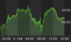
Figure 1 is a weekly chart of the GLD, and the pink labeled bars are negative divergence bars. In this instance, the divergence is between price (i.e., what you see on the chart) and an oscillator (i.e., like a stochastic or RSI) that measures price. A negative divergence means that price is going higher but the oscillator is heading lower. As I have chronicled on many occasions in the past, negative divergences signify slowing upside momentum at best and often times lead to a range in prices where the highs and lows of the negative divergence bar serve as the highs and lows of that range. They are not a harbinger of a market top unless there is a clustering of negative divergence bars and more often in a bull market they lead to higher prices.
Figure 1. GLD/ weekly
This past week's price action is producing a negative divergence bar in GLD, and this mini sell off has many wondering if this represents a buying opportunity or not. So let's construct a simple study. We will use weekly data of the GLD and execute all trades at the close; commissions and slippage are not considered. The first trade generated was in February, 2006. The buy rule is: 1) buy GLD on a weekly close when there is a negative divergence bar. The sell rule is two fold: 1) sell GLD on a weekly close below the low of the negative divergence bar; or 2) sell GLD on a weekly close above the high of the negative divergence bar.
So looking at figure 1, we buy GLD when there is pink bar and sell our position on a weekly close above or below the highs or lows, respectively, of that pink labeled price bar. Simple enough. I have labeled the buy and sells from the trades generated from this strategy.
Since 2006, there were 13 trades generated by this strategy. 69% or 9 trades were winners. In other words, if a negative divergence was present, there was a 69% chance that prices would close above highs before closing below the lows of that negative divergence bar. But remember this is what one would expect when being in a bull market.
The maximum adverse excursion (MAE) graph for this strategy is shown in figure 2. The MAE graph assesses each trade from the strategy and determines how much a trade had to lose in percentage terms before being closed out for a winner or loser. You put on a trade and if you are like most traders the position will move against you. MAE measures how much you have to angst and squirm while you are in that position. As an example, look at the caret in figure 2 with the blue box around it. This one trade lost 3.25% (x-axis) before being closed out for a 3.5% winner (y-axis). We know this was a winning trade because it is a green caret.
Figure 2. MAE Graph
Looking at all the trades from this strategy, we note that the 3 out of the 4 losing trades had MAE's in excess of 3.5%; these are the trades to the right of the blue line. These trades did not recover, so in all likelihood, a trade that loses more than 3.5% will be a losing one.
Other characteristics of this strategy include: 1) average time in a trade was 3.5 weeks; 2) the ratio of average win to loss is 2.46; 3) the RINA index, which is a measure of trade efficiency or which takes into account profit, draw down and time in the market, is a very robust 214; above 50 is considered good.
In summary, gold is in a bull market. The weekly chart shows a negative divergence bar. Negative divergence bars signify slowing upside momentum; however, in a bull market it pays to buy those divergences.


