


As of Tuesday's close, the amount of assets in the Rydex bullish and leveraged funds exceeded the amount of assets in the bearish and leveraged funds by a ratio of more than 2 to 1. Over the past 3 months, this measure of excessive investor enthusiasm for equities has coincided with more selling than buying.
This is nothing new. As we have seen this drill before, I thought now would be a good time to present some data on the entirety of this data series and why I feel it is a useful contrarian indicator.
Figure 1 is a daily chart of the S&P500 (symbol: $INX) with the Rydex leveraged and bullish assets (green line) v. the leveraged and bearish assets (red line) in the lower panel.
Figure 1. Rydex Bull and Leveraged v. Bear and Leveraged/ daily
Let's design a study, and call it study #1.
1) buy the S&P500 when the amount of assets in the Rydex leveraged and bullish funds exceeds the amount of assets in the leveraged and bearish funds;
2) sell the S&P500 when the amount of assets in the Rydex leveraged and bullish funds is less than the amount of assets in the leveraged and bearish funds;
3) to simulate how I get the data, all trades are executed at the next day's open;
4) no commissions or slippage are considered.
In essence, we are only long the S&P500 when the green line is greater than the red line.
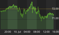
Since June, 2000, study #1 yielded a negative 1342 S&P500 points!!! Buy and hold has netted a negative 400 points since that time. There were 83 trades and 42% were profitable. Your market exposure was 77%. The equity curve for such a strategy is shown in figure 2, and it speaks for itself.
Figure 2. Study #1/ equity curve
Now let's reverse the scenario and we buy the S&P500 when the assets in the Rydex leveraged and bearish funds are greater than the Rydex and leveraged and bullish. We are long the S&P500 only when the red line is greater than the green line in figure 1. We call this study #2.
Since June, 2000, study #2 generated 934 S&P500 points. There were 83 trades and 76% of these were profitable. The average winning trade was three times larger than the average losing trade. Your market exposure was 23%. The equity curve for such a strategy is shown in figure 3, and it speaks for itself.
Figure 3. Study #2/ equity curve
So let's summarize. We have a strategy (study #2) that beats buy and hold by about three fold with one fourth the time in the market. On the other hand, study #1 lost three times as much as buy and hold with 77% market exposure. So let's make this easy and ask: when would you like to be exposed to the markets?
Simple enough.
But before we finish this up, let me remind you that we haven't discovered the holy grail here. Figure 4 is an maximum adverse excursion (MAE) graph from study #2. If we look to the right of the blue vertical line, we note that about 10% of the trades had a trade down or maximum excursion beyond the entry point of greater than 6%. I would call a plus 6% draw down on a trade in the S&P500 as excessive and uncomfortable. Yet this is what we see with other sentiment data (i.e., like the "Dumb Money" indicator). Between 10 to 15% of the signals will yield draw downs that most traders find uncomfortable.
Figure 4. MAE Graph/ study #2
This is not a holy grail, but yet one tool to position yourself against the vast majority of traders and investors who function in the markets without a plan or a strategy.


