


Originally published 08/28/10-09/02/10 for BullBear Trading members.
There are significant indications that an important bottom may have been made in the equities markets on Friday, August 27th. Overnight, markets in Asia and Europe reversed initial weakness to rally 1-3% higher on no news. After dumping to a new low following another poor inventories report, crude oil continued to rally strongly. And copper rallied yet again.
Fed Chairman Ben Bernanke disappointed the market at first by failing to announce specific measures to support the economy and Intel downgraded its revenue expectations for the quarter. Panic ensued--for about 2 minutes and when SPX 1040 was hit a rally began that lasted the rest of the session and finished at the highs of the day. This bullish tape action came in the context of bearish sentiment which easily equals the worst seen at the bottom in March 2009. Let's keep in mind that the SPX, at its nadir, fell a mere 17% from its April high and is currently trading 60% above its March 2009 lows. In spite of this, many measures have bulls at levels equal to the March 2009 low.

From www.AAII.com
Recently, "Death of Equities" type articles in Fortune and Wall Street Journal and daily mainstream coverage of obscure bearish technical signals such as the Hindenburg Omen have transferred apocalyptic bearishness from the domain of the fringe to the subject of popular consensus. Even Tony Robbins is sounding off like a Kondratieff Wave theorist, warning of a deep "Winter". Much attention has also been given to astrological predictions of a major turn date on August 6th, which coincided with a recent top in the markets. The mainstream media has also extensively reported on the overwhelming investor preference for the safety of bonds over the risk of equities. Overall, sentiment is at negative extremes frequently associated with important bottoms. Certainly, if a crash or even a steep selloff were to occur here, it would be the most advertised and anticipated market catastrophe in history. Apocalypse? Maybe someday, but not just yet.
Technicals Favor a Strong Rally
A review of the technical market landscape reveals a host of factors which when considered in the context of extreme bearish sentiment leads to the conclusion that a bottom is in for equities and that a rally should ensue promptly. The duration and extent of the move is not yet clear but no top will likely form until sentiment has returned to at least a neutral condition. There are preliminary indications that the current bottom, should it hold, may be at least as significant a market turning point as the April top and perhaps even as important as the March 2009 bottom.
Let's see how the Bearish sentiment extreme is being reflected in a variety of markets and indicators.
Intermarket Analysis
The Japanese Yen acted as a carry currency for speculative trades during the liquidity bubble and rallied sharply as that trade was unwound. It is also regarded as a safe haven currency. Dollar.Yen recently fell (which is to say that the Yen rallied against the Dollar) to levels well below the Financial Panic lows creating a divergence between the asset market price levels of 2008 and the present when measured in terms of Dollar.Yen.


This can be regarded as another measure of extreme bearish sentiment as investor flight to the safety of Yen has significantly outpaced actual market downside performance.
Similarly, and far more significantly, the US Treasuries market has recently been the beneficiary of investor fear to such an extent that at the short end yields have fallen to levels equal to or even below those found at the depths of the Financial Panic. Let's recall again that risk asset performance is still substantially positive relative to the March 2009 bottom.
The Dow Jones CBOT Treasury index is composed of the 30, 10 and 5 year Treasuries futures contracts and it is trading at an all time high (or at least it was until Friday's sharp selloff) and is now 7% above the high made at the apogee of the Financial Crisis.

Note that during the 10 year lateral bear market, Treasuries have rallied sharply as money fled equities during market downdrafts and traded sideways during market rallies. During the recent sideways oscillation in SPX from June to August, Treasuries have enjoyed one of the sharpest rallies. This flight to the perceived safety of bonds absent a real liquidation in stocks may indicate a blow-off top in bonds and a bottom in equities. On the short end of the yield curve, we see that the 2-Year Treasury yield bottomed in 2009 and essentially traded flat throughout the massive equities rally until recently when investor demand for a short term safe haven drove the price to an all-time low. Investors are now apparently willing to pay anything and get nothing for the right to loan their money to the US government for two years. Is this sustainable?

A view of the 30-Year Bond shows that price recently hit an upper band which in every prior instance initiated a selloff in bonds and a rally in equities. Is it different this time?

We can see that there has been a continual rise in bond price (and a continual downtrend in yield) since 1982, a trend which was coincident with the bull market in stocks until 1998. For that 16 year period the flow of investment capital was sufficient to sustain raging bull markets in both equities and bonds. Beginning with the 1998 Russian Debt/Long Term Capital Management crisis, that changed. Since then the two asset classes have competed for available investment capital. Although the bond bubble has continued to inflate, the bubble in equities has endured periodic bouts of deflation. The long bond has consistently visited its 360 Week EMA support line during periods of equity inflation. If this pattern holds true, the massive inflow of capital that fed the recent spike in bonds may soon fuel a renewed rise in stock prices as investors seek a reasonable return on capital.
A long term view of the SPX as measured by the 30-Year T-Bond shows a market which is currently poised to either resume a long term uptrend or begin a long term downtrend. This is a picture of a market which will decide to do one or the other sometime relatively soon.

The shorter term chart shows the potential for a breakout from a falling wedge pattern within the context of an ABC correction.

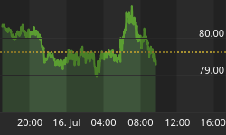
While investors may be freaked out, bankers apparently are not. LIBOR is now in a steep downtrend and priced at levels seen before the onset of the European sovereign debt crisis. The TED spread shows the same comfort in the credit markets.


The apparent disconnect between the Treasuries market and the credit markets can be seen in this comparison chart.

In June the TED spread began to ease dramatically as bankers relaxed but the 30 Year T-Bond spiked dramatically as investors panicked. Note the same pattern during the Panic of '08 when Bankers eased credit spreads as investors launced into a paroxysm of risk aversion from October through December. Who's the smart money here?
Technical Indicators
The 200 day EMA of TRIN (Arms Index) is at all time highs. This indicator has inversely tracked long term tops and bottoms and is flashing a long term divergence as its new highs are not matched by new lows in the index and can be regarded as a technical measure of excessive fear in the market. As a measure of long term oversold conditions it is now at levels well above the 2002, 2003 and March 2009 bear market lows.


As a ratio of two indicators, the Arms Index reflects the relationship between the AD Ratio and the AD Volume Ratio. The TRIN is below 1 when the AD Volume Ratio is greater than the AD Ratio and above 1 when the AD Volume Ratio is less than the AD Ratio. Low readings, below 1, show relative strength in the AD Volume Ratio. High readings, above 1, show relative weakness in the AD Volume Ratio. In general, strong market advances are accompanied by relatively low TRIN readings because up volume overwhelms down volume to produce a relative high AD Volume Ratio. This is why the TRIN appears to move "inverse" to the market. A strong up day in the market usually pushes the Arms Index lower, while a strong down day pushes the Arms Index higher. Similarly, strong declines are usually accompanied by relatively high TRIN readings because down volume swamps up volume.
(From: http://stockcharts.com/school/doku.php?id=chart_school:technical_in...)
We can see that there is also a near term divergence in this indicator.

The Volatility Index fell hard out of a rising wedge pattern which is bullish for equities.

The SPX measured by the Total Put/Call Ratio has surged ahead of the market and may be signaling a big rally to come.

The McClellan Oscillator is showing a significant divergence and is signaling a turn.

The green boxes show instances where similar setups resulted in strong intermediate term rallies and higher highs.
The Advance-Decline line showed strength throughout the August decline and has broken out.

Advance-Decline volume has been making higher lows since May and has just broken out.

Advance-Decline Ratio is showing a bullish divergence with the SPX.

There's a bullish divergence with SPX on the 50 EMA of the volume of advancing stocks.

50 EMA of volume of declining stocks remained flat during the August decline showing downside exhaustion. In fact this indicator shows that selling pressure has been diminishing since the June bottom, giving weight to the potential for a long term bottom.

The Small Caps/Big Caps ratio chart has refused to fall during the August decline and has rocketed to a higher high putting in a bullish divergence with SPX.

There are quite a few more indicators flashing similar divergences and setups but these illustrate the current technical condition of the market well enough. Within the context of extreme bearish sentiment and the near total abandonment of the equities market by the retail investor in favor of nearly non-existent bond yields the market is showing internal strength, resilience and a lack of selling pressure. In spite of the Sovereign Debt Crisis and the potential for an economic relapse, the SPX has at worst sold off by 17% and is showing signs of putting in a bottom.
Let's have a look at price charts of the SPX now.
SPX Technical Chart Analysis
At this juncture there are solid bullish and bearish arguments to be made for the chart of SPX. Given the above discussion and give the bears' repeated failure to close SPX below the key 1040 level I would say we have to give the edge to the bullish scenario at this time.

Here the rise from the July low was a leading diagonal wave 1 after a Major Wave (2) bottom. The August decline has been an abc wave 2 correction. If SPX should close above 1066 and break its downtrend from the August high then this scenario will be in control of the market. Given the strong rise in world markets overnight a gap open higher above 1066 and continuation run as overconfident shorts cover is likely.
Here's the short term bullish chart:

The wave count is fairly clear and requires only a move above 1066 for confirmation.
The Bearish Scenario is still in play but has been significantly damaged by the inability to take out 1040. As far as it goes, the count is fairly solid, but a wave iii in a wave 3 down should not have such difficulty taking out major support. It's not acting like a wave 3 down. In addition, the volume on the decline was very poor (not shown).

Here's the short term bearish count:

A break of the downtrend will make it difficult to count this as a 5 wave decline. In fact a move above 1070 disrupts the bearish impulsive structure as wave iv will then enter into wave 1 territory. To salvage this scenario, the market should turn tail and run back to 1040 and below right away, which does not seem likely.
Anticipating the negation of the above bearish scenario, we can consider this alternative:

Here, SPX continues mired in a complex sideways corrective wave 2. These combination corrections frequently terminate with a five wave abcde diagonal. This would be a grinding, contracting, back-and-forth process for several more months that would surely frustrate, confuse, perturb, vex and otherwise drive every trader on the planet to utter madness. Which of course vastly increases the likelihood that this is just what the market will do!
In the alterate Bullish scenario, 1040 fails and we continue lower to complete the final capitulation C leg of the Major (2) correction of the rally from March 2009. It projects November lows in the SPX 940 area.

On a long term basis, I continue to entertain the notion that the market structure since 2000 has been a garden variety ABC flat correction. Most technicians count the 2000 top as a wave 5 of 5 but there is a highly viable alternate count which makes that a Major Wave III high and the 2009 bottom as the C wave of a Major Wave IV with Major V in progress. Here I have it charted as a rising wedge diagonal which makes marginally higher highs before failing.

Agriculture
It would appear that the correction in grains and the Ag sector is over or nearly over. Given that once begun we are talking about a wave 3 it may not be advisable to delay entry any further. There may still be some volatility in the short term but if you take a reasonable position size you should be able to ride it out.

If you would like to receive these reports as they are issued become a member of the BullBear Trading Room at www.TheBullBear.com. It's free to join and no credit card is required. If after your first month you decided to stay with us you simply make a monthly donation. If you have benefitted from this report feel free to make a donation. It represents many hours of work and years of study and practice.


