• 825 days Will The ECB Continue To Hike Rates?
  • 826 days Forbes: Aramco Remains Largest Company In The Middle East
  • 827 days Caltech Scientists Succesfully Beam Back Solar Power From Space
  • 1,227 days Could Crypto Overtake Traditional Investment?
  • 1,232 days Americans Still Quitting Jobs At Record Pace
  • 1,234 days FinTech Startups Tapping VC Money for ‘Immigrant Banking’
  • 1,237 days Is The Dollar Too Strong?
  • 1,237 days Big Tech Disappoints Investors on Earnings Calls
  • 1,238 days Fear And Celebration On Twitter as Musk Takes The Reins
  • 1,240 days China Is Quietly Trying To Distance Itself From Russia
  • 1,240 days Tech and Internet Giants’ Earnings In Focus After Netflix’s Stinker
  • 1,244 days Crypto Investors Won Big In 2021
  • 1,244 days The ‘Metaverse’ Economy Could be Worth $13 Trillion By 2030
  • 1,245 days Food Prices Are Skyrocketing As Putin’s War Persists
  • 1,247 days Pentagon Resignations Illustrate Our ‘Commercial’ Defense Dilemma
  • 1,248 days US Banks Shrug off Nearly $15 Billion In Russian Write-Offs
  • 1,251 days Cannabis Stocks in Holding Pattern Despite Positive Momentum
  • 1,252 days Is Musk A Bastion Of Free Speech Or Will His Absolutist Stance Backfire?
  • 1,252 days Two ETFs That Could Hedge Against Extreme Market Volatility
  • 1,254 days Are NFTs About To Take Over Gaming?
Is The Bull Market On Its Last Legs?

Is The Bull Market On Its Last Legs?

This aging bull market may…

Another Retail Giant Bites The Dust

Another Retail Giant Bites The Dust

Forever 21 filed for Chapter…

  1. Home
  2. Markets
  3. Other

Who Is In control? Bulls or Bears?

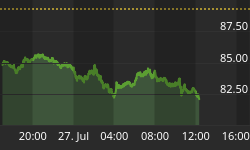
A current update on last week's analysis of Very Strong stocks versus the Very Weak stocks ....

From last week's posting: What if the number of Very Strong stocks in the market was in a "down trend" while the number of Very Weak stocks in an "up trend" ... what would you say?

The chart below shows the actual number of stocks in both categories during the past 25 days. Note that the blue line representing Very Strong stocks has been making lower/lows, while the red line representing Very Weak stocks has been making higher/lows. So this is showing a slight on-going negative bias and one that corresponds to the down trending channel that the SPY has been seeing in the past few weeks. See the next chart for today's update data ...

Here is what happened since last week ...

I drew lines from the high/lows which occurred on May 29th, to where the levels were yesterday.

Looking at the chart, is becomes clear that the number of Very Strong stocks have trended lower, while the number of Very Weak stocks took the lead and trended higher. This is saying that the Bears have the advantage over the Bears.

While the chart may look simple, it requires our computers to analyze "every stock" on four major indexes and count how many stocks were getting very strong or very weak on a daily basis. This analysis is run every night and the data is used in Ratio computations that are posted on our subscriber site. (FYI ... "Every stock" is defined as stocks that have a value of at least two dollars or more.)


Back to homepage

Leave a comment

Leave a comment