


Think back to those QE days when the market went up day after day after day for months on end without more than a single pullback of more than 1%. Yes, the good old days. Certainly, there was a lot of angst in the air not because prices were going higher but because to participate in the rally you had to hold your nose, jump in and pray that the end wasn't tomorrow.
During the QE days, the market never pulled back and it only went up. Looking at the price structure -- which is the path that prices take as they swing from low point to high point and back again -- we note a series of higher lows. See figure 1, a 60 minute bar chart of the S&P Depository Receipts (symbol: SPY). The black dots are key pivot points, which are the best areas of support (buying) and resistance (selling).
Figure 1. SPY/ 60 minute
The area inside the gray bars is the time frame from December 9, 2011 to March 1, 2012. During that time, the market blasted off because of the belief in Operation Twist and the European Long Term Refinancing Operations. What we note is 12 consecutive, higher key pivot points over 3 months, which is an extraordinary amount of time without a pullback that breaks support. This kind of price action was also seen during QE2 (12 consecutive, higher key pivot points over 3 months) and QE1 (8 consecutive, higher key pivot points over 3 months).
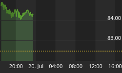
Now contrast this with the current market environment. See figure 2, a 60 minute bar chart of the SPY.
Figure 2. SPY/ 60 minute
Since the bottom in June, prices have traveled within a well defined trend channel, and it is only over the past 2 days that prices have fallen from this channel. But more importantly, the pattern of higher lows, which is characteristic of unabated buying seen during Operation Twist and the QE', is not being seen. In fact, prices have struggled and appear to be rolling over.


