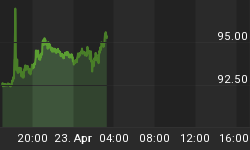
Now that the US stock market has gotten in sync with the rest of the world in its ups and downs, it also joins the rest of the world in generally (and loosely; it's not a minute-by-minute relationship) being inverse to the Gold-Silver ratio (GSR, AKA the "metallic credit spread" - Hoye).
Here is the daily view of the GSR, showing a gap up and spike that came with the stock market's big disturbance and a consolidation down that has come with its relief bounce. This is a bullish chart and so, it is a short-term bearish chart for US and global stocks. GSR broke out and is bullish while above the MA 50's, MACD and RSI are positive and AROON is trend up.

GSR weekly is fully bullish as well. It adds a long-term up trend to the daily chart's bull features. You can see the long and grinding journey upward GSR has taken since it was drubbed in 2010 (into 2011) by full frontal QE, as silver exploded vs. gold and the 'inflation trade' took off in 2010 and eventually blew out (in spring of 2011).

GSR monthly offers a different view however, as it is nearing historical resistance. Maybe when this resistance is hit it will hold and those who have, shall we say cheered so long and hard for silver can finally deliver the ultimate "I told you so!" after 4+ years of futility.

The bottom line is that the Gold-Silver ratio indicates more short-term problems in US and global stock markets, commodities and even potentially the precious metals themselves. But the bigger picture view at least offers a line in the sand (long-term resistance) where an 'inflation trade' may finally get going again.
That scenario could be the product of a saturation of the non-stop inflation that has been promoted in the US and globally by policy makers, with a global deflationary backdrop hiding its effects. Alternatively, it could be the product of panic by the US Central Bank, should the stock correction get serious enough. The entire recovery out of 2009 has been, after all, about risk 'on' asset market speculation and wealth effects.
Whatever it is, you can bet that political animals and powerful policy makers alike do not want to see the Gold-Silver ratio break out of its big picture limits.
Subscribe to NFTRH Premium for your 25-35 page weekly report, interim updates and NFTRH+ chart and trade ideas, or the Free eLetter for an introduction to our work. Or simply keep up to date with plenty of public content at NFTRH.com and Biiwii.com. Oh, and follow @BiiwiiNFTRH.


