Okay, so the theme is that on the macro 3 events may come together to signal a big climax, leading to change.
Those Amigos are…
- Stocks complete their rise vs. gold.
- 10yr & 30yr yields hit upside targets (and limitation points) around 2.9% & 3.3%, respectively.
- The yield curve finishes flattening (at least) and turns to steepening (at most).
We use the big picture graphic (a bit dated now) for cartoonish illustration purposes. This shows global and US stocks retracing the former bear market vs. gold, the 30yr yield Continuum™ and the yield curve.
Today, let’s take a daily view of stocks vs. gold and update the big pictures of the others.
SPY vs. GLD is taking the next step higher. Referring to the big picture graphic above, this could be the final and terminal launch to the projected resistance area. Warning to all you real time thinkers: the process could move slower than your brain waves. Have patience.
The next Amigo is long-term bond yields. The 10yr held the 50 and 200 day moving averages.
The 30yr is more suspect, but the pattern’s symmetry is still in play.
Here’s the Continuum™, AKA the 30yr bond yield and its 100 month exponential moving average limiter. It continues to flash a bull flag and the pattern above would measure to the limiter around 3.3% if it becomes active.
Here is the daily view of the yield curve. It is burrowing downward, chronically flattening but not yet near inverted.
Here’s the bigger picture view complete with my editorial markups about the bond/yield curve manipulation scheme secretary Mnuchin is cooking up in a ‘me too!’ play to the brilliantly evil Operation Twist that was inflicted upon free markets by the Bernanke Fed in 2011. Here is the post from November 20 in which we highlighted the details of the scheme.
Bottom Line
The 3 Amigos of macro change will ride until they hit the wall known as the limitations of a cooked up macro market backdrop. If – and it’s of course still a question – stocks retrace vs. gold, yields rise and the yield curve flattens toward logical limit points, and these limits come about in confluence, it could be the biggest market signal (of drastic changes) many of us have received in our lifetimes. And I don’t see that as hyperbole.
In the case of yields, the message could be doubly bad because if the limiters fail and yields break the secular bear (bond bull) a debt addled economy would eventually get croaked under inflationary and yield pressures. If yields are limited and turn back down with the other two Amigos, the message would be that deflationary pressure is building because a rising gold/stock ratio indicates risk ‘off’ and liquidity issues and a rising yield curve can have it both ways, under inflationary or deflationary pressure.
Meanwhile, party on Garth because it’s really bullish out there. But for crying out loud, go easy on the punch.
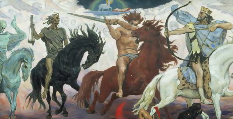
[edit] You may recall my previous metaphorical exercise, the 2 Horsemen, which would be the Gold/Silver ratio and US dollar, riding together to bring an end to market liquidity. They could yet ride together later, after the dollar finishes its newly reinstated bear phase. But the one to keep an eye on is the 1st Horseman, the gold/Silver ratio. We’ll keep him at the ready for the time when the limits shown above are reached. This Horseman rode hard in Q4 2008 and if the coming change is not inflationary, as would be indicated by silver leading gold, he could join the above three. My well honed math skills tell me that makes 4 Horsemen and they wouldn’t be nearly as enjoyable as the happy-go-lucky 3 Amigos.
[edit 2] Lest the reader think it’s a Doom & Gloom piece, please understand that it’s a bullish piece heading one day into a wall of limitations and hence, change… and very likely gloom. But I ask readers not to impose their wants, desires (hey look, who doesn’t desire a meltdown of the construct Bernanke and his monetary cohorts created and Trump and his fiscal cohorts seek to amplify and sustain?) and bias on this. The risk ‘on’ markets are bullish and I for one am aligned that way (as sensibly as I can). Later, when indicators tell us the time is right, something is going to change and that change, as indicated by all the Amigos and Horsemen above, will either be inflationary intensification or deflationary unwind of man-made excesses now interwoven in every corner of the financial markets.


