


The markets are always at an interesting and "critical" juncture. Nonetheless, a look at some longer term charts across various markets and sectors should give you a sense of the best and worst investing themes going forward.
NASDAQ 100
Figure 1 is a monthly chart of the NASDAQ 100. Price still remains in the channel having failed at the upper channel line. It would not be surprising if we see prices re-test the upper channel again. On the other end of things, a close below last week's low at 1168 would be very bearish.
Figure 1. NASDAQ 100/ monthly
Dow Jones Industrials
Figure 2 is a monthly chart of the Dow Jones Industrials. Are we headed for a retest at 11239 or will 10664 be probed? This past week's GE announcement wasn't encouraging. I thought March's 10% plus move in GE was being touted as follow the "smart money" as the CEO was buying the stock hand over fist. Oh well, if the CEO doesn't know about his own company, then who does? So much for following the "smart money".
Figure 2. Dow Jones Industrials/ monthly
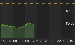
Copper
Figure 3 is a monthly chart of copper. I have dubbed this price chart the most important chart of all the charts to watch. The bull market (since 2003) for copper remains intact, and the breakout over two pivots is bullish. This is bullish for the world economy, developing countries, and hard assets in general.
Figure 3. Copper/ monthly
Figure 4 is a weekly chart of copper, and the breakout over the mega base or 2 year consolidation is readily seen, and the implications for an extended price move are more apparent. This is bullish until it isn't!!!
Figure 4. Copper/ weekly
Dollar Index
Figure 5 is a weekly chart of the US Dollar Index. The positive divergence bar (highlighted with gray oval) has temporarily thwarted the down trend, and as expected this positive divergence bar acts to keep prices in a range. A break below the lows of this price bar will likely lead to accelerated selling in the dollar. A break above implies greater strength for the dollar. However, a monthly chart (not shown) of the dollar index is not in "position" to suggest that a trend reversal is at hand.
Figure 5. Dollar Index/ weekly
USDJPY Cross Rate
Want to explain the movements in the stock markets over the last 9 months? Then just follow a chart of the US Dollar/ Japanese Yen cross rate. Figure 6 is a monthly chart. The USDJPY topped out in July, 2007 (red arrow on chart), and this market sold off rather dramatically over the past 9 months and has broken through rather significant support. The recent bounce back to resistance levels (old support) has coincided with the improvement in equities. This is the carry trade and it has been a cheap source of capital. The past 9 months have seen an unwinding of these risky bets.
Figure 6. USDJPY/ monthly
EURJPY Cross Rate
Figure 7 is a monthly chart of the EuroDollar/ Japanese Yen cross rate. The close below the prior pivot low is bearish for the Euro relative to the Yen. So in sum, the Yen should be bullish against the Euro and the US Dollar. Also look for interest rates in the EuroZone to moderate relative to Japan. 140 is the downside target.
Figure 7. EURJPY/ monthly
Crude Oil
Figure 8 is a weekly chart of crude oil. With a close over the prior pivot high, $109 becomes the new support level. I wouldn't make too much of this level failed to support prices, but the prior level of support ($99) showed considerable buying interest, and this should hold.
Figure 8. Crude Oil/ weekly
Natural Gas
Figure 9 is a monthly chart of natural gas. This is the same chart I showed over a month ago. As expected prices have stalled at $10; the chart remains bullish with a price target of $14. Price moves in natural gas usually end with an expansion in price range. Hang in there!
Figure 9. Natural Gas/ monthly
To learn more about our quantitative and disciplined investment approach please visit www.thetechnicaltake.com and sign up for our free weekly newsletter and downloads.
Guy M. Lerner may be reached at guy@thetechnicaltake.com.


